How to create your best website layouts ever
From sketch to screen - how to get results you'll be proud of
As time goes by, I find more and more that there isn't really one tool to do all the jobs I need, and I find myself increasingly turning to the browser and treating it as a design tool in itself.
There's one easy-to-spot reason why designing in the browser makes a lot of sense: it's where the site, once finished, will be viewed. There are a variety of other reasons, but for me typography is one of the biggest ones – I've yet to find an application that can accurately simulate the way type appears in the browser, and as text is rendered differently in different browsers and on different operating systems, there's no one true 'correct' rendering anyway.
Designing in the browser is also a massive time-saver. Changing a line or two of CSS to affect something like column width or line height across an entire test site will often be much quicker than making the same changes in a mock-up, where the change would need to be made across several elements, re-exported and so on. It also means testing to see what works and what doesn't can be done in seconds.
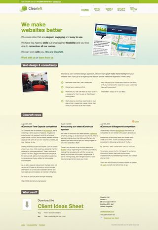
BE FLEXIBLE: Flexible widths, like those on clearleft.com, are tricky to represent in static Photoshop mockups – a great reason for designing in the browser
Consider a 20-page site where each page has 10 divs containing text. If you have a mock-up for each page, it would be a huge job to change the gutter width between each text block from 10 to 15 pixels. But with a browser, you only need to open your stylesheet, change something like div.text { margin:0 15px } and you're done. Just hit Save and then refresh your browser!
37signals is known for favouring browser-based design. In his post 'Why We Skip Photoshop', Jason Fried explains why the company jumps straight to HTML and CSS: "You can't pull down menus in a Photoshop mockup, you can't enter text into a field in a Photoshop mockup, you can't click a link in a Photoshop mockup. HTML/ CSS, on the other hand, is the real experience."
My opinion is that this approach should be used where appropriate. I still do 80 per cent of my design in Photoshop and use browser-based design for tweaking and making the more intricate decisions about typography, for instance.
Get daily insight, inspiration and deals in your inbox
Sign up for breaking news, reviews, opinion, top tech deals, and more.
Photoshop is a necessary tool for graphics-heavy sites (something I tend to produce rather a lot) but is understandably not as necessary for a company like 37signals, as its products use less imagery and favour simple blocks of colour and text-heavy elements such as multiple form fields.
Once again, it comes down to choosing the most appropriate tool for the job. However, another reason it's worth considering browser-based design is that it will instantly show you how your site appears, not only on multiple browsers but also on multiple devices.
No designer can ignore the increase in demand for mobile compatibility, and while that has been made a little easier with the popularity of the iPhone and Mobile Safari's desktop-like experience, there are still key differences. With difference comes broken layouts, so it makes a lot of sense to see if and where they're happening as soon as possible.
Working with fixed layouts has always been the easiest option, but with elastic and fluid layouts it's a different matter. This adds an extra layer of uncertainty, as more parts of the design are allowed to move, so multiple scenarios need to be considered. And how do you show these changes in a flat mock-up?
There's no question about how awkward this is to do in Photoshop, where you'd need to create multiple versions of the page, rendered at different widths. If you're creating elastic or fluid layouts, designing in the browser is worth doing as soon as possible in the process.
Layout constants
I'm a big fan of trying to design sites that break from convention and do something a little more interesting than all of the other clones out there.
However, innovation is only effective when it's balanced with conformity and let's face it, sometimes we've just got to conform! Hence there are some elements in web design that appear time after time, and why not?
Take the humble header: it's hard to come across a site that doesn't have one. But a clearly defined header adds some site-wide branding and consistency, and when it contains navigation, it gives users a guaranteed base to which they can return and find their way around.
Headers needn't actually be at the top of the page, either: I think of them more as a point of focus. Take balhar.com for instance: the 'header' is actually a strip that appears vertically centred in the middle of the screen.
Huge footers seem to be all the rage these days, and for good reason. If you consider the common sidebar, a regular feature on blogs especially, there's a lot of information there that sits alongside the actual content (which, on blogs, is usually the post).
The trouble is this that the sidebar often contains elements that don't necessarily relate to the post itself: think of the search box, generic category listings, links to recent comments on other posts, etc. Why clutter up your page with these things that detract from the main article being read?
Sure, there are valid reasons to give prominence to these elements, but often we throw these things together without even thinking. Not so with the big footer: it's a way of presenting large amounts of disparate information (such as blogrolls, social network links and daily bookmarks) without interrupting the flow of reading the main article.
