How to create your best website layouts ever
From sketch to screen - how to get results you'll be proud of
If there's one area in web design I find exciting right now, it's the concept of art direction being injected into the way we approach layout: something that, until recently, was sadly lacking in our online world.
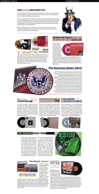
Popularised by Jason Santa Maria's approach to his blog entries, the mantle has now been picked up by a number of designers who are aiming to treat their blog posts with the amount of care usually reserved for offline magazine articles.
The key thing is that each post has a unique design, or variation on the 'base' design, and is thus a unique experience in itself. Rather than succumb to the rigidity of templates (something we're all guilty of), each article gets designed according to its content.

MIX IT UP: Each article has a distinct personality, echoing the best of magazine design
Dustin Curtis' site is a great example: apart from the nav bar and footer, every single page looks completely different. Greg Wood's site is another example in a similar vein, with even fewer constants. Each article has a distinct personality and looks absolutely beautiful.
Of course, art directing every single page isn't something that can be applied to all websites. In fact, if we're being honest, the number of sites that would be suited to this approach is relatively small. But it goes to show that layout on the web is finally growing up and we're starting to achieve something that print design has enjoyed for years.
Even if this only serves to impart a subtle influence on other sites where full-on art direction is unsuitable, it's undoubtedly a great thing, and a sign that web designers are no longer afraid to do what they do best – design!
Get daily insight, inspiration and deals in your inbox
Sign up for breaking news, reviews, opinion, top tech deals, and more.


