How to make your website mobile compatible
What you need to know about mobile compatible websites

The days of building websites targeted solely at desktop or laptop environments are over. Users can and will access your website from a variety of internet-enabled devices.
Accessing the web from mobile devices is far from new. However, the popularity of smartphones and cheaper data packages from network providers have driven a sharp rise in mobile web usage, which is not just reserved for the latest and greatest smartphones.
As website owners, mobile devices also offer some fantastic features typically not available on the desktop – functionality such as clicking a hyperlink in your website to call your phone number, or adding your contact details to an address book. And with more advanced devices, a mobile website can provide more targeted, location-aware content for your visitors.

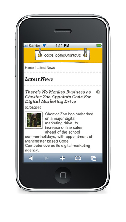
MOBILE FONTS: Computerlove's Advanced Profile on the iPhone demonstrates how the @font-face technique can be used to bring brand fonts onto a mobile site
With the growing importance of mobile devices and the diversity of access it brings, it's vital as website owners, designers and developers that we think smarter and broader about how we enable visitors to engage with our sites.
You need to have a clear policy and strategy in place for making your website accessible to as many internet-enabled devices as possible. Over the following pages, I'll look at some key lessons the team at Code Computerlove has learned while developing mobile websites. I'll cover general hopefully use and apply to your own websites.
Which technology for mobile sites?
Get daily insight, inspiration and deals in your inbox
Sign up for breaking news, reviews, opinion, top tech deals, and more.
The first question you may be asking is: What technology is involved? Well, a technology stack, served by your existing web server, and utilise your existing web development skills. You use XHTML and CSS. There's no need to invest in learning a new formatting language or resurrect an old one such as WML (Wireless Mark-up Language).
At Code Computerlove, our base-level entry devices have to support WAP 2.0, which in turn supports XHTML-MP (Mobile Profile) and WCSS (Wireless Cascading Style Sheets). We also target high-end devices that fully support XHTML and CSS through to HTML5 and CSS3.
XHTML-MP is simply a subset of XHTML for mobile use and WCSS is a subset of CSS. Whilst XHTML-MP has been adopted and superseded by the W3C with XHTML-Basic 1.1, it's still the most widely supported XHTML variant. If you know XHTML, you already know XHTML-MP and XHTML-Basic. The same applies for WCSS.
Styles can be embedded or linked into your XHTML just like normal desktop web pages. What about more interactive technologies such as JavaScript or Flash? Support for these is inconsistent.
However, at the lowest level, like the desktop version of your website, the mobile website should still work without them.
Device diversity
To reiterate, mobile websites are built using existing web technologies. The main challenge is that given the sheer diversity of mobile devices, support for these technologies is inevitably inconsistent.
Certain devices may not support particular features, or features common to devices may be implemented in different ways. So how can you be sure your mobile website will look and act the same on all mobile devices if they all implement the technology in slightly different ways? How can you test your mobile website effectively? How can you assure your clients that their mobile website will work flawlessly on all devices?

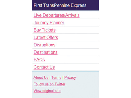
BASIC PROFILE: The Basic profile of the site on OpenWave shows the lowest common denominator
The simple answer to these questions is … you can't! It's a tough call to make, but an important one. It's logistically impossible to set up and test all of the XHTML-supporting mobile devices that are available, as well as dealing with quirks that each device offers.
Ironically, appreciating this early on will actually help your build, testing and quality assurance processes. At Code Computerlove, we came up with a two-pronged approach to help us deal with this diversity.
Firstly we agreed to support at the lowest level, only those devices that support XHTML and CSS. Secondly, we used the concept of 'device profiles'. A device profile is simply a way of logically grouping devices.
The criteria for each group can be based on device capability, manufacturer and operating system, or by any other criteria. We created three core profiles. The 'Basic' profile covers low resolution, text-only devices. The 'Intermediate' profile includes devices that support images and have a screen resolution greater than or equal to 240 pixels (such as the BlackBerry, Nokia N95 and Nokia Xpress).
Finally, the 'Advanced' profile includes the latest smartphones based on WebKit browsers, such as the iPhone and Android phones. These profiles help us both to generalise and specialise device capabilities. They help us form a design, build and testing strategy, as well as enabling us to demonstrate to our customers how a mobile website experience will differ between diverse mobile devices.
These profiles are not set in stone. Neither are they static. Profiles may vary between projects and customers. They reflect which agreed device features are to be targeted, as well as the specific handsets we need to support.
During the life cycle of a website, new profiles may be added and old profiles removed. Additionally, they require regular reviews to guarantee their relevance and to ensure that new devices entering the market are properly assigned to the right profile.
Device profiles play an important part in our build process. We assume that all devices adhere to the basic 'text-only' profile. This is our default, fallback profile that will work on all devices. We then progressively enhance a site for subsequent profiles.

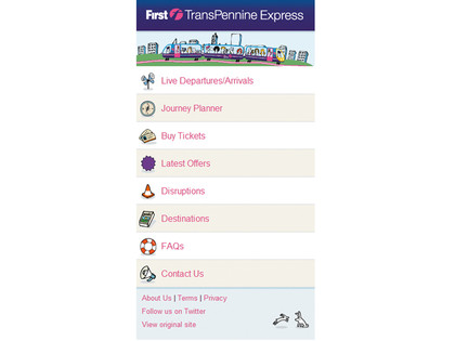
INTERMEDIATE PROFILE: The intermediate device profile for the First Group TransPennine Express site shows how it looks on more advanced mobile devices
For example, the Intermediate profile introduces a wider colour palette and the use of images. The Advanced profile extends this further by using advanced CSS3 techniques or more interactive scripting elements.