How to make your website mobile compatible
What you need to know about mobile compatible websites
Device detection
So how do you determine whether a web page request is coming from a mobile device? And secondly, how do you determine what profile a device belongs to?
We do this by simply inspecting a web browser's user agent details and matching them up in a device capability file, which contains extended details about the device. Each web browser has user agent information about itself, such as vendor, version or operating system.
Irrespective of whether a browser is running on the desktop or mobile device, whenever it requests a page from a server, it also sends this information as part of that request. A server can then use this information to determine whether a request has come from a mobile device or not and what capabilities that device has.
To help with this, there are a number of publicly available 'device capability' files that you can use with your server-side technology. These files contain extended information about the web browser and device accessing your site, such as screen resolution, colour depth, image support, touch screen support, manufacturer and operating system.
These database files come with a number of pre-built helper methods, enabling you to integrate them easily into various server-side web technologies such as PHP, ASP.NET and Java.
At Code Computerlove, we use the paid-for subscription service DeviceAtlas. For a minimal yearly cost, this service provides us with regular database updates as well as an online database for browsing phone capabilities.
Get daily insight, inspiration and deals in your inbox
Sign up for breaking news, reviews, opinion, top tech deals, and more.
There are of course alternatives, and a popular open source project called WURFL (Wireless Universal Resource File) is available from wurfl.sourceforge.net. Alternatively, you could write your own user agent detection routine!
Testing
How do you test your mobile website and device profiles? There's no substitute for using real physical devices. Not only will you see precisely how the site will look, but you'll also experience any hardware challenges that the device will throw up, such as screen size or quirky input mechanisms.
Physical testing on every single device is, of course, logistically impossible. But you should try to obtain a few devices that fit each of your device profile characteristics. And if you're building a site on behalf of a client, it's worthwhile trying to get hold of the common handsets they use. There are also a number of software-based testing tools you can use in your daily build and testing process.

TEST AS MUCH AS POSSIBLE: The more devices you can test on the better, but testing on all devices is next to impossible
For testing your mobile site within your desktop browser, use the Firefox User Agent extension. This extension changes the browser details that are sent to your server, spoofing the server into thinking you're accessing the site from a mobile device.
It's important to note that you'll still be viewing the website via the Firefox rendering engine, not how it will be actually rendered on mobile devices. What it will show you, though, is an approximation of how your site will look across various device profiles.
For greater accuracy, there are a number of device simulators available for you to install on your development box for BlackBerry, Android, and iPhone to name a few. Furthermore, there are hosted options offered by Opera, Nokia and Device Anywhere. The latter is a paid-for service hosting thousands of genuine mobile device simulators.

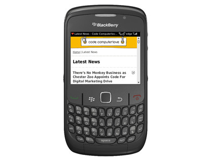
IMPROVING ALL THE TIME: The Intermediate profile on a BlackBerry shows improved formatting and imagery
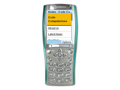
Perhaps one of the most useful tools is the now-defunct OpenWave simulator. It's fantastic for experiencing your mobile website against a small resolution, text-only device profile. Due to its limited nature, what you'll get is an immediate indication of whether your navigation and content work for mobile.
Multiple websites
Throughout this article, I've been discussing mobile websites as distinct entities from desktop websites. But do you need to build separate websites? Do you need separate URLs for your mobile website?
There's no right or wrong answer to these questions. In an ideal world, your website should be accessible to all devices – desktop or other – and be capable of rendering itself where possible, using the same content and navigation structure.
This singular approach works brilliantly if you know from the outset that your website is to target multiple devices as this can be factored in accordingly when planning structure, layout and content. However, if you have to retro-fit mobile onto an existing desktop site, it may be easier to run the two as separate sites.
Navigation and content that traditionally works well on the desktop may not when displayed on a mobile device. Desktop navigation may seem unnecessarily complex on a mobile device, and content may need rewriting, either to be shorter and more immediate or to be split across multiple pages.
As the amount of server-side branching logic increases to alter navigation and content for desktop and mobile, it's then a case of either re-evaluating your design, structure and content or, if the two sites serve slightly different objectives, running the two as separate instances.
At Code Computerlove, we've separated out our desktop and mobile website. We've found this easier when internally managing site assets such as style sheets, scripts and images and server-side logic.
We are, however, in a convenient position in that our content management system enables us to share content between multiple websites. So, while both are distinct sites, there's crossover and shared content between both.
Do you need a separate URL to distinguish your mobile website from your desktop website? Again, there's no right or wrong answer to this: it's purely down to your own requirements. You don't need a '.mobi' domain, an 'm.' subdomain or a 'mobile' folder as part of your main website's URL.
At Code Computerlove we've used the 'm.' sub-domain approach for mobile – for example, m.codecomputerlove.com – and www for desktop, as this suits our requirements.
If a mobile device browses to the desktop URL, it's redirected to the mobile site. The mobile site contains a hyperlink that enables the visitor to navigate back to the desktop site if they wish to. Conversely, if a desktop browser visits the mobile site, we don't force a redirect back to the desktop version.
Structure and content
Due to restrictions on screen real estate and the various input mechanisms used by mobile devices, relying on a traditional multi-column desktop-based layout doesn't work. This is true even for smartphones that accurately render desktop websites. The novelty soon wears off when scrolling through and zooming around desktop-targeted websites.
At Code Computerlove, we've developed a standard template structure for our mobile websites, initially based on a template that can be found at MobiForge.
This template follows a single-column, fluid-width design. What this means is that the user need only ever scroll vertically and that the page always fits the available width of the mobile device's web browser. The template is purposely 'light'. It encourages simple navigation with tightly written, relevant and focused page content.
Additionally, the template promotes the use of clean and simple XHTML markup that mobile devices with limited processing capabilities, memory and variable network speeds are able to render quickly.

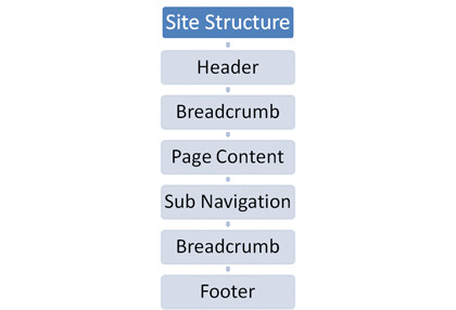
MOBILE TEMPLATE: This diagram will give you an idea on how to structure a mobile website
The template is composed of a header containing the company name or logo; top and bottom breadcrumb trails displayed on all pages except the homepage, enabling the visitor to navigate back through the site with ease; a page content area; sub-navigation links; and a footer containing copyright information plus, more importantly, a hyperlink to the desktop version of the site.
Final tips and tricks
To wrap things up, here are a few final tips and tricks to help with your mobile website development:
Mobile-specific META tags
A number of XHTML META tags that are specific to mobile websites can be used in addition to the common tags such as author and description. A review of these can be found here.
One important one is the viewport META tag, which can be used to set the initial scale of the width of the site to fit the screen. This is especially important for iPhone browsers. It forces your mobile website to fully fit the screen at the correct resolution and prevents the user 'zooming' into a page, for example:
CSS and presentation tips
Given the variable nature of screen resolutions, it's best as a rule to stick with relative units such as percentages and ems. Relative units will help when it comes to making a quality and scalable mobile design. With perhaps the exception of more advanced smartphones, fonts and sizes are in general poorly supported.
It's best to assume that most devices will only use their default font faces and sizes for XHTML elements. CSS background images tend to be well supported. However, your design must work well in the event that they aren't.
We did find a glitch with BlackBerry browsers. To ensure maximum support, make the URLs to your background images absolute, not relative, to the style sheet.
Image resizing and scaling
It's preferable not to push full-size desktop-targeted images to mobile users. Where possible, ensure your images are optimised accordingly. There may be instances where you need to scale images dynamically on the server to match the screen resolution you're serving to.
If you're using DeviceAtlas for browser detection, you can obtain the actual screen width of the web browser and rescale the image accordingly, using such tools as ImageMagick or any other server-side image manipulation library.
Google Analytics
Avoid using the default JavaScript-generated code. Many mobile devices don't support JavaScript and so using the default code will distort your website statistics. Google now offers tracking code options that are targeted specifically for mobile devices.
This code does not rely on JavaScript. You can find the option under the Advanced tab in the section where you normally generate your tracking code from.