Secrets from the world's top 20 web designers
Essential design tips from the kings and queens of code
Douglas Bowman
Twitter's creative director is "helping change the world, 140 characters at a time". Before joining Twitter, Bowman was visual design lead for an obscure dotcom called Google, and prior to that his Stopdesign firm built acclaimed sites and online applications for the likes of Blogger, Adaptive Path and Cathay Pacific Airways.
"In a world where data bits flow abundantly, our minds have developed filters to sift through the overflow of useless and badly designed information," he writes. "The presence of design should simplify and facilitate our everyday life, enable us to accomplish our tasks more effectively, and help us enjoy them along the way."
Jason Hickner
Hickner's favourite project isn't a website: it's Ektos, an energy management system he and his brother Ryan created. "We developed some pretty intense predictive algorithms," he says. "So far we've saved customers over $20million in electricity, and offset about 100,000 tons of CO2."
Get daily insight, inspiration and deals in your inbox
Sign up for breaking news, reviews, opinion, top tech deals, and more.
Hickner is particularly excited by the possibilities of multi-touch overlays and augmented reality. "What if there were no physical signage?" he asks.
"No billboards, no street signs, but whatever signage you wanted to see was drawn directly onto your retina. Imagine glowing arrows leading you to your destination, or pointing out your friends nearby. See something interesting? Make a gesture with your eye (up, then right?) to Google it. Write a column of numbers on paper and make an eye gesture to total them. I think we're on the edge of the most interesting and transformative technology we've seen yet, and I can't wait to build applications for it."
"Good problems are all around us, but they're hard to see because we've grown accustomed to most of the small inefficiencies and inconveniences that are built into the things we use," Hickner says.
"Try to get in the habit of seeing everything new. Instead of just using everyday objects and interfaces, pretend you're designing them. Really see their flaws, and think about what you would do differently. You probably have three or four good design problems within a few feet of you right now."
Brendan Dawes
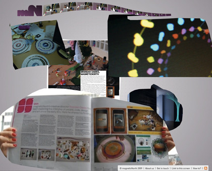
magneticNorth's creative director is an author, sought-after speaker, Flash guru, a designer whose work has been showcased in the New York Museum of Modern Art, a blogger, a masked vigilante, and a man who admits to being inspired by Waitrose. Only one of those things isn't true, and it isn't the Waitrose bit.
"I try to notice things that quite often go unnoticed and try to fill my head with lots of disparate crap – usually nothing to do with computers, the web or any such stuff," he explains. "For instance, wandering around Waitrose is like a master class in typography. It may not be cool, but I've never cared about such things."

BRENDAN DAWES: Brendan Dawes is proud of magneticNorth's new site, which is defiantly experimental
Dawes is particularly proud of magneticNorth's new site, which is defiantly experimental and playful. "We wanted to create something that would provoke a reaction and create debate … it's always baffled me why many design companies choose to put 'different' stuff in an experimental section, hidden away, almost in an apologetic fashion."
Anatoly Zenkov
"I can do anything," says the strapline on Zenkov's website. From conceiving, modelling and programming a multi-user musical game to developing websites for MTV, his Flash work is characterised by its vivid visual style. For Zenkov, inspiration can come from anywhere.
"When I was a child I got an A2 size sketchbook, which was half of my height. And I had a dream of drawing the whole world on it, everything I that I knew and had seen. That old dream became the basis of Termit's site conception."
At other times, Zenkov deliberately tries things he isn't good at. "I'm a bad photographer, so I began to play photographer, sometimes a real one," he says. "An example of such mimicry is the actual front page of my own website."

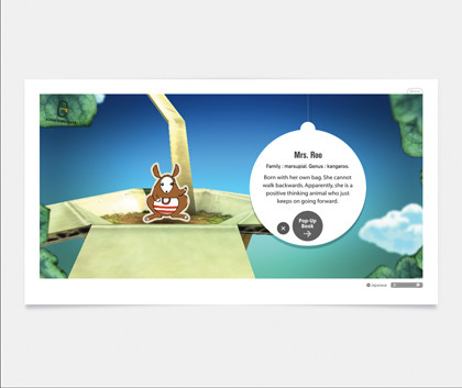
ANATOLY ZENKOV: The utterly charming Eco Zoo was the FWA Site of the Year and .net readers voted it Interactive Site of the Year
Roxik
The word "genius" is bandied about all too frequently in design circles, but we think Roxik, aka Masayuki Kido, deserves the title. His Eco Zoo was the deserved winner of the .net Awards Interactive Site of the Year, and his 3D engine demos appear to have been beamed in from another planet.
Current page: See everything as if for the first time
Prev Page Don't just jump on the Web 2.0 bandwagon Next Page Study and emulate work of those you admireWriter, broadcaster, musician and kitchen gadget obsessive Carrie Marshall has been writing about tech since 1998, contributing sage advice and odd opinions to all kinds of magazines and websites as well as writing more than a dozen books. Her memoir, Carrie Kills A Man, is on sale now and her next book, about pop music, is out in 2025. She is the singer in Glaswegian rock band Unquiet Mind.
