The Netflix fix: UI overhauls, trend testing and ego-free changes incoming
Giving the people what they want

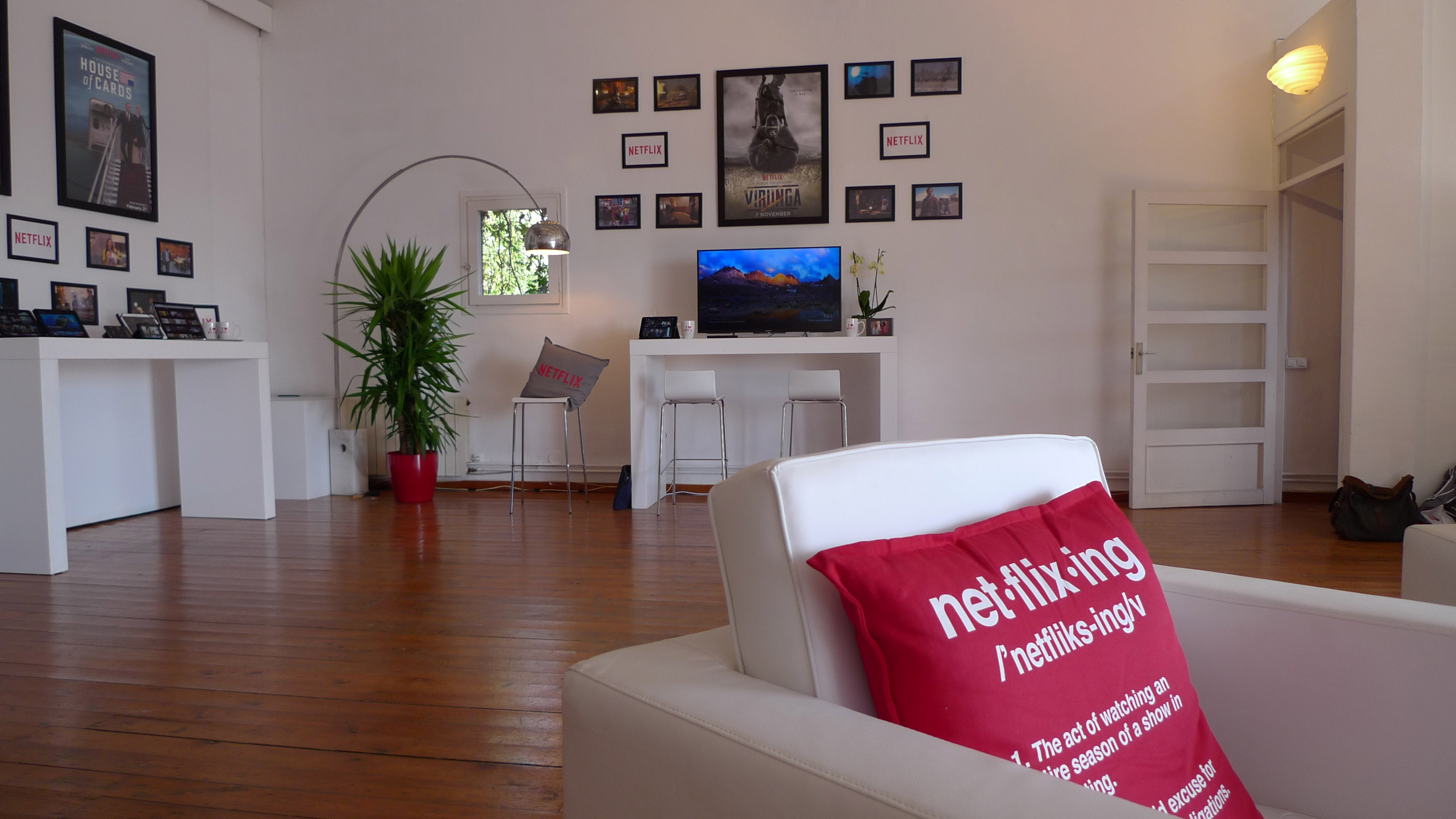
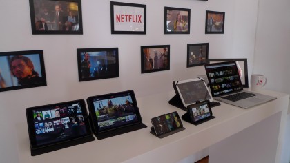
Far away from MWC 2015, Netflix made camp in an airy loft, and tempted us over from Barcelona's urban sprawl with the promise of things to come.
One of those things was something we'd dearly hoped for - a long awaited update to the Netflix iPad and web client user interfaces.
There are a number of changes currently being tested, the first of which is a smaller update for the TV interface. When you select a title, Netflix will immediately start playing the content, with the usual information overlay. After a few seconds, that information will fade away, leaving you to watch your show.
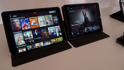
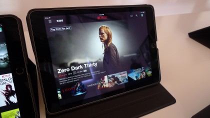
That's cute, but that iPad redesign is the big news. And here it is.

As you can see, the vertical box-shots are gone and replaced by multiple rows of content, similar to the excellent Xbox One app.
On trend
Keep scrolling and you'll see more recommendations based on your viewing habits. The UI now presents a hierarchy of recommendations, championing the top one with much richer imagery.

The web client has had a similar redesign too. But if you're starting to get excited, just hold on a second, because there's a caveat: Netflix will only implement this across the board if it passes user testing.
Get daily insight, inspiration and deals in your inbox
Sign up for breaking news, reviews, opinion, top tech deals, and more.
For example, a small percentage of Netflix users are currently getting a 'Trending Now' selection, and their activity is being monitored.
If those users show a decrease in usage - fewer minutes watched per session, less time spent on the service in general, that sort of thing - Netflix says it will take those improvements back to the drawing board, or perhaps scrap them altogether. That includes big UI updates like that proposed for the iPad.
So basically, if users don't like it, Netflix won't roll it out, and you'll never see this layout again.
Testing time
"Two or three years ago, we tried a whole new kids experience. We were so excited, all these bells and whistles, it was great. [It was a] total failure. Less streaming. Worse retention. Total bummer," says Todd Yellin, Netflix's man behind Product Innovation.
"We just want to drive a business, and we're not going to let our egos get in the way. So all that code and all those months, we threw it out of the window."

It's the opposite end of the spectrum from Steve Jobs' famous 'people don't know what they want until you show it to them' line, which is fascinating for such an innovative company. But as Yellin says, that's a hardware-centric philosophy, and there's no honour in "jumping the gun" - if users don't want it now, Netflix doesn't want it either.
Netflix has loads of original content on the way too, including the new Daredevil collaboration with Marvel, the Wachowski's Sense8 series, four new Adam Sandler movies, and plenty more thanks to partnerships with Sony Pictures, Dreamworks and others. It should be a great year to be a Netflix-er.