Vimeo's drastic new redesign revealed
Sneak peek at YouTube rival's new look

Vimeo, the thinking man's YouTube, has just undergone its biggest ever redesign and its first since 2007. It's been a year's worth of work and a mammoth undertaking that's seen the site rebuilt from the ground up, and today it enters a closed beta.
That means that some of you will be lucky enough to try the swish new site out, but most of us will be languishing on the old version for a couple more months.
But never fear - Vimeo let TechRadar peek behind the curtain so we can show you all the design delights you've got to look forward to.
Clean and clear
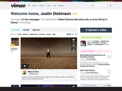
The inbox is much cleaner and makes it much clearer to see what videos are listed and why – Vimeo has taken a blog-like approach and it works really well.

By far our favourite new feature is the video ticker that is sneakily hidden away at the top of each page. The cute kaleidoscopic header slides out when you click 'more videos' and offers you a bunch of video recommendations, a playlist of videos you've liked, as well as quick access to your feed and your 'watch later' list.

It's smooth, clean and convenient. When you're sick of it, just hit 'hide videos' and it'll be as though it was never there.

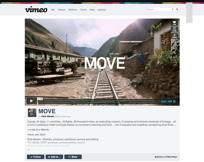
Vimeo is all about the videos, though. So when you go to a clip page to watch a video (like the utterly excellent Star Wars Uncut), all the extra clutter has been swept away. You get the video, the synopsis and not much else at first glance.
Get daily insight, inspiration and deals in your inbox
Sign up for breaking news, reviews, opinion, top tech deals, and more.

Options and navigation are hidden in drop-down menus across the header and under the player. Very clean and very tidy. Stoppit and Tidyup would be proud.
Other handy new features include improved search, which will allow you to use voice recognition in Chrome as well as advanced search functions that allow you to filter by license types, video length etc - it's going to be really handy for videographers.
Finding new videos has always been a bit of a pain, so while the search improvements are welcome, we'd like to see a more sentient recommendations service. At present, Vimeo uses similar tags and relevant channels to make suggestions; something more algorithmic like Last.fm's recommendation service would be amazing.
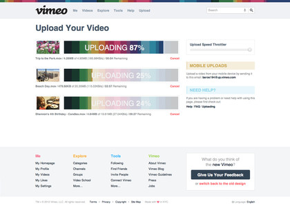
New Vimeo will also allow you to upload multiple files in the redesign, which means you can set it to work uploading your trilogy of Tarantino homages, go out and shoot the fourth part, and come back to find them all online.

A redesigned website might not seem like groundbreaking news, but Vimeo's 65 million users are going to love it. (Interesting fact: London is its largest city in terms of users.)
The comparisons with YouTube are inevitable, but the two sites have grown into very different beasts. Where YouTube scrambles to make money from adverts, premium content by jamming as much content on to a page as possible, Vimeo aims to let the video shine. And the redesign, which manages to retain all of the site's quirky coolness, does just that.
The closed beta will run until all the bugs are caught and quashed, with a projected launch date of the end of Q1/early Q2 (March/April).
Former UK News Editor for TechRadar, it was a perpetual challenge among the TechRadar staff to send Kate (Twitter, Google+) a link to something interesting on the internet that she hasn't already seen. As TechRadar's News Editor (UK), she was constantly on the hunt for top news and intriguing stories to feed your gadget lust. Kate now enjoys life as a renowned music critic – her words can be found in the i Paper, Guardian, GQ, Metro, Evening Standard and Time Out, and she's also the author of 'Amy Winehouse', a biography of the soul star.