4 reasons why customers don't trust a website
And how to solve them

We've all had that "get me out of here" moment when browsing online. It could have been because you landed on a website where the content looked shady or because you visited an online store and their security credentials didn't look legit. Whatever it was, the outcome was the same, you left the site.
This is the last thing you want to happen when customers visit your business website, but it could be happening right now. In this article, I'll take you through 4 reasons why I think customers are finding it hard to trust your website, and I'll give you a few tips on how to improve the credibility of your website so your web visitors stay around longer.
1. Unprofessional Design
If the design of your site is poor, customers won't trust your website. Customers have to have a positive first impression of your website, if you expect them to stick around. Boring design or poor legibility are not going to persuade visitors to stay on your website. If you don't have a professional designer on hand, here are a few tips that will help you improve your design yourself:
- Use professional images - Use photos that are unique to your business, provided they are good quality and look professional. Stock photos are also a good alternative, if you can't use your own photos, but stay away from images that look outdated or staged.
- Pick your brand colors wisely - Nothing looks worse than a website with a mishmash of colors. It can look unsightly and also have a negative effect on how customers perceive your brand. If you're not blessed with a designer's eye, here's a handy tool (courtesy of Adobe) that helps you pair colors nicely.
- Choose a readable font - Copy on your website should be readable, so pay close attention to what typography you choose and how content is displayed on the page. Use headings, sub-headings, bullets and numbered lists to break up blocks of text.
2. Points of assurance
If you're running an online store, points of assurance along the purchase path can really help to build your customers' trust.
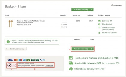
Take a look at this page within the John Lewis checkout flow. I landed on this page before I enter my payment details. I've highlighted a few points on the page that are designed build my trust, so that I feel comfortable enough to give my credit card details.
Websites can only display the VeriSign logo (Point 1) if they follow good security practices and use secure methods for transactions. I understand what this means and recognise it from shopping online, which gives me confidence.
However, not all customers visiting this page may recognise the sign. That's why Point 2 is important. In plain writing, it says that the company is 'secure' and also provides me with a link to this page that explains more about the security and privacy practices. This is fantastic and really helps to build my trust.
Get daily insight, inspiration and deals in your inbox
Sign up for breaking news, reviews, opinion, top tech deals, and more.

The icing on the cake is Point 3 where they assure me on the call-to-action that the next step of my journey is secure. At this point I have no issue clicking on the button and completing my purchase (after a quick check to make sure I am on a secure address - https:// and not a http://)!
3. Contact information
|Contact details are such an easy thing to add to a website and will really help to build trust. I see this often at Yola, where small businesses build websites but don't include prominent contact details on the homepage. Having a phone number on the homepage is ideal, if that's not possible, then include a "Contact Us" page in the main navigation as a good alternative.
Your customers should be able to easily find a way to get in touch with you. Don't make them hunt for important information. If you do, they could think you're shady or don't want to be contacted, both of which are detrimental to building trust.
Here's a great example of one of our customer's websites, Made by Hol, a UK business who make bespoke handmade wedding invitations and stationery (if you want to check them out). She has included a 'Contact' page in the top level navigation. Once on the Contact page, you'll see every way possible to contact her - by email, phone, social media info as well as a contact form. All these really help to build trust with customers who have never visited the site before.
4. Third party endorsements
Finally, a great way to build trust is by using third party endorsements. Some examples of third party endorsements that you could include on your website are:
- Recent press coverage
- Customer testimonials
- Awards or recognition from industry experts
Put all of these four elements together to go a long way to improve the credibility of your website. Although these elements are small, add them to your website and they will really help to build customer trust and improve the effectiveness of your website. I'd be really interested to know if you've made any changes to your website that helped instill trust and improve its effectiveness, let me know by commenting below.
- Abi Waterer, Director of Marketing, Yola Inc. She has nine years of marketing experience working with major consumer brands, non-profits and bootstrapped startups in the US and UK. She currently works for Yola, a free website builder that helps small businesses create websites and grow their businesses online.