Google Keep officially launched, rivals Evernote for note-taking
Google Drive adds Google Keep
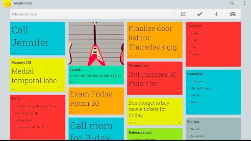
Google Keep, touted as a digital replacement for all of those yellow 3M sticky notes that've been stuck to your desk for too long, was officially launched today - and this time it's for keeps.
The search engine giant had prematurely released Google Keep into the wild over the weekend, but now everyone can experience the "save what's on your mind" product.
"Every day we all see, hear or think of things we need to remember," jotted down Google Software Engineer Katherine Kuan on the search engine giant's official blog.
"Usually we grab a pad of sticky notes, scribble a reminder and put it on the desk, the fridge or the relevant page of a magazine.
"Unfortunately, if you're like me, you probably often discover that the desk, fridge or magazine wasn't such a clever place to leave the note after all."
What is Google Keep?
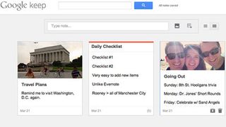
Google Keep (accessible here) is supposed to solve the problem of inconveniently placed stickies with a grid of text blocks for writing down thoughts and checklists for sorting out priorities.
Trumping Google's similar Tasks product, this new note-taking service includes the ability to add photos and a color stripe to the header of each task grouping.
Get daily insight, inspiration and deals in your inbox
Sign up for breaking news, reviews, opinion, top tech deals, and more.
It also automatically keeps these notes close to you at all times, storing them on Google Drive and syncing the data across Android and web devices.
This means iPhone and iPad owners can access Google Keep through the Safari browser, too, minus of course the ability to use Google's Android-only transcribe voice memos functionality. As an app, only mobile users with Ice Cream Sandwich 4.0 and above can access it via Google Play.
Google threw up a paper mache video to explain its new property:
TechRadar asked Google to see whether it plans to launch a full-featured Google Keep iOS app in the future, and will update this story when the company responds.
Google Keep vs Evernote
The launch of Google Keep is a sign that the company has been taking notes on the success of note-taking services like Evernote.
Google Keep is clearly still in its infancy, as it lacks Evernote's ability to change the various font settings and attach much larger images anywhere within a note, not just at the top.
More of an issue, when it comes to checklists, Google Keep doesn't allow for indentations for sub-tasks like Google Tasks and Evernote do.
Google Keep's bare bones design does have some pluses, though. The grid view makes the day's tasks easy to read compared to a Google Tasks' list and Evernote's snippets.
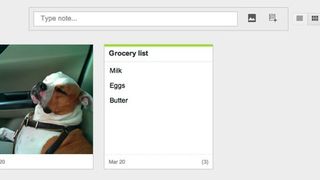
Also, Evernote's checklists have always been very archaic - there's no way to reorder checklist items, and hitting enter after one task doesn't set you up with a new checkbox for another task.
Google actually pointed this first problem out today, saying, "changing priorities isn't a problem: just open Keep on your Android phone or tablet and drag your notes around to reflect what matters."
Unfortunately, this hyped drag-and-drop functionality hasn't made it to the web version of Google Keep just yet.
Surprisingly something not mentioned in Google's announcement is that Keep so far won't cost users an extra dime outside of their Google Drive disk space.
Evernote charges a fee for users who upload more than 1GB of data a month and has had a run-in with hackers recently.
This makes it the opportune time for Google to strike.
If Google Keep can add indentations to its checklist and make the tasks editable in the so-far read-only grid view, then Google Keep could be the next big note-taking to keep a hold of.
