Highs and lows of a decade in web design
Top web designers reminisce about the noughties
"These days there can still be a lot of waiting around watching preloaders spinning – designers' work often seems to swell to fill the width of whatever pipes it travels along," says Corradi. "However, at least Flash is now mostly used where Flash is best, and has become the platform for online video and unique interactive experiences."

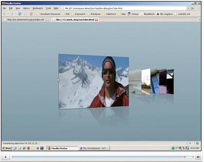
FLEX: Flash has gone from strength to strength over the past decade, bolstered by a number of technological developments such as Flex
"Flash continues to go from strength to strength," agrees Mike Jones, founder of Pixadecimal. "With the introduction of the Flex framework to assist rapid app development, the ability to deploy Flash content to the desktop through AIR and support for devices, Flash is the media of choice when it comes to offering rich immersive experiences and application-orientated solutions."
"In the last decade, the single most important thing that happened with regards to web design was when Flash video was incorporated in the Flash authoring tool in Flash MX 2002 and Flash Player 6," says Rob Ford, founder and principal of the Favourite Website Awards.
"This finally enabled creatives to do what they had been fighting with for years, easily adding video to their projects rather than trying to embed video players. Without this development, YouTube would not be what it is today and the web would be a very different place."
"Flash has really withstood the test of time because of the diversity in how it's used: microsites, games, banner ads, applications, video playback," says Mielke. "Every year it improves, adapts and morphs its uses on the internet. I believe it's also the main reason why front-end developers have pushed harder to develop other techniques like Ajax, which gives us even more creative options."
Standard compliance
Get daily insight, inspiration and deals in your inbox
Sign up for breaking news, reviews, opinion, top tech deals, and more.
Is there an automated app that will make web designers' lives easy? Not any time soon, says Ryan Carson of Carsonified. "Almost all truly great web designers are still hand-coding. No one has been able to create a piece of software that solves this problem: how can a WYSIWYG editor truly produce standards-compliant, semantic and accessible markup?"
Jakob Nielsen is confident of improvements in accessible sites: "If improvements continue at the current rate, we'll achieve maybe 80 per cent success rates by 2020. Getting rid of the 20 per cent of failures will require substantial usability advances, which will probably take more than 10 years. But improving the web's usability quality to the 80 per cent level can be done without breaking a sweat: sites just have to follow the basic usability guidelines that were documented at the beginning of the current decade."

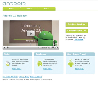
ANDROID: Google's Android platform has provided an exciting challenge for a new generation of web developers
Following advice that's already 10 years old? Ought to be a piece of cake. "The next decade will also finally see the mobile web turn mainstream," Nielsen continues.
"Right now, mobile sites are still beneath contempt. A recent study by Nielsen Norman Group found that users only succeeded 38 per cent of the time when trying to access sites on mobile phones. In other words, the current mobile success rate is even worse than it was for desktop use in 2000.
"When we asked British users to find out 'what's on BBC1 tonight at 8pm' using their mobile phones, they took 199 seconds to find the answer. Much worse than our study of WAP users in 2000, when the same task only required 159 seconds. We have gone backwards in mobile usability!
"What we need is for companies to start designing dedicated mobile sites that are optimised for these more constrained devices. The old web ideal of 'design once, view anywhere' has failed and should be discarded."
User interaction
"The biggest change is likely to be in the way people interact with content," adds Craig Grannell. "In whatever a 'typical' browser evolves into, a lack of precision will lead to different interface design, with accessibility at the forefront. We're already seeing this in the shift from desktop machines to mobile, where a prodding finger is way less accurate than a mouse pointer, but also in the way you directly interact with content rather than doing so in an abstract way via a pointing device."
Grannell also warns against the design-once mentality: "Information will increasingly be accessed across hugely varying devices. While I don't think we'll get back to the bad old days of designing for every device, mobile will be increasingly important, and even when devices evolve in terms of underlying power, people will still want fast, efficient web experiences on the go, rather than sluggish, time-wasting experiences."
Rob Corradi agrees: "As we're about to enter a new decade in which new platforms emerge almost yearly, designing and building to standards and thinking multi-platform is more important than ever. With netbooks, smartphones, consoles and more, all with different processing power, different screen sizes and input methods accessing what we make, one size no longer fits all."
"Ten years is a lifetime in terms of the web and technology," adds Shane Mielke. "I think you'll see web-enabled phones, watches and PDAs become items that potentially control every electronic item we own. I think we'll see 'web design' as it's currently defined start moving away from just websites viewed on computers and grow to encompass other media. It really is exciting because it means a constant evolution for everyone and the opportunities to work on projects for TV, computer, cellphone, and so on, where currently we're limited to our own little niche of the internet."
"Mobile, mobile, mobile," says Margaret Manning, CEO at Reading Room. "While I think there may be some rough times ahead, it's undeniable that mobile is where we're all going. I think there are some really interesting design and usability challenges coming up – we've all got used to the luxury of working in lots of space on large screens. Mobile shakes things up a bit – in the way we design and in what we give to the end user."
"Everyone is going to say mobile, of course," says Brendan Dawes. "For me it's not really about that, but more about context. I want the thing I use to interact with the web to know what I'm doing, where I am and to simply work like magic. Yeah. Magic. Let's have more of that."
After watching War Games and Tron more times that is healthy, Paul (Twitter, Google+) took his first steps online via a BBC Micro and acoustic coupler back in 1985, and has been finding excuses to spend the day online ever since. This includes roles editing .net magazine, launching the Official Windows Magazine, and now as Global EiC of TechRadar.