iOS 16 beta brings back a feature that never should have been removed
Battery percentage is back

The biggest feature we’re expecting with iOS 16 is customizable lock screens, but in the latest beta, Apple has quietly added a feature that some users might find even more useful. Or rather, it’s brought back a feature that never should have left.
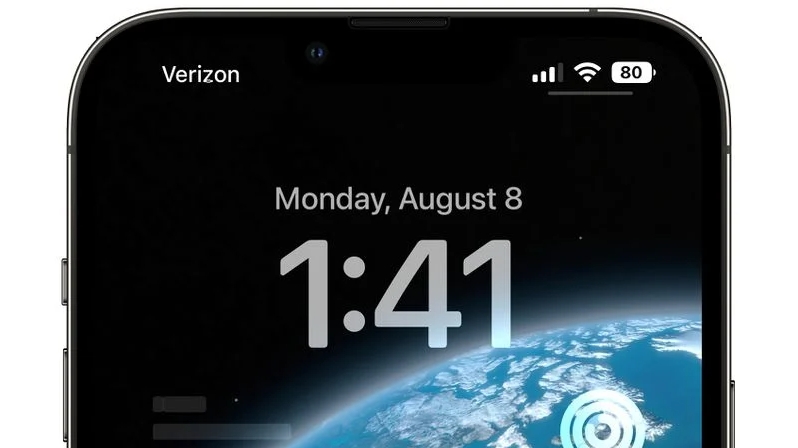
If you have the fifth iOS 16 beta then you’ll find there’s a toggle to enable battery percentage on the status bar, so you can see at a glance exactly how much battery your iPhone has remaining, rather than relying on a fairly vague visual indication.
This is a feature Apple used to offer, but the company removed it for phones with a notch, as the notch encroached on the top edge of the display meant there was less space for additional information in the status bar. So it’s good to see it returning here.
The implementation isn’t perfect, however – with the battery percentage enabled, the actual battery icon reportedly appears full until the battery drops to 20% or below, which some users are finding confusing. But at least you now have the choice.
MacRumors reports that the battery percentage toggle also isn’t available on the iPhone 12 mini, iPhone 13 mini, iPhone 11 or iPhone XR. It’s not clear why that is, but perhaps it’s again a space issue, due to the phones being smaller or the notch taking up more space.
Of course, this is just a beta, so it’s possible that when the finished version of iOS 16 launches this feature will be available for those phones too, and maybe it will have been tweaked so that the battery icon still displays the current battery level as well. There’s also an outside chance that this feature won’t make the cut at all, but we certainly hope it does.

Analysis: an obvious option that never should have been removed
A battery percentage indicator is such a useful and obvious feature to have at a glance, and it’s baffling that Apple ever removed it. The current battery indicator is better than nothing, but it can’t provide more than a vague indication of battery level, and you shouldn’t have to swipe to the Control Center to find the percentage every time.
Get daily insight, inspiration and deals in your inbox
Sign up for breaking news, reviews, opinion, top tech deals, and more.
On phones without a notch, such as the iPhone SE (2022), Apple places the percentage next to the indicator, so you can get the best of both worlds and, of course, there’s no space for this implementation in phones with a notch.
That’s understandable, but if Apple was only going to offer either a percentage or an indicator, arguably the former is more useful. Or better yet it could have given people the choice, as it essentially has in this latest beta. That this took so long to happen is baffling, but it’s nice to finally see it, and it could help make iOS 16 a big upgrade over iOS 15.
James is a freelance phones, tablets and wearables writer and sub-editor at TechRadar. He has a love for everything ‘smart’, from watches to lights, and can often be found arguing with AI assistants or drowning in the latest apps. James also contributes to 3G.co.uk, 4G.co.uk and 5G.co.uk and has written for T3, Digital Camera World, Clarity Media and others, with work on the web, in print and on TV.