It's time for Skeuomorphism to return to iOS
It’s Skeuomorphin’ time

When the first iteration of iOS, or iPhoneOS as it was first known, was unveiled in January of 2007 alongside the original iPhone, watchers were amazed in how the user interface looked and ran. From the elasticity of reaching the end of a contact list, to interacting with the Slide to Unlock feature at the beginning of the demo by Steve Jobs.
As the operating system matured and the needs of the user required it to be rebooted with iOS 7 in 2013, we were greeted with a flat-design, with parallax scrolling and chilled-glass backgrounds abound.
But as we approach the next iteration of iOS, I think it’s time for skeuomorphism to return.
- iOS 15 hints may have been shown by Apple already
- Best iPhone 12 deals in May 2021
- Everything we know about the iPhone 13
Skeuomorphism where it mattered
From the moment the iPhone was unveiled in 2007, many were enamored with how similar iPhoneOS looked, but it was something that had not been seen before in a smartphone. Everything looked old and new at the same time, it was uncharted territory.
The objective behind skeuomorphism is how it reflects real-world objects, so it would be reminiscent of something that you would see or use in the world around you.
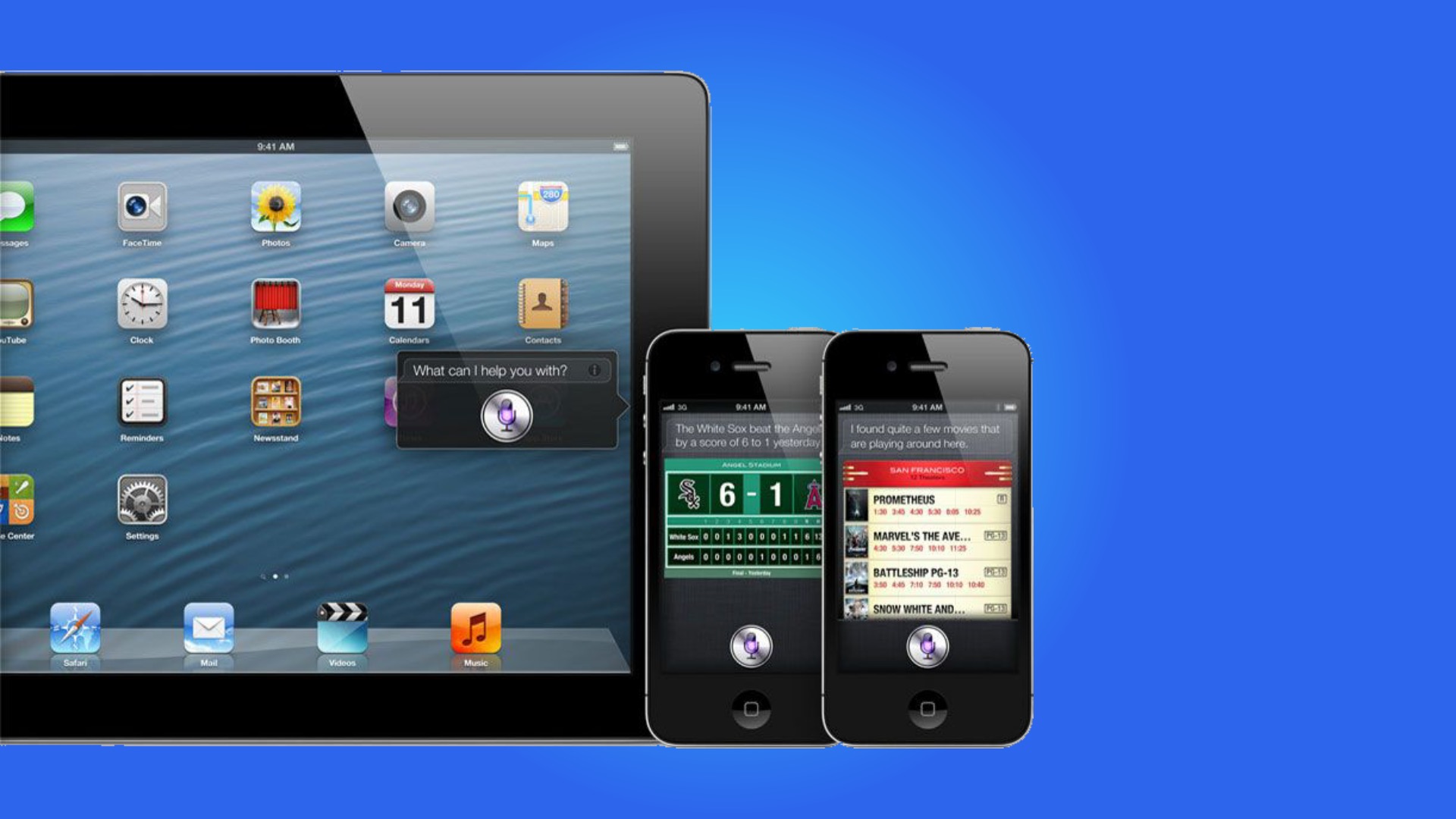
Fast forward to 2010, and the Retina Display would arrive on the iPhone 4, bringing the screen resolution from 480x320 to 960x640. But this would bring the skeuomorphic design to a high-resolution display and suddenly made everything look razor sharp.
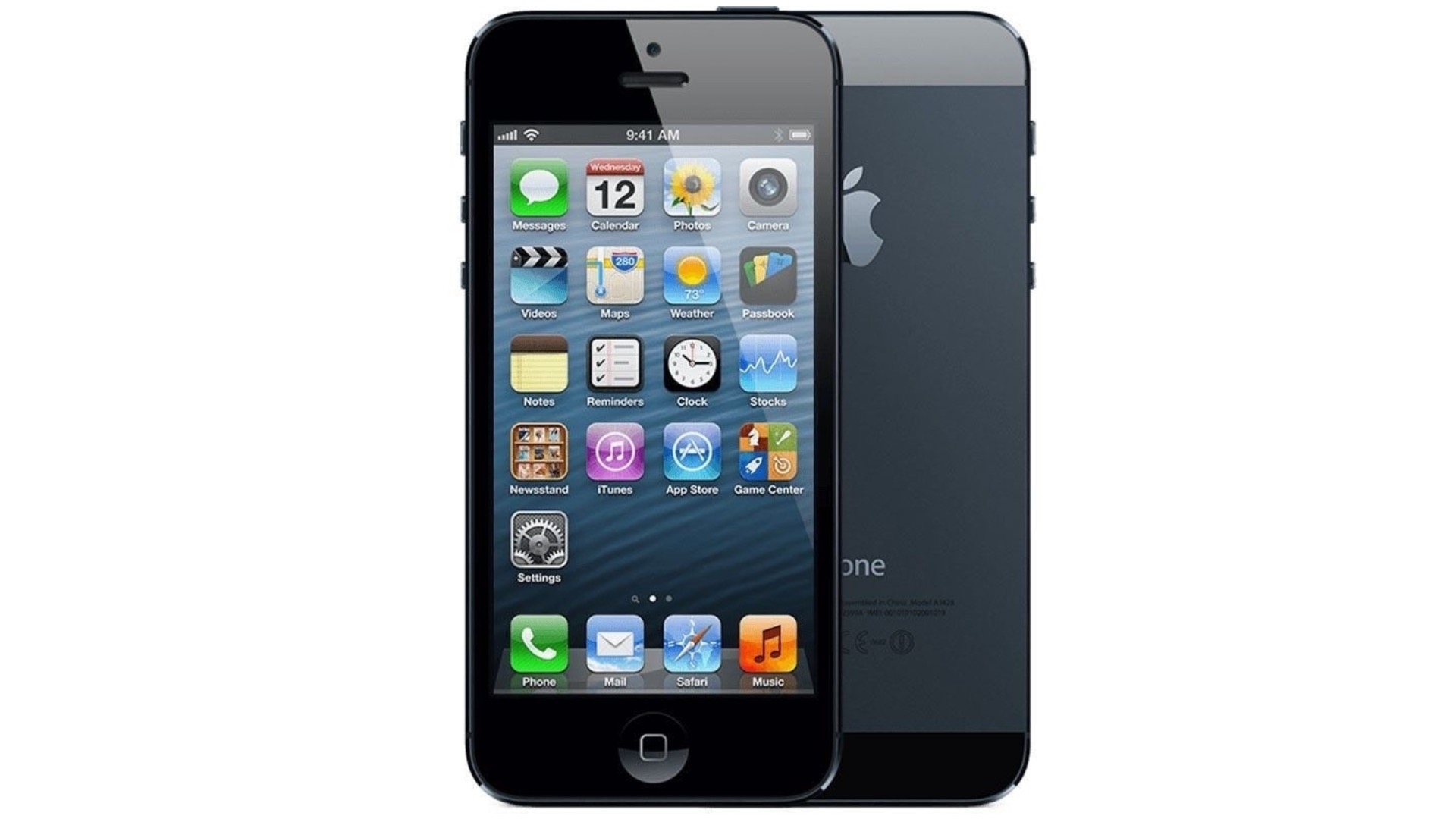
Fast forward to 2012, and iOS 6 was where the UI peaked for me. The iPhone 5 coupled with iOS 6 brought out the best of the OS, with the taller screen showcasing every app at the height of its prowess.
Get daily insight, inspiration and deals in your inbox
Sign up for breaking news, reviews, opinion, top tech deals, and more.

The skeuomorphism was abound even in the animations, such as when you would open a folder, and the home-screen would almost split in two. Or when you would double-tap the home button, the whole screen would move up, and you would be greeted with a dock of currently-running applications.
However, this was a time where real-world appearances in operating systems and applications were not the fashionable thing at the time. There was a push, more than ever, for a more brighter, colorful design, which, coupled with the departure of iOS Vice-President Scott Forstall, led to iOS 7.
Gone was skeuomorphism, and focus shifted to bright, flat, blurry designs. Elegant on the eye, but it was clearly an early look at the design - there were glaring omissions in animations and layouts, and the operating system didn’t really feel finished until iOS 8 the following year.
Skeuomorphism and flat-design in harmony
As we approach iOS 15, it seems as though it's time for a return to skeuomorphism, but with an updated approach.
There’s already some of this in macOS 11, namely the icons, where they have much more depth than their iOS brethrens, while toggles and navigation bars look to have much more gradients and textures to them.
Even to the animations, there could be a return of pre-iOS 7 skeuomorphic tropes here. Folders have never looked right after iOS 7, especially on an iPad. They fill the whole screen and it’s one of the few areas where it looks like you’re on an enlarged iPhone.
There’s always a need for nostalgia and the new, and that couldn’t be more prevalent than the latest iMac design. Perhaps we’re seeing a return of the fun that Apple brought to its products, and perhaps we’ll see this train of thought come to iOS 15 as well.
Fashion comes and goes, and the same applies to technology. With Android 12 offering a new Material You methodology with its customisable color scheme and more rounded widgets and menus, perhaps Apple should bring back what made skeuomorphism great to begin with, and how it can look great again in certain areas in the animations and icons that we interact with on their devices every day.
- Get a head start on Prime Day 2021 deals

Daryl had been freelancing for 3 years before joining TechRadar, now reporting on everything software-related. In his spare time, he's written a book, 'The Making of Tomb Raider'. His second book, '50 Years of Boss Fights', came out in 2024, with a third book coming in 2026. He also has a newsletter called 'Springboard'. He's usually found playing games old and new on his Steam Deck, Nintendo Switch, and MacBook Pro. If you have a story about an updated app, one that's about to launch, or just anything Software-related, drop him a line.