Microsoft is redesigning the Skype app, again
Back to basics

Skype's desktop and mobile apps are getting another design overhaul, aimed at appeasing users who weren’t happy with the previous one.
Since acquiring the online messaging service in 2011 Microsoft has rolled out several redesigns and new features, although not always to much fanfare.
Last year saw a new Highlights feature seemingly styled after Snapchat’s Stories, but that's now being dropped. A blog post from Skype admitted that Highlights “didn’t resonate with a majority of users”, and set out its aim to focus on the core messaging features its community is actually making use of.
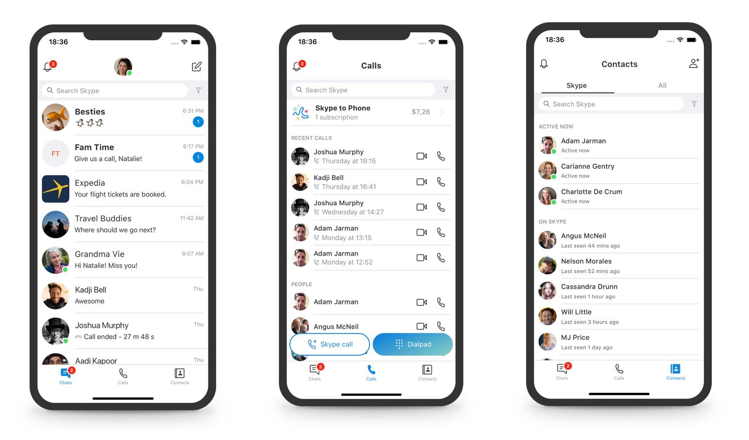
On mobile, the app is slimming down to three navigation buttons for Chats, Calls, and Contacts along a bottom bar, while the desktop app is grouping them with the Notifications button at the top-left of the window. The design is also being toned down, with less contrasting colors and fewer “decorative elements”.
Stand out from the crowd
Skype was the go-to messaging app for calling your friends and family online – until everyone else started doing it. And now that it’s easy to set up video calls over FaceTime, WhatsApp, or Facebook Messenger, it's becoming harder to make the case for Skype as a unique offering.
So it makes sense for Skype to listen to its users and cut the chaff from its UI – and it has also set up a UserVoice website to collate feedback on incoming features and changes; however, if that’s not enough for you, we have a number of alternative services at the link below.
Get daily insight, inspiration and deals in your inbox
Sign up for breaking news, reviews, opinion, top tech deals, and more.
Henry is a freelance technology journalist, and former News & Features Editor for TechRadar, where he specialized in home entertainment gadgets such as TVs, projectors, soundbars, and smart speakers. Other bylines include Edge, T3, iMore, GamesRadar, NBC News, Healthline, and The Times.
