New Windows 10 Start menu has been shown – and it can be tested now
Gradual rollout to testers has begun with Windows 10’s latest preview build

Windows 10 has witnessed the release of a new preview build which showcases a big change that we’ve heard about previously; namely a new look for the Start menu, alongside some other tweaks like altering the way Alt-Tabbing works in certain cases.
Windows 10 build 20161 has been released to testers in the ‘dev channel’ (the new name for the fast ring), although these new features won’t come to every Windows Insider straightaway, and it’ll be a gradual rollout with only a small number of testers involved at first – so you may have to wait a little while to see this in your preview build.

- May 2020 Update is blocked by this security feature
- How to work smarter from home with Windows 10
- We solve 100 common Windows 10 problems
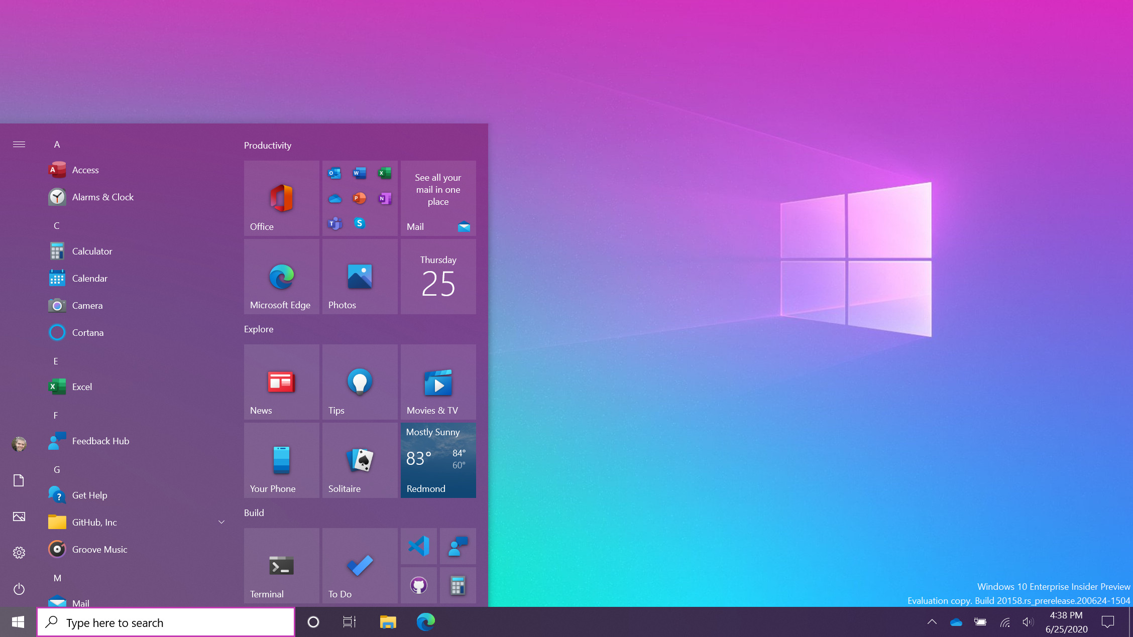
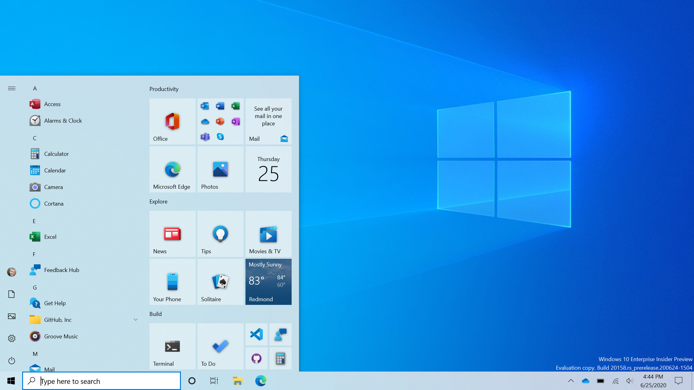
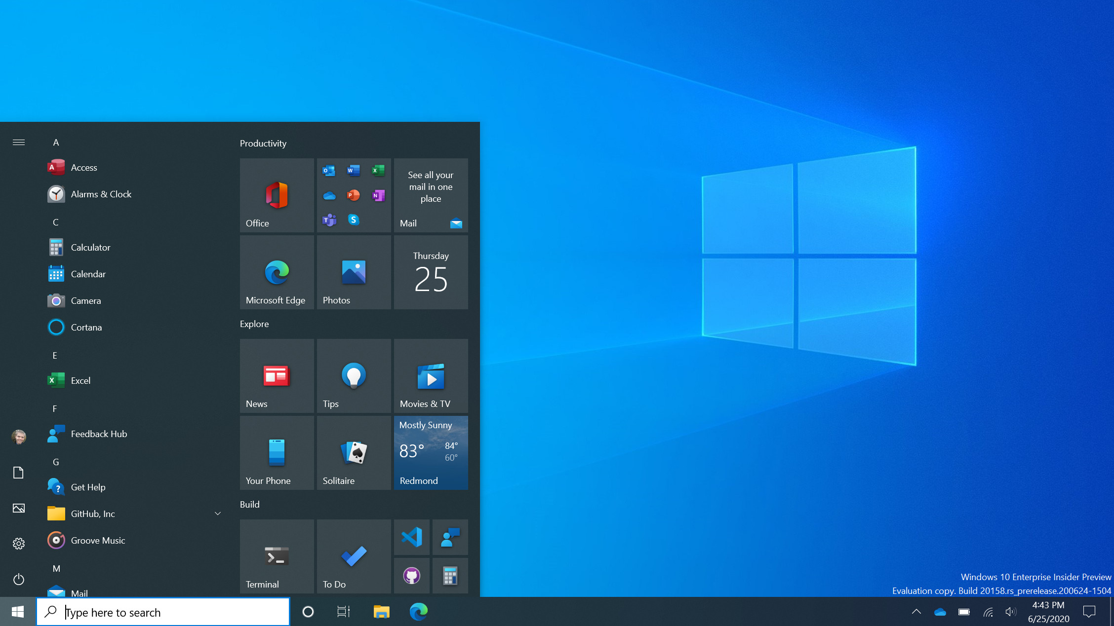
The centerpiece here is the new Start menu which has previously been teased, and as you can see from the images Microsoft provided, it’s not a massive change initially – although more work is doubtless in the pipeline – but it does make the interface look cleaner and more uniform.
Live tiles have been altered so they aren’t such a hotchpotch of different colors, and they now all carry the same color background for a uniform appearance which matches whether you’re running a light or dark theme (in the blog post describing the changes, Microsoft notes that you can apply an accent color if you wish).

The backgrounds of the icons on the Start menu’s app list have also been removed for a cleaner overall look. The changes are good, we think, and previous feedback online has been positive about them too, but as we already mentioned, there’s likely further work to be done – and it will be interesting to see exactly what else Microsoft has planned.
Note that the new Start menu in build 20161 isn’t tied to any particular version of Windows 10; as Microsoft clarifies, this is a build from its Active Development Branch.
In other words, we don’t know when or with which update we’ll witness the debut of the new Start menu, but the smart money is on H1 2021 (given that the update due for later in 2020 is a minor one with no big introductions, just like the November 2019 Update was at the end of last year).
Get daily insight, inspiration and deals in your inbox
Sign up for breaking news, reviews, opinion, top tech deals, and more.
Tabs aplenty
Build 20161 also changes the way Alt-Tab works, the function which allows you to quickly switch between the windows you have open, but the tweak only relates to Microsoft Edge.
Instead of an Edge window being considered one task for switching purposes, now each tab open in Edge is displayed separately and can be Alt-Tabbed between; so if you’ve got a few tabs open, you’ll easily be able to switch between them using Alt-Tab.
If you have a lot of tabs open, mind, then things will doubtless become rather cluttered and confusing – but fortunately, Microsoft has included the option to turn this feature off (or limit the amount of tabs displayed when Alt-Tabbing).
Like the Start menu, this functionality is also only rolling out to a small subset of testers initially, so again you may not see it straightaway. Further note that you need to be running the Dev or Canary build of Microsoft Edge to be able to use this, as well as preview build 20161.
Microsoft promises that more ‘productivity enhancements’ will be coming to Edge, so that sounds like we can expect the browser to be further pushed within Windows 10, which is no great surprise. Remember that Microsoft is currently in the midst of a wide-reaching campaign to persuade folks to switch their browser to Edge, with all manner of ads popping up here and there, including with Windows 10 search (and Microsoft is frankly running the risk of this getting pretty annoying).
Anyhow, a few other more minor changes arrived with build 20161. They include a more personalized taskbar for those setting up Windows 10 using their Microsoft account, whereby the OS will, for example, put the Your Phone app on the taskbar by default for those who have a linked Android smartphone.
Notifications have also been tweaked to show the relevant app icon along the top, along with an ‘x’ icon top-right to make dismissing the notification an easy process.
- These are the best laptops of 2020
Darren is a freelancer writing news and features for TechRadar (and occasionally T3) across a broad range of computing topics including CPUs, GPUs, various other hardware, VPNs, antivirus and more. He has written about tech for the best part of three decades, and writes books in his spare time (his debut novel - 'I Know What You Did Last Supper' - was published by Hachette UK in 2013).