Google digs deeper into Android 3.0
Big G brings web market and new features to Honeycomb OS

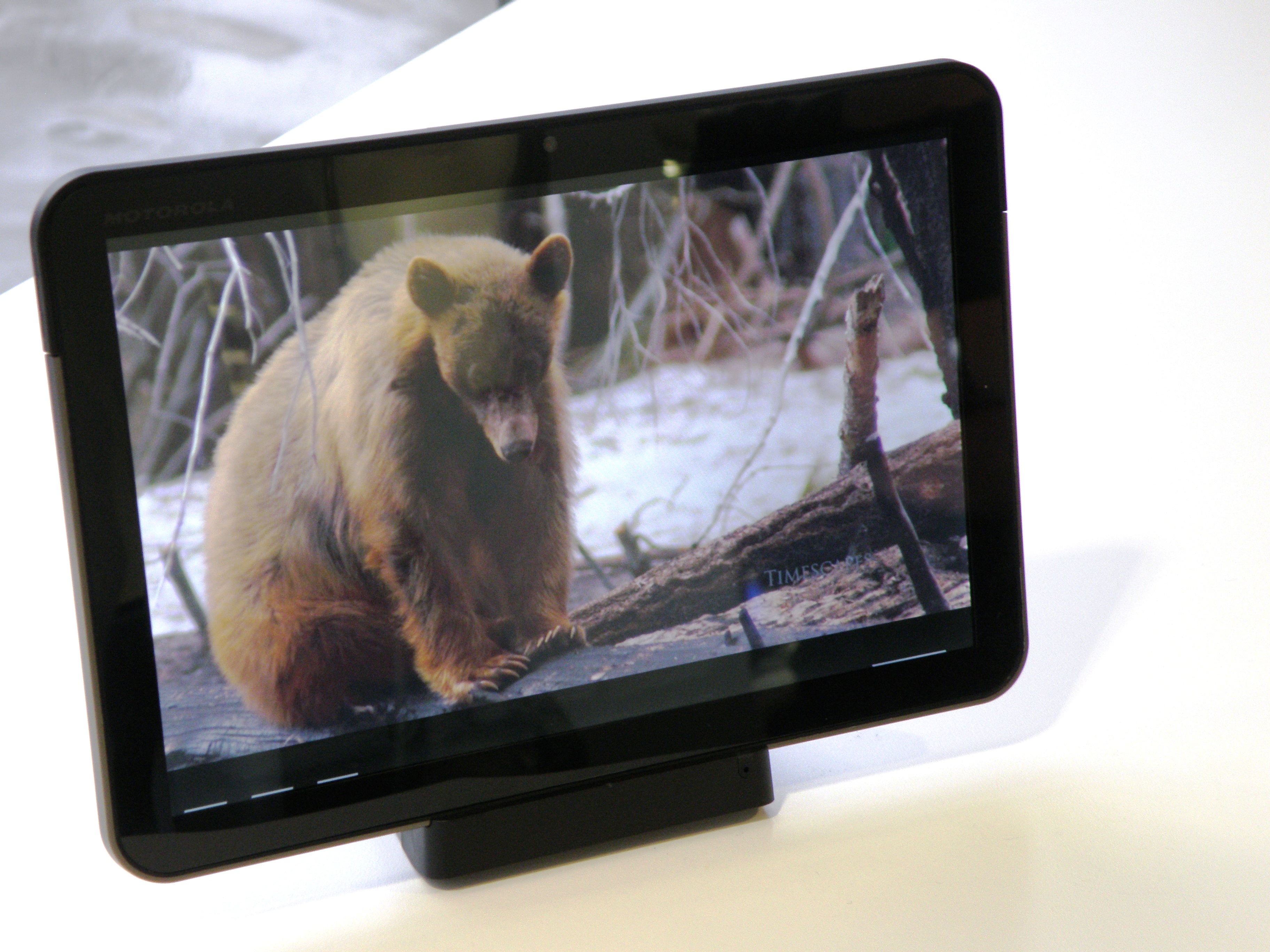
Google has thrown down the gauntlet to Apple's iPad today by lifting the lid on the Android 3.0 Honeycomb operating system, fully optimised for tablet computers.
The OS, first previewed on the Motorola XOOM tablet at CES last month, was unveiled in all its glory at today's event from Google HQ in San Francisco.
Big changes from the smartphone OS include new 3D graphics, multi-tasking, video chat, slick animations and a completely new interface that rivals the usability of Apple's iOS.
Multi-tasking and notifications
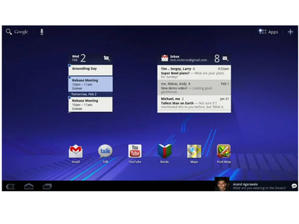
Initially, the homescreen is dominated by your apps, but offers a multi-tasking tab that brings up all of your running applications in an easy to navigate menu on the left hand side of the the screen.
There's also a neat-looking non-intrusive notifications system which brings them into the bottom right hand side of the screen allowing you to act on them at your convenience.

Likewise, key settings like screen brightness, media controls and connectivity can be accessed easily at the bottom right hand corner.
Get daily insight, inspiration and deals in your inbox
Sign up for breaking news, reviews, opinion, top tech deals, and more.
3D graphics and animations
Perhaps the most impressive aspect of today's presentation from San Francisco shows a complete revolution of the UI with some seriously attractive animations and 3D graphics.
Navigating around the interface is greatly improved over the mobile OS, with a series of gorgeous transistions that really adds a slickness not seen on tablets like the Samsung Galaxy Tab running Android 2.2.
On the homescreen you can flick through 'bubbled' widgets which present multiple stories, videos, emails or books without entering the application, giving easy access to your important information without entering the app.
Android 3.0 also showcases the new RenderScript 3D graphics platform which was best showcased by a new 3D video wall in YouTube and an exquisite page turning animation in the Books that makes the slickness of Apple's iBooks look a little passe.

You'll also be able to drag and drop into folders.
Applications
Google also announced the "Application fragment" functionality which will allow developers to present information in panes, just like in iPad applications like Twitter and BBC News.
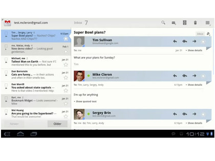
In the Gmail application you can now open messages to the right of the folder, while pushing older tabs out to the left. Google thinks that it will allow developers to make apps more intuitive.

CNN also took to the stage to debut a new massively-impressive application tailored specifically to the Android 3.0 platform. Google also showcased a new video chat application to rival FaceTime.
New Android Market
Google also used the event to announce the arrival of a new Android Market webstore, likely unveiled to combat the threat of the forthcoming Amazon Android App Store.
Market.Android.com is live now.
It's also ditching the reliance on the US dollar as the main means of pricing apps. Applications will be priced differently in different markets.
Support for in-App purchases is also on the way for developers.
Check out the video of the demo - that is, if you have a spare hour:
A technology journalist, writer and videographer of many magazines and websites including T3, Gadget Magazine and TechRadar.com. He specializes in applications for smartphones, tablets and handheld devices, with bylines also at The Guardian, WIRED, Trusted Reviews and Wareable. Chris is also the podcast host for The Liverpool Way. As well as tech and football, Chris is a pop-punk fan and enjoys the art of wrasslin'.
