Hands on: Android 3.1 review
The Honeycomb 3.1 update is more about stability than features
Interface improvements in Android 3.1
Navigation is slightly improved: when you press the on-screen Home button, instead of always taking you to the central home screen it takes you the home screen you were on last - press it again if you actually want the main home screen.
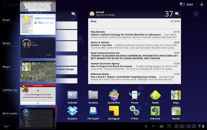
The task switcher is better but still disappointing: it can now show more open apps than fit on screen, so you can scroll up or down to see more current apps - but you still can't close an app from here (or at all, without installing a third-party tool).

SWITCH NOT KILL: See more running apps to switch to, but you can't stop them
Compared to the powerful and intuitive navigation on the HP TouchPad and the BlackBerry PlayBook, this still feels clunky and primitive.
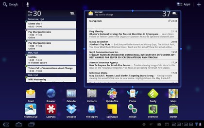
Google promised resizable widgets for Honeycomb and the Android 3.1 update adds this but developers have to code it into their widgets; it's there for Google's own calendar and email widgets.
You can press and hold to get a blue outline around the widgets with handles that you can drag to make the widget smaller or larger - although you can only make it bigger if there's blank space on the home page; Honeycomb won't shrink another widget to make room.
Get daily insight, inspiration and deals in your inbox
Sign up for breaking news, reviews, opinion, top tech deals, and more.

STRETCH: You can now resize some widgets on the home screen
Other improvements are cosmetic. There are some new wallpapers, including some fun animated ones. The system font changes to bold; characters are thicker and rounder (and look far more like the iPhone's font) but that means you can't see as many letters of an app title - so Angry Birds Rio is truncated to just Angry Birds, for example. Google says the calendar grid is easier to read, although the only difference we can detect is that today's date on the day picker is in a larger font.
Mary (Twitter, Google+, website) started her career at Future Publishing, saw the AOL meltdown first hand the first time around when she ran the AOL UK computing channel, and she's been a freelance tech writer for over a decade. She's used every version of Windows and Office released, and every smartphone too, but she's still looking for the perfect tablet. Yes, she really does have USB earrings.