Kindle Fire vs Nook Tablet: which should you buy?
Seeking a budget tablet? We compare and contrast the top options

While the iPad and a slew of less-obvious competitors duke it out for the premium end of the tablet pool, Amazon has made a big splash with its $199 Kindle Fire, a smaller and significantly cheaper option – and Barnes & Noble has its own like-priced competitor, the Nook Tablet.
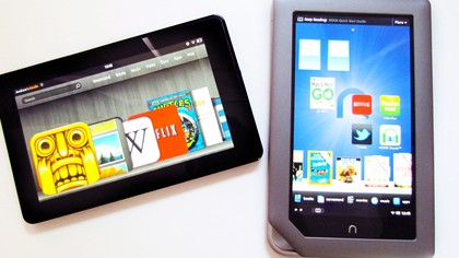
Both clearly take after their E Ink reader counterparts in terms of portability and basic dimensions, but significantly diverge when it comes to what's on the screen.
Sure, you can read books – millions of them, actually – but these bright, colorful displays also hold the key to scads of apps, games, movies, and magazines, as well as web browsing.

They're true tablets, only much easier to hold with one hand.
We recently compared the merits of the backlit Nook e-reader to the Kindle Touch and came away recommending Barnes & Noble's option, but the companies' respective tablets offer up an entirely different debate.
Both have their merits, but when it comes to spending your $199, which truly warrants the investment?
Devices
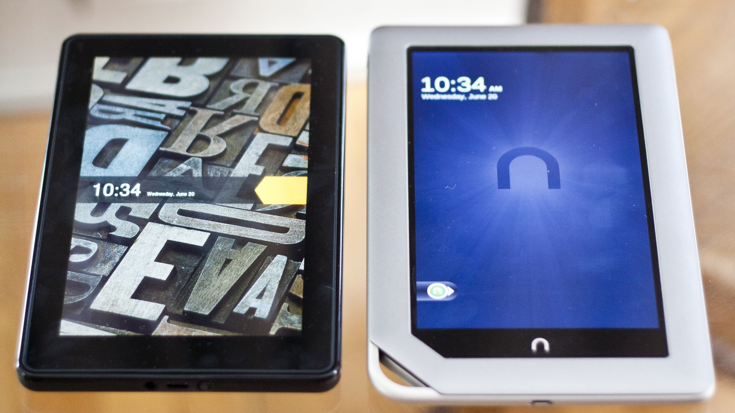
In terms of build and design, the Kindle Fire immediately grabs your attention. It's sleek and compact, with a seven-inch multitouch display surrounded by a crisp black border.
Get daily insight, inspiration and deals in your inbox
Sign up for breaking news, reviews, opinion, top tech deals, and more.
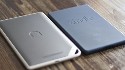
The lightly rubberized back makes the compact tablet easy to hold in one hand, and the device as a whole feels durably built.
Comparatively, the rounded gray plastic exterior of the Nook Tablet feels a bit cheap, and the break between the front border and the back of the device makes it seem less durable, as well.
However, the softer-feeling plastic and even more rubberized backing makes it arguably less taxing to hold for long reading sessions.

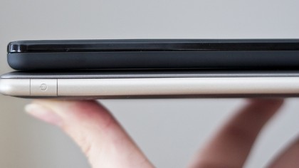
Like the Kindle Fire, Barnes & Noble's tablet offers a seven-inch screen at the same resolution (1024x600) and is rated identically for clarity (169 pixels per inch), though its overall form is notably larger – it's 0.6 inches taller and 0.3 inches wider than Amazon's effort.
Both weigh about the same, with the Kindle Fire listed at 14.6 ounces and the Nook Tablet at just a half-ounce lighter.
The Nook Tablet does have one notable physical advantage over the Kindle Fire, though, and that's the inclusion of physical home and volume buttons.
Both devices include power buttons, but otherwise, touch controls are used on the Kindle Fire to return to the home screen or adjust the volume on the fly – which keeps the device slim and sleek, but can prove awkward in use.
Meanwhile, the Nook Tablet has a lowercase "n" button below the display that lets you go back a screen in an app and eventually return to the home screen, while volume buttons are found on the upper right side of the device.
It's a small usability feature that benefits the Nook, though it comes at the expense of larger and less attractive design.

The Nook Tablet also wins out in battery life, as it's rated for 11.5 hours of reading and 9 hours of video on a single charge, while the Kindle Fire comes up short at 8 hours of reading and 7.5 hours of video.
Additionally, while both tablets ship with 8GB of internal storage at the $199 level, a $249 Nook is available with 16GB of space, and both versions of the Nook Tablet can be expanded with up to 32GB of microSD card storage.
Weighing the options here largely means choosing between form or added function, as the Nook Tablet delivers uninspiring design compared to the Kindle Fire, but delivers physical buttons, better battery life, and expandable storage.
For our money, though, the slimmer and more durable build of the Kindle Fire wins out.