Kindle Fire vs Nook Tablet: which should you buy?
Seeking a budget tablet? We compare and contrast the top options
While the hardware debate will come down to preference for many prospective buyers, the decision on interface is much, much simpler: The Kindle Fire is an absolute breeze to use, while the Nook Tablet proves cumbersome.
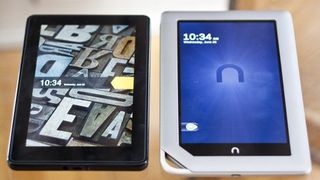
The Lock Screen
Both devices utilize a swipe-to-unlock method, with the screen initially activated on the Kindle Fire by pressing the power button, or on the Nook Tablet by pressing either the power or front home button.
The Kindle Fire impresses by randomly picking from a handful of included photos, like a mess of stylized vinyl records or an up-close shot of typewriter keys, to greet you at the lock screen. Meanwhile, the Nook Tablet simply has a drab logo with the date and time displayed.
It's a minor thing, sure, but it shows an extra bit of style and care that fit with the overall aesthetic of the Kindle Fire.
Getting Around
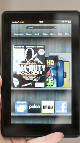
Both tablets run a heavily customized version of Android 2.3 (Gingerbread), and Amazon has clearly put a lot of effort into making it a comfortable fit for such a compact device.
Taking the form of a digital bookcase, complete with a faux-wood backdrop, your latest books, apps, docs, movies, and more are displayed visually in the middle of the screen, and easily browsed via swipe.
Favorites can be marked on the smaller shelves below, plus you'll have finer-grained access to the various types of media from the words (like "Newsstand" and "Video") listed below the search box up top. Tapping a word brings you to that specific page, which also holds the key to Amazon's various storefronts for apps, books, and more.
Get daily insight, inspiration and deals in your inbox
Sign up for breaking news, reviews, opinion, top tech deals, and more.
The Kindle Fire interface is also viewable in landscape orientation.
The Nook Tablet, on the other hand, utilizes a series of portrait-only home screens upon which you can drag and drop favorite icons for apps, books, and more, though you're not limited by a grid – apps and books can overlap or be bunched together. It's more like a computer desktop in this regard.
A stream of your latest downloads appears near the bottom – similar to the Kindle Fire, but in a less-stylized manner. Persistent links to your books, apps, and more are found just below.
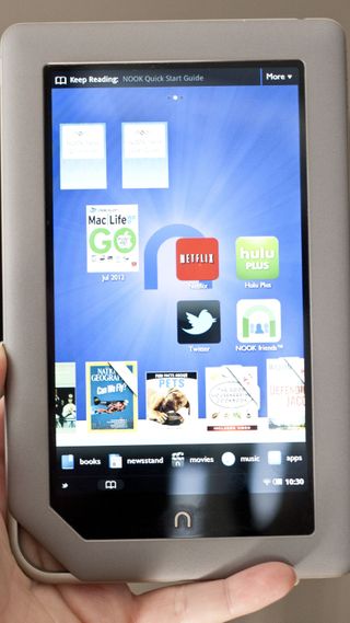
Amazon's tablet seems clearly designed to keep you comfortably moving from screen to screen, with all of your apps and downloads available at an easy tap, plus smartly-designed storefronts that make browsing and buying a joy.
It's really quite simple to get around, and everything looks great as you're flipping around.
On the other hand, the Nook Tablet seems stuck between a traditional Android UI layout and a Kindle-esque streamlined approach, and the results prove clunky and inconsistent.
Finding your way into the app marketplace is awkward in practice, with pop-up menus introducing both owned and suggested downloads, and the actual store delivers very broad categories with no quick way to see the most popular apps. Some occasional jagged text annoys, as well.
Performance is similar on both devices – the Kindle Fire and Nook Tablet get around quickly enough, but not without occasional hitches.
Neither features top-of-the-line innards, after all, considering the price points. But when it comes to using the devices in a day-to-day setting and actually making the most of what each has to offer, the Kindle Fire is easily the winner.

