TechRadar Verdict
It has a few downsides, and it’s up against some heavy hitters in the budget category, but HMD’s reboot of last year’s Nokia 6 is a tasty, thick slice of pure Android goodness.
Pros
- +
Stock Android with guaranteed updates
- +
Durable yet attractive handset
- +
Generous HD screen
Cons
- -
Solo rear camera
- -
Battery just about lasts the day
- -
Audio is a bit disappointing
Why you can trust TechRadar
The Nokia 6.1 is part of the second wave of the new Nokia smartphones, and it's time for the resurgent brand to prove that it can offer more than just a single-hit of nostalgia.
The original Nokia 6 got a strong 4-star review with some caveats - notably the slow charging and average hardware. When the Nokia 6.1 was announced, there was a lot of excitement among Android purists about the updated design, upgraded chipset and addition of fast charging. The price has had a little bump too.
Before we get into whether it’s worth the extra spend, it’s worth mentioning that there’s some confusion around the name of this phone. The company itself calls it ‘the new Nokia 6’ in some places, and ‘Nokia 6.1’ in others, including on the box.
We’ll be using both in this review, but it’s useful to know because the Nokia 6 (2017) is still out there, and you’ll want to double check you’re buying the newer handset before you pull the trigger.
Nokia 6.1 (2018) price and availability
The new Nokia 6.1 price is $269 (£229, RS 16,999 about AU$420), which is slightly more than the launch price of its predecessor ($229, £200, AU$399).
It's available from retailers in the US, UK and India and will be coming to Australia in more regions soon.
Design and display
- Classy aluminum design with eye-catching accent colors
- Generous 1080p screen with glossy finish
- Weighty and not the most comfortable to hold
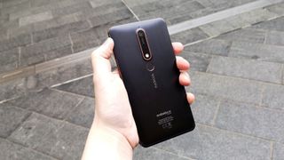
In true Nokia style, the Nokia 6.1 is built like a tank. The 148.8 x 75.8 x 8.6mm (including camera bump) unibody is made from 6000-series aluminum with flat diamond-cut sides, rounded corners and a highlight color on the outlines.
Our review model is the Black/Copper colorway, which is an innovative way to make yet another black rectangle look different - and classier - than its competition.
There’s also a gorgeous deep blue option with gold accents, and White/Iron, which is a pale silver with metallic reddish accents rather than the deep grey you might expect from the name - presumably we’re talking about oxidized iron, aka rust.

Between the all-metal body and the thickness of the handset, this is a weighty piece of tech at 172g and feels reassuringly like it could handle modern life without being cosseted in a case.
That said, after a couple of weeks of use and several drops, we have noticed a few small dings in the edges, so you might want to case it up anyway if you’re a perfectionist about that kind of thing.
Speaking of drops, the Gorilla Glass 3-covered screen is also built to last, sustaining no damage from our butter-finger tendencies (note: not a guarantee).
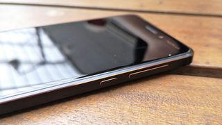
However, with its incredibly glossy, slightly rounded design, it does make the phone liable to fall straight off your desk if you put it face-down. Face-up it’s fine and has plenty of grip, but if you’re one of those people who flips your phone over for meetings, it might be better off in a pocket.
It’ll have to be a big pocket, though: the 5.5-inch screen and relative thickness at 8.6mm means this isn’t one of the sleeker phones on the market.
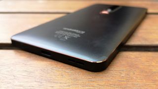
That means it’s not the comfiest to hold in your hand, either: smaller-pawed humans might well find it uncomfortable for long stretches, and it’s ridiculously easy to entirely muffle the solo downward-firing speaker on the bottom left with the heel of your hand.

Assuming you’re on board with the chunky aesthetic, the Nokia 6.1 is an impressively good-looking piece of kit considering its price point.
The anodized back panel includes a long Zeiss-branded camera and flash opening, which protrudes a little. Below that is the fingerprint scanner, also ringed in the accent color, and past that is the sideways silver Nokia logo. That’s it for the back except for the Android One logo.
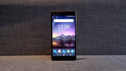
The face of the phone is similarly minimalist, relying on that super-glossy screen and the accent color to stand out, which it absolutely does.
There’s a small Nokia logo on the top right of the fairly large (for 2018) bezel, and there’s a thick black chin below the screen. This serves no obvious purpose as the fingerprint key is on the back and the nav buttons are software, but we can’t ask too much at the budget end of the market.

The left edge holds the SIM tray, there’s a proper headphone jack on the top right of the top edge, accented volume rocker and power key on the right edge, and a centered USB-C charging port on the bottom next to that left-mounted speaker.
Our only complaint about this layout is that it’s quite easy to miss the fingerprint pad by touch and smudge up the flash unit just above it. That said, at least you’re not putting your fingerprints all over the camera lens as with some phones.
You will, however, get your fingerprints all over the glossy screen and the aluminum back panel.
The 5.5-inch 16:9 screen of the Nokia 6.1 in particular is very smudgy, but it’s much less noticeable when the display is powered on.
It’s a lovely-looking screen, bright and sharp, and while of course it can’t compare to the pixel-packed displays of the top-end devices, it does offer a full HD (1080 x 1920, 403ppi) experience in a much less expensive package. As long as you don’t hold it next to a Samsung Galaxy S9, you should be happy.

