10 things to know about the Nexus One Google phone
All the facts on Big G's mobile

Update: read our Hands on: Nexus One review.
The Nexus One is set to launch any day now, and there's a sense of expectation that this might be the handset to lay the smackdown to the iPhone.
But will it be the slayer all the Apple-haters have been praying for... or is it just going to be another Android mobile phone that's a bit thinner than the others?
1. Larger than life
The first thing that most will note on the new Nexus One is the large screen - 3.7 inches of it to be exact. It's not as large as the behemothic 4.3-inch screen on the HTC HD2, which is both fantastically large and far too big at the same time, but the version on the Nexus One is large enough to allow easy video and web viewing, and the WVGA resolution means things look pin sharp.
2. All about the OLED
Apart from being a huge display, the Nexus One's screen is also an OLED, rather than LCD. Not only does this allow the device to be thinner but also have better colour reproduction too.
Get daily insight, inspiration and deals in your inbox
Sign up for breaking news, reviews, opinion, top tech deals, and more.

This means that blacks look blacker, reds look redder and whites are much cleaner and crisper - although this might be a shock to some people who are used to washed out colours on LCD, but some videos can look stunning on the OLED screen and Google is keen to take advantage of that.
3. Snappy fast
The Nexus One uses a Snapdragon processor from Qualcomm, kicking along at 1GHz, making things zip along nicely.
This skill might not be that much use for some elements of the phone, but when it comes to the Gallery (loading a number of pics), lists (think email) or the web (just general browsing) it can eradicate that stupid wait we're forced to endure when trying to load up content.
4. Finding Flan
All the hype about Motorola's Milestone and Google's Android 2.0/Éclair is over already - it's all about the next generation: Android 2.1 or Flan to its friends.
But the problem is people were expecting the version of Android on the Nexus One to be the ultimate rendition - in honesty it's just an incremental upgrade from the 2.0 release, with two more home screens adding the available space on the main display being one of the highlights (unless you count animated wallpapers... which we don't).
5. Ditching tabs

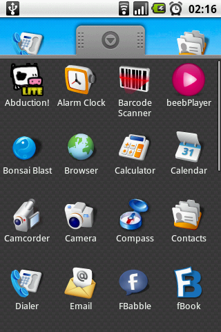
But one thing that has been overhauled in the Nexus One is the menu system - gone is the pull-up tab to open the menu on the home screen; instead there's a multi-dotted system to jump to a new menu layout.
It's not hugely different to the system Android fans are used to now, but it does add that element of sheen to proceedings that the iPhone had nailed, and the kind of thing someone with no idea about touchscreen phones would find really cool when picking up the Nexus One for the first time.
- 1
- 2
Current page: 1-5: Displays, speed and desserts
Next Page 6-10: Better camera, slimmer frame and media
Gareth has been part of the consumer technology world in a career spanning three decades. He started life as a staff writer on the fledgling TechRadar, and has grew with the site (primarily as phones, tablets and wearables editor) until becoming Global Editor in Chief in 2018. Gareth has written over 4,000 articles for TechRadar, has contributed expert insight to a number of other publications, chaired panels on zeitgeist technologies, presented at the Gadget Show Live as well as representing the brand on TV and radio for multiple channels including Sky, BBC, ITV and Al-Jazeera. Passionate about fitness, he can bore anyone rigid about stress management, sleep tracking, heart rate variance as well as bemoaning something about the latest iPhone, Galaxy or OLED TV.