5 Samsung TouchWiz features that should be in stock Android
Gaming, snapping, disabling and more
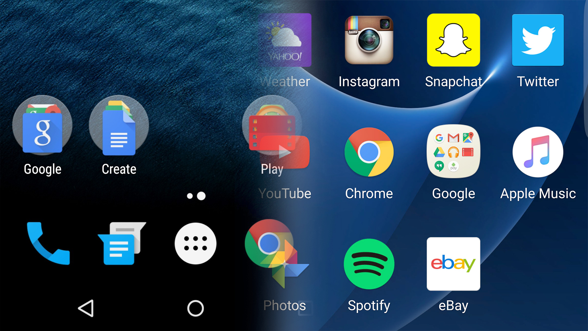
TouchWiz is Samsung's custom take on Android. For years it was something you just had to live with: packed full of features but a total mess.
But you know what? These days it's actually pretty good. It's among the best-looking Android interfaces outside of a stock Marshmallow install, and by paring back some of the extras only 0.1 per cent of people used, Samsung has actually managed to come up with some bonus bits we really like.
2016 is a good year for TouchWiz, and some its features are brand new, not seen before the Samsung Galaxy S7 and Samsung Galaxy S7 Edge arrived. Here are the TouchWiz features we'd like to see Google bung into Android Nougat - or whatever Android O is called.
1. Always-on display
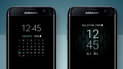
The latest version of TouchWiz has an always-on display mode. And it's pretty neat.
You want to keep your phone on all the time? Won't that mean the battery will be dead before you've even had a chance to complain about your train home being cancelled on Twitter? It actually only has a minimal effect on stamina.
TouchWiz's always-on screen is here to give you a time read-out even when you haven't used the phone in a couple of hours. This isn't the first time a phone company has glued a feature like this onto Android... far from it.
Motorola has used it a bunch of times in its Moto phones, and even before then Nokia made great use of it in Windows phones.
Get daily insight, inspiration and deals in your inbox
Sign up for breaking news, reviews, opinion, top tech deals, and more.
It's probably not something that'll be the deal breaker when you're going to buy a phone, but every time we end up using one of these always-on troopers, they make a much better desk buddy than a regular old phone. This is one of TouchWiz's newest features too, having only arrived with the S7 family and now used on the Samsung Galaxy Note 7.
All it does is to display the time, date, battery life and an icon or two if you have any notifications, in white on a black background. This is a Samsung feature, so it's no surprise you can customise it pretty thoroughly too - and with the Note 7, this includes some pretty fancy space constellation pictures.
The only complication is that unless you have an OLED screen or a seriously efficient LCD one, it may eat a chunk out of the phone's run-time. As OLEDs have emissive pixels, only a tiny part of the display has to be powered - but we reckon Google could make this work.
2. Recording of your super-sweet gaming victories
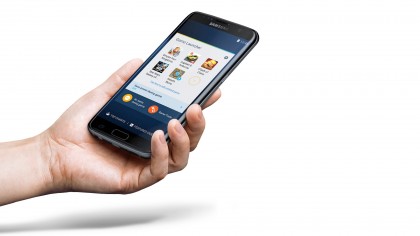
The new TouchWiz feature all the nerds are talking about is Game Launcher. Our general opinion on even good third-party software extras is usually "yep it's fine, but I'd still trade it for vanilla Android", but Game Launcher has had a good stab at changing that.
It's Samsung's nod to the idea that the one thing just about everyone seems to do on their phone is use Facebook and play casual games. Far more people we know do that than make calls these days.
This smart feature puts all the games you install into one neat folder, and lets you do all sorts of clever stuff while you're playing. The one that grabs attention was recording of your mobile game footage. You're probably no YouTube star, but this is a feature that could open up a whole new generation of 'Let's Play' mobile game channels.
Whether that's a good thing or not is up for debate. If you're not an online video obsessive, this is where someone plays through and commentates on a game, often with hilarious results.
Other more practical features of Game Launcher include being able to manually select the game resolution and refresh rate to save battery, and locking your soft keys so you don't boot yourself out of a game in a frantic moment of screen-tapping.
3. Camera app
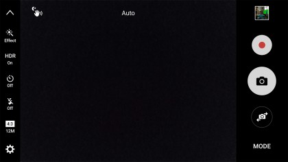
Perhaps the single weakest part of the vanilla Android experience is the camera app. It's fine but nothing more, when the rest of the OS is flat-out great at this point.
Samsung's Galaxy S7 camera app is a lot better. Right out of the gate, it just gives you a very simple and clear Auto interface. Just snap away and you'll be able to get some great shots with no effort.
There are several layers to this appy onion, though. More advanced settings are put at your thumb-tips and the further you dig the more modes and settings you'll find.
Samsung's camera app used to be a bit of a frustrating mess of extra modes that were given way too much of the spotlight. But after a few years of people like us and you complaining, Samsung sorted its game out.
Now it has one of the best Android camera apps out there. As well as being fast and offering super-effective HDR shots, there's manual control and RAW capture. This offers data-rich photos before the phone's processing has put its mark on them, giving you total control - whether that could be baked into all phones though remains to be seen.
4. Disabling of apps
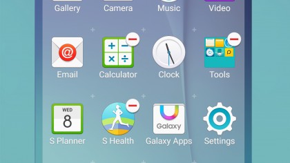
Android Nougat does its best to simplify the basics of its interface. However, that means you don't get an awful lot of control over how it looks.
One thing TouchWiz lets you do that a lot of other interfaces don't is to effectively uninstall any app on the phone, even ones in the core Google line-up you're not usually allowed to touch. It does this by blasting them from the apps menu without actually removing the app data. It's a cunning 'loophole' of sorts.
Previously Samsung used to let you both hide and 'disable' apps, but in the latest version of TouchWiz you can only do the latter.
You might argue that we should be able to fully uninstall any app we like, but then preinstalled apps are generally pretty diddy little things memory-wise anyway. What disabling apps lets you do is really cut back all that app bloat without going to the time-consuming, potentially warranty-voiding, effort of installing a custom ROM on your phone.
The key difference here is that while you've been able to disable apps from Android for a while, hiding them away has always been a bit trickier - so let's make it as simple as TouchWiz.
5. Switching the apps grid layout
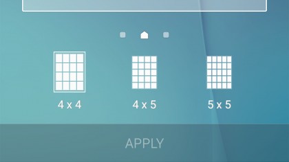
Android looks and feels good, which is why so many people hanker for its simplicity. It's almost been a decade since Android was born, and only now has it really nailed down totally accessible visuals with a snappy-but-smooth feel. With that has come complete rigidity in its layout, though.
Conversely, TouchWiz lets you choose between having four rows of apps on the screen and five, letting you cram in more visual information than a Nexus device. You could achieve the same thing on your stock Android device now if you install a launcher - a skin that sits upon the system and allows you to tweak all manner of things - but for those that like to keep it simple, we'd like to see this by default.
This comes in particularly handy on phones with 5.5-inch screens or larger, where a 4-icon width style just means a lot of wasted space. And app icons that wouldn't look out of place on a tablet designed for kids.
Most phones above £200/US$300/AU$400 easily have enough pixels to squeeze in those extra elements without leaving slightly smaller icons looking remotely blocky.
Update: We've made some changes to outline what kind of disabling of apps we mean, and pointed out the options of stock launchers if you want some of these features right now. Thanks to our commenters for adding in their thoughts - let us know if you want to see anything too!
- There's a lot to like in iOS 10 as well
Andrew is a freelance journalist and has been writing and editing for some of the UK's top tech and lifestyle publications including TrustedReviews, Stuff, T3, TechRadar, Lifehacker and others.
