Forget the iPhone 6S - this is what the iPhone 7 should look like
What will the next iPhone actually look like?
Introduction
Apple's iPhone 6S and iPhone 6S Plus are official and both look quite similar to the iPhone 6 and iPhone 6 Plus respectively
Traditionally the company goes a completely different direction when it jumps up a number, meaning the iPhone 7 is set to be a drastic overhaul of the whole phone.
That gives people coming up with concept ideas a free reign and can be really inventive of what we'd like to see on a new iPhone – sometimes even more so than Apple itself.
We've put together some of our favourite concepts showing what we'd love to see from the iPhone 7 and even beyond.
The techradar edition
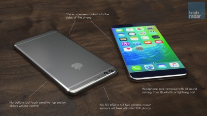
We went and turned our hand to design our own dream iPhone 7 and it looks pretty great, even if we say so ourselves. Forget about bezels, those thick lines around the side of the handset have given up the ghost and the screen now reaches the sides of the phone and looks gorgeous.
This time there's no buttons on the sides either. Instead, there's a touch sensitive section on the side that controls the volume of the phone.
There's no headphone jack this time around so you'll have to connect up with Bluetooth headphones and the camera even takes the ultimate HDR photos with two variable colours sensors.
Full screen madness
The iPhone 6 features a 4.7-inch screen but still manages to be the size of other phones on the market, it's all down to the wasted space around the screen.
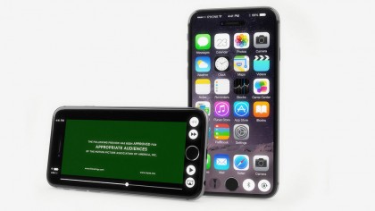
Designer Martin Hajek believes that's not right and his idea of the iPhone 7 loses those bezels for a full size screen on the front of the phone.
There's still the trusty home button along the bottom of the screen with some options sat there such as bluetooth and the torch app. We think they might get a little in the way when trying to use the phone but it's likely you'll be able to turn those off.
Forget the bezels
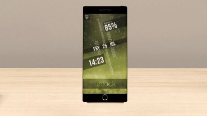
One of the earliest iPhone 7 concepts came before the iPhone 6 was even announced, and once again it has called for an edge-to-edge display. It seems people really want to see those bezels die and we have to admit it this idea from SET Solutions looks beautiful here.
Imagine how cool you'd look with this futuristic piece of tech sat in your palm. On this concept the iconic black rims along the top and bottom of the phone are still present with the hardware button sat on the bottom in the middle as per usual.
All in all, the square corners make this look a little like it's influenced by the Sony Xperia design, but we all know Apple wouldn't ever do that. It's unlikely to look like this but it's just more evidence people want to see an edge-to-edge screen.

Bent screen tech
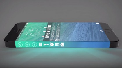
Samsung is currently the real purveyor of the innovative edges with the Galaxy S6 Edge and Galaxy S6 Edge+. ConceptsiPhone on YouTube seem to believe the new phone may come with the same kind of technology, but at a sharper angle than we've seen on the Samsung phones.
Along the side will sit the options such as setting an alarm and toggling the volume. The screens sit flush to the side though with no break from the screen to the side.
Samsung has been praised for its innovative new tech so it wouldn't be a big surprise for Apple to follow suit and try to one up the company.
How about an iPhone Edition?
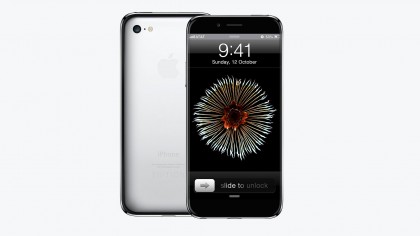
Ever wanted an even posher version of the original iPhone? Russian designer Grisha Serov has come up with the concept of an Edition version of the iPhone that looks a lot more like the iPhone 3GS rather than the iPhone 6.
Once again it's an edge-to-edge display but those thick black bezels are still there to house the front facing speakers.
The button is back to the top of the phone on this concept but it does more than ever before housing the Touch ID sensor as well as waking up the phone and sending it back to the Home menu. That means there's extra space along the bottom of the phone.
Full metal iPhone?
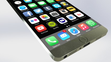
Finally, edge-to-edge is in full force again on this idea from Jan-Willem Reusink, but this time metal is the big focus as well. The whole phone will be made out of solid metal according to this concept, and it's looking pretty thin as well with a huge display.
The main home button has been turned into the apple logo itself and there are speakers sat along the bottom edge with the headphone jack and lightning port there as well.
Our main concern with this concept is signal – how are the radio waves going to make it into the phone if it's all metal? That's a problem for Apple to solve though.

James is the Editor-in-Chief at Android Police. Previously, he was Senior Phones Editor for TechRadar, and he has covered smartphones and the mobile space for the best part of a decade bringing you news on all the big announcements from top manufacturers making mobile phones and other portable gadgets. James is often testing out and reviewing the latest and greatest mobile phones, smartwatches, tablets, virtual reality headsets, fitness trackers and more. He once fell over.