From iPhone OS to iOS 8: just how has Apple's mobile platform changed?
Did you even remember it was called iPhone OS?

iOS is the smartphone platform that, some argue, started it all, and with iOS 8 arriving very soon, it's easy to forget where it all began. Although it was only 2007, the launch of the Apple iPhone and its nascent iPhone OS seems millennia ago.
With that in mind, we decided to dig deeper and take a trip down a grid-based memory lane, so here's our look at the software side of Apple's mobile revolution.
iPhone OS

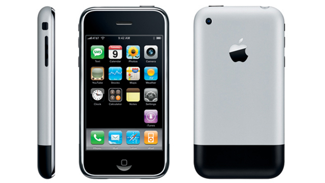
You remember the iPhone right? Not the one with the Retina screen that's all the rage on public transport, but the one that started it all nearly six years ago.
The mobile market has never looked the same since WWDC 2007. The leader at that time, BlackBerry, is now struggling, and nigh on every smartphone adorned with a massive touchscreen. Powering the first iPhone was Apple's iPhone OS, a touch-optimised version of OS X.
With its black background and App grid, the iOS platform was pretty bland. However, it had multi-touch capabilities, and it carried a mobile-ised version of Safari, the precursor to the mobile versions of Chrome, IE and FireFox, albeit without Flash (something that has remained omitted to this day).
These elements might have seemed small, but a great touch-based interface and strong web browser were killer features.
iPhone OS 2

The next major iteration of iOS came along with the iPhone 3G, the second version of the iPhone. Whilst there were some notable hardware upgrades, such as 3G support, people began to realise that the big difference was the software.
Get daily insight, inspiration and deals in your inbox
Sign up for breaking news, reviews, opinion, top tech deals, and more.
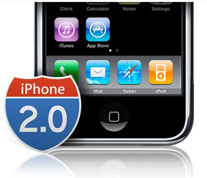
The iPhone 2.0 software gave birth to the App Store, housing what has become the staple of the smartphone diet: apps.
True third party apps could be created and distributed easily, with a whopping 500 applications at launch. Apps could even be downloaded directly to the iPhone, skipping iTunes if you wanted.
For many users, the other major update to iPhone OS 2 was nothing to get excited about, but don't underestimate its importance.
It pushed Apple's devices towards the business market as Microsoft Exchange came built in, alongside Cisco IPSec VPN and WPA2 Enterprise support, opening up a whole new revenue stream for the brand.
iPhone OS 3

Again, the next iteration of Apple's mobile OS was launched with a phone, the iPhone 3GS.
Once more there were big features that now seem commonplace in both the mobile and iOS markets, such as landscape typing now available in third party apps.
The first really big update came in the form of Spotlight, that search page to the far left of your home screens, allowing you to search through contacts, Mail and Calendar apps.
The other major update was copy and paste, something that has been on desktops for as long as we can remember. (Apple, incidentally, was the company to bring it to the fore on the Lisa and Macintosh systems of the early 80s.) Text and even imagery could be copied across, and placed in the upgraded Messages app, meaning the iPhone finally packed MMS support.
iOS 4

Cue 2010 and a refresh of name. Unhappy with dominating just the mobile market, Apple spied the next big thing in the form of the tablet.
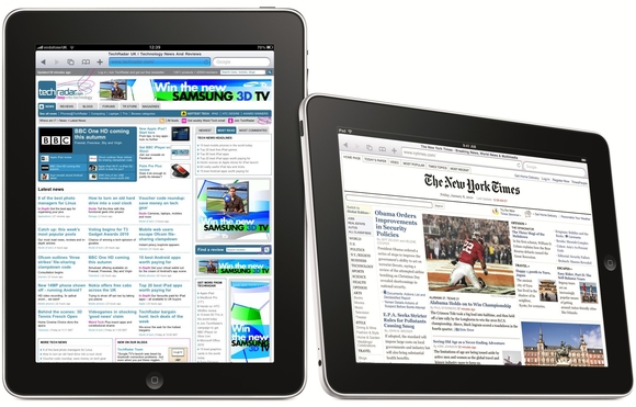
With many writing it off as a large iPod, the iPad took the world by storm. Yes, the original shipped with iPhone OS 3.2, but it meant that iOS was no longer locked to small displays, making it across to the 9.7-inch screen.
So what did iOS4 bring to the iPad, and the newly launched iPhone 4? Wallpapers would be the first thing to change: the dull bland black background was replaced, and customisable lock screen wallpapers arrived as well. iBooks made its first appearance, optimised to turn the iPad into an eReader.
Video calling also popped over in the form of FaceTime, although limited only to Wi-Fi connections. The new decade did herald two other new features to iOS, and they were big features: multi-tasking and folders.
A double tap of the home button allowed access to the strictly controlled multi-tasking bar along the bottom for easy switching between your apps, meaning navigating iOS became easier, and battery life got longer. Win win.
A folder system was also implemented, and to this day many can't see its integration ever being beaten (although it's often copied).
Dragging and dropping icons onto each other meant you could hide away system apps, and group your games together. We're sticklers for neatness, so we don't know where we'd be without folders.