Hands on: Nokia N9 review
Getting down and dirty with the first MeeGo phone
The MeeGo 1.2 iteration on the Nokia N9 is a real departure from the maddening confusion of Symbian, with the 1GHz ARM Cortex-A8 OMAP 3630 processor, PowerVR SGX530 graphics and 1GB of RAM all working together to deliver a fluid response under the finger.

We received huge criticism from Symbian lovers for our negativity towards the touch response on the Nokia N8 when it was released, despite the fact it took a beat or two for the phone to respond to gestures on the home screen.
But THIS is how a phone is supposed to work, with a rapid response to swiping and movement. Symbian Anna had better be as good, else we'll be very disappointed in Nokia.
Entering the phone can either be started by hitting the power key or double tapping on the screen, and a simple swipe of the lock screen to open the phone. A neat touch: swiping up a centimetre or two to get access to four often used applications, such as the internet browser or camera.
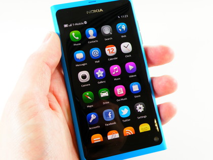
The main system is as follows (try to keep up): the 'centre' home screen has a long list of application icons to scroll through, and will just get longer as you start downloading more from the Ovi Store.

Speaking of which, Nokia won't give us any indication how many MeeGo apps there will be available at launch - although it's apparently very easy to port the Symbian versions over, thanks to both being based on QT.
It really depends on HOW easy it will be to port though - as given there's likely to be very few phones on the market that run MeeGo, it's going to have to be as simple as ticking a box for developers to want to bring their apps to the new platform.
Get daily insight, inspiration and deals in your inbox
Sign up for breaking news, reviews, opinion, top tech deals, and more.
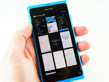
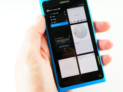
Back to the home screens: if you swipe right from the list of apps, you get to the multi-tasking pane. This is a grid of either four or nine tiles (selecting by pinching and zooming) of your most recent applications and you can scroll down the list to see all the ones you've got open.

A long press will allow you to shut down the unwanted applications, and also gives the option to close them all down if you fancy saving the 1450mAh battery, which given Nokia's penchant for power management should last pretty well indeed.

Swiping left from the main app list will bring up the notifications list - this is basically a mash of all missed messages or phone calls, as well as Facebook and Twitter updates in one long view.
This annoyingly wasn't working on our prototype model, but we'll be interested to see if this is actually an intuitive system or a noisy muddle of Twitter updates with the odd SMS thrown in for good measure.
Current page: Hands on: Nokia N9 review
Prev Page Hands on: Nokia N9 review Next Page Hands on: Nokia N9 review
Gareth has been part of the consumer technology world in a career spanning three decades. He started life as a staff writer on the fledgling TechRadar, and has grew with the site (primarily as phones, tablets and wearables editor) until becoming Global Editor in Chief in 2018. Gareth has written over 4,000 articles for TechRadar, has contributed expert insight to a number of other publications, chaired panels on zeitgeist technologies, presented at the Gadget Show Live as well as representing the brand on TV and radio for multiple channels including Sky, BBC, ITV and Al-Jazeera. Passionate about fitness, he can bore anyone rigid about stress management, sleep tracking, heart rate variance as well as bemoaning something about the latest iPhone, Galaxy or OLED TV.