Hands on: Sagem Puma Phone review
Budget phone powered by the sun - and a big cat
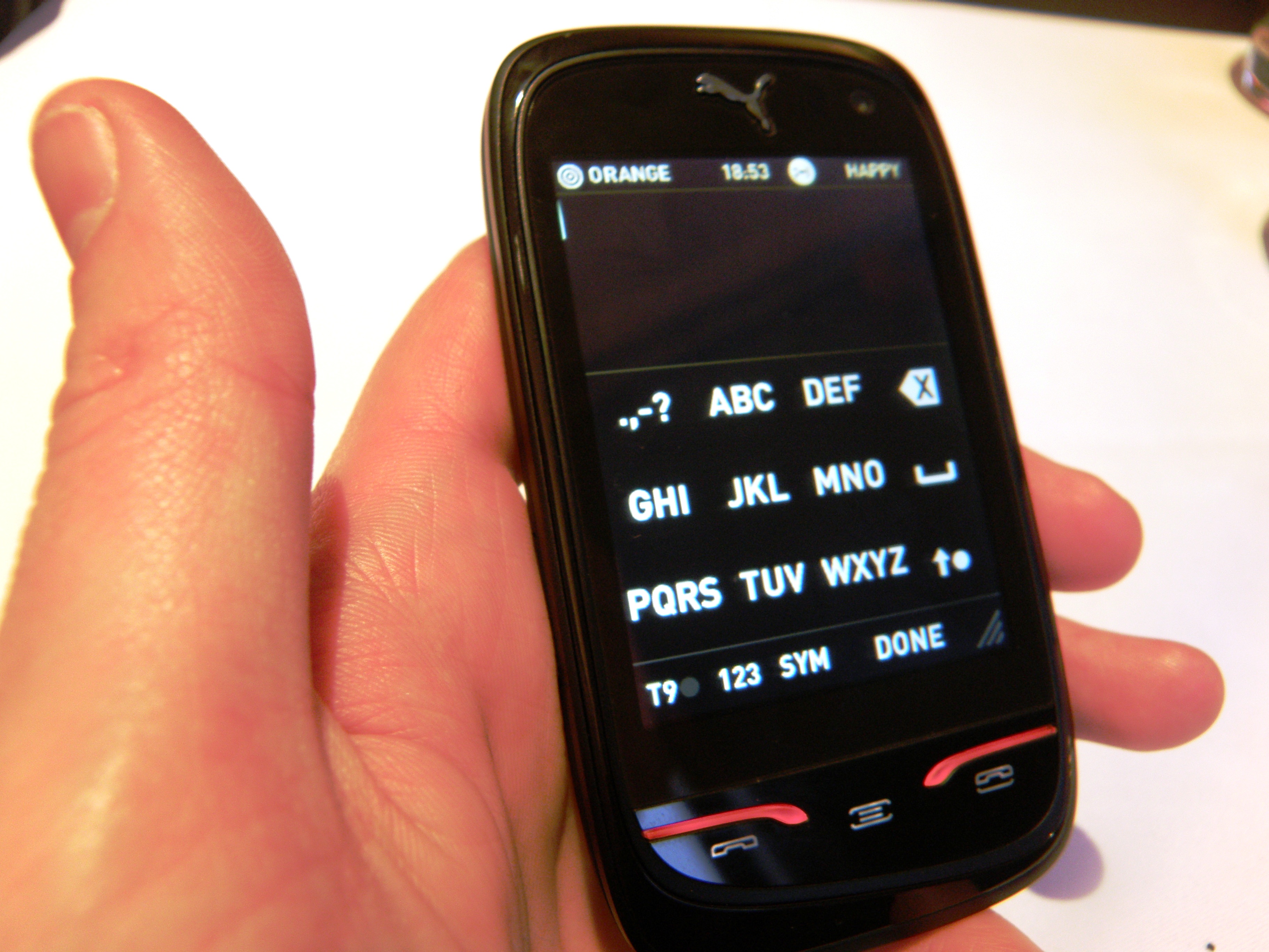
We recently managed to snag some quality time with the soon-to-be-released Puma Phone to see if sports branding could actually co-exist with a decent handset.
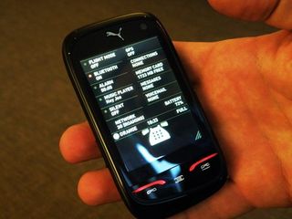
The first thing we noticed about this phone is that it actually seems pretty well put together - a compact handset that sits nicely in the palm.
The polished black plastic doesn't feel too cheap (although we're not sure it matches the mooted £300 price tag) and we like the styling of the three simple buttons on the front with red finish.
There's a 2.8-inch resistive QVGA screen on the front, which again is a little low budget for our tastes, and does suffer from accuracy issues at times.
On the back we see some pretty cool extras - a 3.2MP camera with LED flash and a solar panel to help keep the battery topped up.
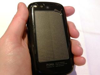
Sadly, it's not able to keep the phone fully charged (especially not in the UK with our seven seconds of sunshine per year), and is to be used more as a back up, but it's still a nice and eco-friendly addition.
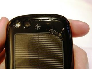
There's a microUSB slot as well as a microSD card port on the phone, and a forward-facing VGA camera for video conferencing.
Get daily insight, inspiration and deals in your inbox
Sign up for breaking news, reviews, opinion, top tech deals, and more.
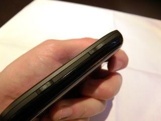
But it's not the hardware that's the major selling point on the Puma Phone, it's more about the quirky firmware and UI underneath.
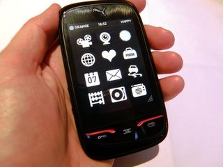
The main premise is pretty simple - one screen at the centre offers links to user-defined shortcuts, to the left is the 'sportier' style things like run tracking and to the right holds the more obvious phone functions like multimedia and the browser.
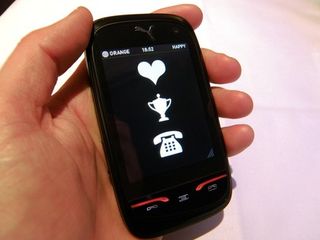
The UI runs pretty smoothly under the finger - it suffers from the slight 'resistive screen' lag that pervades all phones but generally swiping left and right is an acceptable experience.
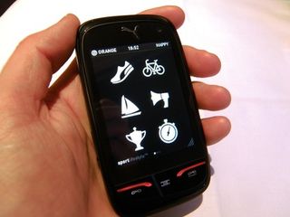
Pressing icons is nice and accurate as well - you once again have to be pretty forceful, but at least the pressure you need to exert is consistent throughout.

We like the little triangle in the bottom right-hand corner of the screen, which when 'pulled up/scrolled back' will open a contextual menu of options to play with.
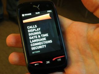
You can also pull down the top of the screen to reveal a whole bunch of new information - from memory card space to music to Bluetooth connectivity.

Gareth has been part of the consumer technology world in a career spanning three decades. He started life as a staff writer on the fledgling TechRadar, and has grew with the site (primarily as phones, tablets and wearables editor) until becoming Global Editor in Chief in 2018. Gareth has written over 4,000 articles for TechRadar, has contributed expert insight to a number of other publications, chaired panels on zeitgeist technologies, presented at the Gadget Show Live as well as representing the brand on TV and radio for multiple channels including Sky, BBC, ITV and Al-Jazeera. Passionate about fitness, he can bore anyone rigid about stress management, sleep tracking, heart rate variance as well as bemoaning something about the latest iPhone, Galaxy or OLED TV.
