Hands on: Sony Ericsson Xperia Pro review
QWERTY-toting Android 2.3 handset put through its paces
Interface
The Xperia Pro has a very similar feel to the Neo and Play, thanks to the combination of Android OS and Sony Ericsson's proprietary Timescape overlay. It's been improved since earlier iterations, though, and the experience is much more enjoyable, making good use of widgets for things like the media player.
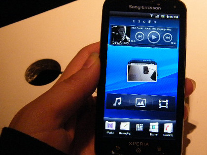
The other great thing about Timelapse on the new school of Xperias is that it's no longer locked into the Android OS, rather it sits on top, which makes updating the handsets to newer versions of Android much quicker and less painful than before (Sony Ericsson Xperia X10 owners will particularly appreciate this!).
The touchscreen itself is capacitive, but does require a little bit of firmness when swiping between Home screens.
The on-screen keyboard is Sony Ericsson's own, like that of the Neo, and as such it's not quite as good as the native Android one. But it's not one you'll have to make too much use of with a physical QWERTY on board.
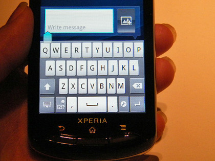
The QWERTY is nicely spaced, and it's not too encumbered by the outer barrier, a problem we've found with other Android sliders, such as the Motorola Milestone.
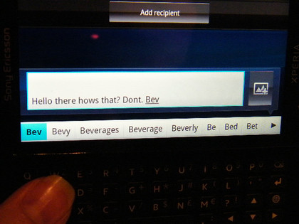
The text predictor isn't bad, but tapping the option you want is a bit of a reach when you're using the QWERTY; if you're a fast typer then you'd probably be quicker just tapping the whole word out.
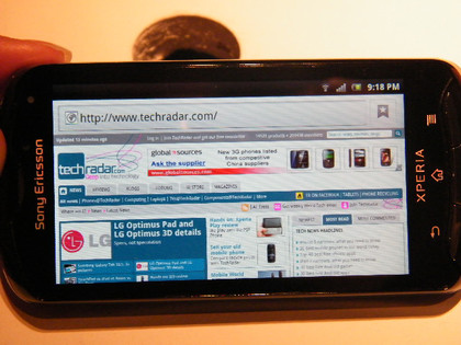
The screen is an adequate size to display a nice overview of a web page when you browse the internet in landscape mode; portrait squashes it up too much to really be able to see anything useful. You'll still need to zoom in to read anything in detail, however. Thankfully, the pinch-to-zoom action is fairly smooth and quick to render.
Get daily insight, inspiration and deals in your inbox
Sign up for breaking news, reviews, opinion, top tech deals, and more.
When it comes to taking pictures, you'd expect the cousin of the Vivaz to be pretty good, and you'd be right. With an eight-megapixel sensor and Sony's Exmoor on board, it's a painless experience and the shutter button makes physically taking the photo much easier than having to tap the screen (although this is an option).
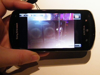
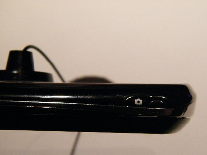
The only annoyance about the camera button is that it's actually just next to the camera icon on the side of the handset, which takes a bit of getting used to.
All in all, the Xperia Pro is not a bad little handset, right up there with the HTC Desire Z in terms of physical QWERTY Androids; we look forward to bringing you our full verdict in the complete TechRadar's full Xperia Pro review in the coming weeks.
- 1
- 2
Current page: Hands-on: Sony Ericsson Xperia Pro review: Interface
Prev Page Hands-on: Sony Ericsson Xperia Pro review: OverviewFormer UK News Editor for TechRadar, it was a perpetual challenge among the TechRadar staff to send Kate (Twitter, Google+) a link to something interesting on the internet that she hasn't already seen. As TechRadar's News Editor (UK), she was constantly on the hunt for top news and intriguing stories to feed your gadget lust. Kate now enjoys life as a renowned music critic – her words can be found in the i Paper, Guardian, GQ, Metro, Evening Standard and Time Out, and she's also the author of 'Amy Winehouse', a biography of the soul star.