HTC 10 vs HTC One M9
A new year, a new number, but what else has changed?
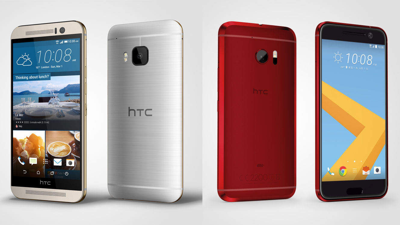
The HTC One M9 was a great phone, but it had its issues and put an end to HTC's five-star review streak. So it was clear that HTC needed to go back to the drawing board with the HTC 10.
That's exactly what the company's done, dropping the 'One' from the name and adding a whole bunch of new and improved features. A lot's been changed, from the design, to the specs and interface.
The good news is that most of it seems to be for the better, but is it enough of an improvement? Check out our full comparison and judge for yourself.
- Read our hands on: HTC 10 review
Design
HTC has always impressed from a design perspective and neither of these phones are any exception. The HTC One M9 perfects what the company started with the HTC One (M7).
It has a premium metal unibody, with a comfortably curved back and, in some colours, a two-tone scheme, where the edges are in a different shade to the rest of the phone.
The HTC 10 is broadly similar, with a metal unibody of its own, but it's slimmer, slightly less rounded and gets rid of the ugly black bar below the screen that's long plagued HTC's handsets.
It can be seen as a blend of the HTC One M9 and the HTC One A9. Is it better? That's subjective, but it's just as high-end.
Get daily insight, inspiration and deals in your inbox
Sign up for breaking news, reviews, opinion, top tech deals, and more.
Display
It's all change on the screen. Where the HTC One M9 has a 5-inch 1080 x 1920 display with a pixel density of 441 pixels per inch, the HTC 10 has a 5.2-inch 1440 x 2560 screen with a pixel density of 564 pixels per inch.
So the screen on the HTC 10 is an upgrade in both size and resolution, which it kind of needed to be, since most rivals are now packing comparable screens.
Not only is it sharper, but HTC promises that it's both 30% more colourful and 50% more responsive than the M9's display, so it should be a substantial improvement.

OS and interface
The HTC 10 is launching with Android Marshmallow on board. That gives it a short-term advantage over the HTC One M9, which is currently rocking Android Lollipop, but with a Marshmallow update in the works.
However, HTC's also improved its Sense overlay for the 10, minimising the number of pre-installed apps and bloat as well as allowing you to place widgets and stickers anywhere you want, rather than forcing them into a grid shape. You can even layer them, giving you more control over your home screen than the HTC One M9 offers.
The HTC 10 also adds a fingerprint scanner into the mix, which can be used to secure the phone and is sorely lacking from the M9.
Other than that the core experience is a lot like what you'll find on the HTC One M9, complete with HTC Themes, which lets you change the sound effects, icons and colour scheme of the interface on both phones.

Power and storage
HTC has packed a quad-core Snapdragon 820 chip and 4GB of RAM into the HTC 10. That's the same as you'll find in the LG G5 and some versions of the Samsung Galaxy S7, so it's a competitive amount of power.
It's also a substantial upgrade on the HTC One M9, which has an octa-core Snapdragon 810 processor and 3GB of RAM. That still leaves the M9 with a lot of power and in general use you probably won't notice much difference right now, but the M10 should have the power to still be speedy a year from now.
Storage comes in at 32GB or 64GB on the HTC 10, while the HTC One M9 comes in just one size - 32GB. But both phones also have a microSD card slot.
James is a freelance phones, tablets and wearables writer and sub-editor at TechRadar. He has a love for everything ‘smart’, from watches to lights, and can often be found arguing with AI assistants or drowning in the latest apps. James also contributes to 3G.co.uk, 4G.co.uk and 5G.co.uk and has written for T3, Digital Camera World, Clarity Media and others, with work on the web, in print and on TV.
Most Popular


