HTC going back to basics with Sense 4.0
Admits previous version was too complicated

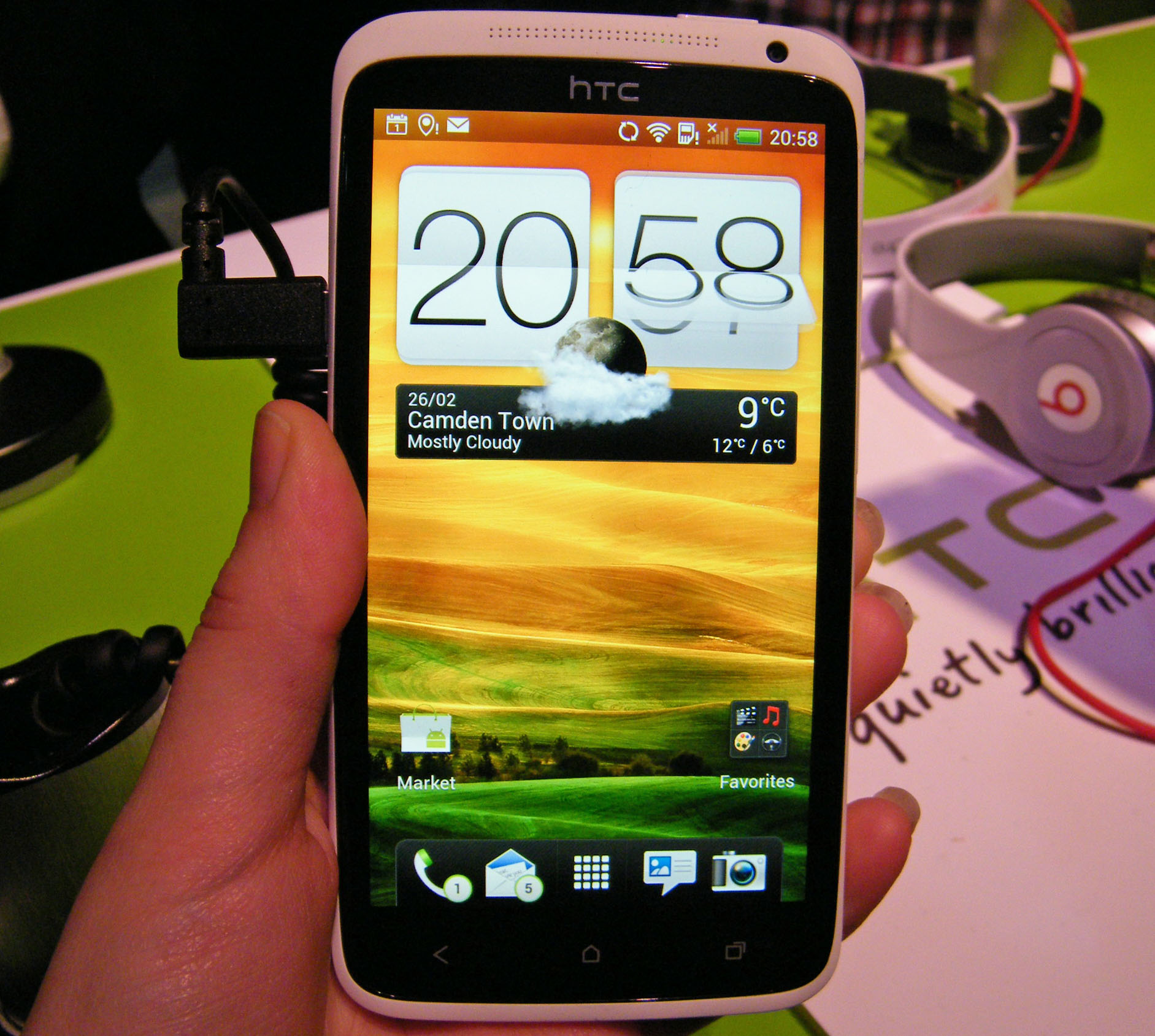
HTC has stripped down its UI overlay for Android in its latest version Sense 4.0, after it admitted that the previous version had become too cluttered.
Alongside its new Ice Cream Sandwich toting phones the One X,
and
, HTC also announced Sense 4.0 at
Get daily insight, inspiration and deals in your inbox
Sign up for breaking news, reviews, opinion, top tech deals, and more.
which features on the new handsets and aims to provide a simpler user experience.
Speaking to Pocket Lint in Barcelona Kouji Kodera, HTC's chief product officer, said: "From the original Sense up to Sense 3.5 we added too many things. The original concept was that it had to be simple and it had to be easy to use and we had that philosophy, but over time it got cluttered"
Easy-peasy, lemon squeezy
Kodera explained just how messy the Sense UI had become: "even on the home screen we had four or five icons before consumers got a chance to add things themselves. For the HTC One range we have taken it down to Sense 2.0 again."
Now don't panic, Sense 4.0 is not just a port of Sense 2.0, but it inherits the simpler and more refined ethos which was the essence of the Sense UI in the beginning.
HTC looks well set to have a strong year in the mobile market with its three new handsets and refresh of its popular Sense user interface. Get the full low-down on HTC's latest UI in our hands on: Sense 4.0 review.
From Pocket Lint

TechRadar's former Global Managing Editor, John has been a technology journalist for more than a decade, and over the years has built up a vast knowledge of the tech industry. He’s interviewed CEOs from some of the world’s biggest tech firms, visited their HQs, and appeared on live TV and radio, including Sky News, BBC News, BBC World News, Al Jazeera, LBC, and BBC Radio 4.