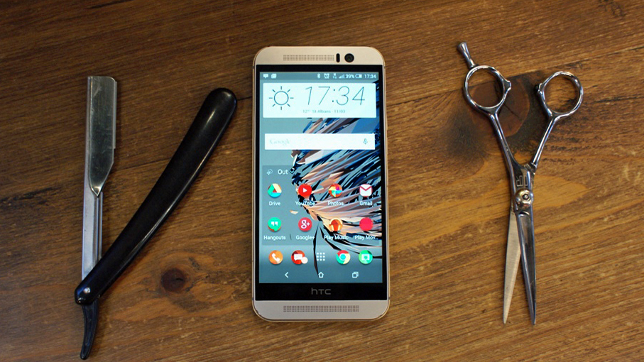
TechRadar Verdict
A great phone if you're upgrading from two years ago, but doesn't deliver enough changes to be worthy of a perfect score.
Pros
- +
Premium design
- +
Strong camera
Cons
- -
Pricey
- -
Battery not good enough
- -
Too few improvements from M8
Why you can trust TechRadar
The HTC One M9 is a phone built on precision. It's a brand realising it made a pretty much perfect phone with the One M8 and doubling down on its greatest strength to try and win over more customers.
It's dropped the maligned 4MP Ultrapixel sensor of its predecessor, bumping it up to a huge 20.7MP option in a bid to attract those that feel safer buying a phone with higher numbers on the spec sheet.
And it's tied off the experience with a huge boost in the engine room and teamed up with Dolby to refine its already powerful BoomSound experience.
Even the battery capacity is improved, something HTC has struggled with in the past. It even beats the biggest rival of its time, the Samsung Galaxy S6, on that particular front. So has the Taiwanese brand managed to do the almost impossible and create yet another perfect device?
It certainly charged for it at launch: In the UK the HTC One M9 came with an initial RRP of £580 SIM free for the handset, with a good £10 per month extra on contract. US pricing had it for $649 without subsidy. These days, of course, you can pick up the HTC One M9 for a lot less.
With its successor the HTC 10 now on the market, you can grab last year's model for around £360/US$400. That's still far from cheap, of course, but then the HTC One M9 is built from premium materials, and contains pricey components like a full 32GB of internal storage.
The internals remain potent: an octa-core Qualcomm 810 chipset, 3GB of RAM, 2840 mAh battery on top of a Super LCD3 screen. The latter component hasn't got the cachet of Samsung's Super AMOLED display, but it's still color rich and seems close to the glass, which is important for image quality.
There are some things that haven't been improved over 2014's HTC One M8 though: the screen is still "only" 5 inches, which could be too big or too small depending on your opinion on the subject. The resolution is "only" 1080p, but again, some still question whether the pin-sharp QHD resolution is needed unless you're intent on using your phone in a VR headset, especially as it's harder on battery life.
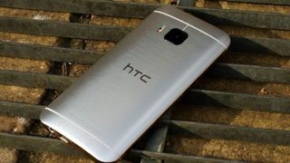
The metallic chassis is back and is bolder than ever. It's a two tone design (well, the Silver/Gold and Gold/Pink versions have a contrasting band around the side, whereas the Gunmetal Grey and Gold on Gold versions don't) that uses a single piece of metal for the entire phone – it really feels better packaged than previous HTC phones.
However, the key question remains: is this package still good enough to warrant the extra cash when you can get the likes of the OnePlus 3 for a similar price? Have the improvements added more to the mix or is the HTC One M9 a sign of the company treading water, adding nuance rather than innovation?
Design
Let's get this out the way at the start – the design is, by far, the most amazing part of the HTC One M9. HTC is calling it "jewellery-grade," with each one hand-finished by craftsmen, and it certainly shows.
The one-piece fascia is complemented beautifully by the two tone metallic rim (on my review unit, the silver and gold variant). The grey and gold versions will look less impressive, given they've lost the two-tone appeal, but that doesn't mean they won't be as nice to hold.
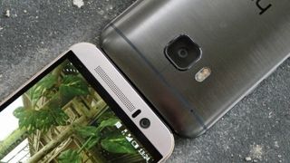
Actually, I'm pretty sure they'll be nicer than this model. There's something about the design right now that I really don't like, the rear edge proving to be quite sharp in the hand. It's not going to draw blood, but when I used the gunmetal grey preview device in Barcelona back in early 2015 it definitely felt closer to the One M8 in style, with more of a comfortable curve.
The reason for this hasn't been confirmed by HTC, but I get the feeling it's something to do with the coloring process.
Whatever the case, it's perhaps telling that HTC ditched this two-tone effect and the associated stepped-edge design for the HTC 10.
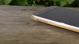
The other thing that's changed here since the HTC One M8 – and not for the better – is the power button transferring to the right-hand side of the phone.
This is a more natural place for it to live, making it easier to turn the screen on and off. However, HTC has inexplicably made it the same size and shape as the volume buttons above, so feeling for it without explicitly looking means I often hit the volume key instead.
Again, HTC altered this button balance in the HTC 10, which could be seen as another admission that the M9's design isn't quite optimal.
The microSD slot is right above the trio of buttons too, and as it's slightly indented can cause confusion when trying to change volume in the pocket. It's hard to tell which is which, even with the phone in your hand – the extra ridges on the power button don't help enough.
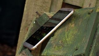
While the decisions HTC has made to improve the One M9's design don't seem to have hit the mark, there's no doubt this is a finely crafted phone, and was probably the best on the market at launch in that respect.
The two-tone finish is superb and still quite distinctive more than a year on, the weight and balance is even better than before, and the precision I spoke of earlier is the overriding feeling.
The sharp edges of the BoomSound speakers are well-defined, and while it's heavy at 157g, especially compared to contemporaries like the iPhone 6 or Galaxy S6, Apple's is the only device that can come close to beating the attractive packaging here – and I prefer the weight and balance HTC has created.
I'd definitely chuck it in a case though. After two days I'd already dented the bottom through it falling a foot onto the floor, and those nicks are really noticeable on the premium casing.
I also checked out an M9 handset more than a year on from launch and, while generally in decent condition, there were tiny stress cracks in three of the four corners where the display glass meets the metal.
Yet another M9 handset I tried recently didn't have this latter problem, but there were visible scratches around the microUSB port where the metal edges of the charger connector had made their mark. It seems you pay a price for such a fine metal finish, then - though that's hardly a unique criticism for a modern smartphone.
Screen
One thing HTC gets lambasted for is the extra space around the screen, with people saying the HTC logo doesn't need to be on there, surrounded by a black bar that many think is there for show.
It isn't. It's packing screen components that have to go somewhere as HTC has extended the length of the One M9 through the need for decent audio chambers to pump out BoomSound – and I'd rather have the powerful speakers than an identikit smartphone.
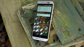
The M9 is actually a little smaller than before, despite having the same 5-inch screen as the previous year. In fact, it's an identical screen to the HTC One M8's, with a 1080p Super LCD display covered in Gorilla Glass.
There are undoubtedly performance improvements, but like the older model, HTC is being cagey about them. What is apparent is the screen's colors are rich enough, the gap between glass and display is low and the response under the finger is noticeably sharper.
That said, in our testing the screen is too dark under auto conditions, the colors often appear washed out compared to the rest of the flagship phones of 2015, and it doesn't pack the same 'wallop' as the iPhone 6 or LG G4, for instance. It's not terrible at all, but it begs the question why HTC didn't update this key component.
I don't want to harp on about the HTC One M9's successor too much here, but it's difficult to argue that the HTC 10's QHD Super LCD 5 display didn't arrive a year too late.
Still, the M9 screen's 441PPI is perfectly sharp and doesn't really offer a lot less than the QHD screens that are starting to flood the market.
The only functional reason I can see to stick a super-sharp display into a screen below six inches in size is to allow for virtual reality headsets, which magnify the screen and can cause pixelation. However, HTC isn't using the phone as the base of its VR Vive headset, so there's not really any need here.
Google is set to launch an ambitious new universal VR headset in Daydream later in 2016, of course, but even that will require brand new smartphone hardware that isn't on the market yet.
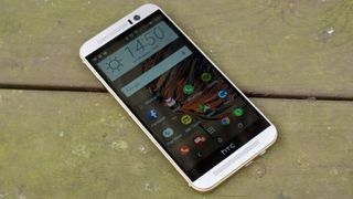
The HTC One M9's 5-inch screen is a fraction smaller than the competition on the market right now, with many other brands choosing to go 5.1-inch and above – but again, 5 inches seems like a fine choice here.
There's a fair amount of bezel on the One M9 compared to other 2015 flagship phones like the LG G4 and the Galaxy S6, and that's more pronounced due to the extra metallic lip that's running around the edge of the phone.
But we don't need edge to edge displays unless that's what the phone is about – and HTC's model is geared towards feeling more ergonomic in the hand, so it seems to suit the device.

Gareth has been part of the consumer technology world in a career spanning three decades. He started life as a staff writer on the fledgling TechRadar, and has grew with the site (primarily as phones, tablets and wearables editor) until becoming Global Editor in Chief in 2018. Gareth has written over 4,000 articles for TechRadar, has contributed expert insight to a number of other publications, chaired panels on zeitgeist technologies, presented at the Gadget Show Live as well as representing the brand on TV and radio for multiple channels including Sky, BBC, ITV and Al-Jazeera. Passionate about fitness, he can bore anyone rigid about stress management, sleep tracking, heart rate variance as well as bemoaning something about the latest iPhone, Galaxy or OLED TV.
