Huawei Ascend P7 vs HTC One M8 vs Samsung Galaxy S5 vs Sony Xperia Z2
Four phones, four flagships
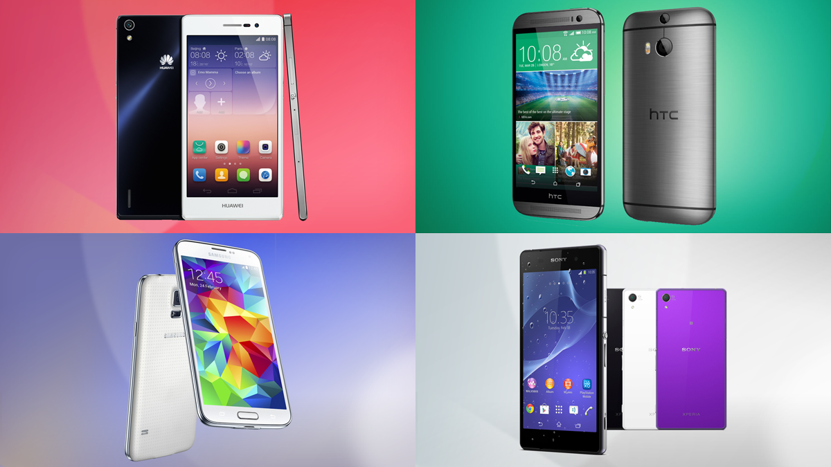
Huawei has joined the 2014 flagship show with the launch of the Ascend P7 at a special event in Paris.
The Chinese firm is still trying to grow its presence in a market which is dominated by the likes of Samsung and Apple, plus with HTC and Sony also launching high-end devices this year Huawei has its work cut out to keep up.
We've brought together the Ascend P7, One M8, Xperia Z2 and Galaxy S5 to see how they all shape up. Which one takes your fancy?
Design
The phone that really stands out in terms of design is the HTC One M8. Its impressive metal unibody, rounded corners and curved back make it a joy to hold and it oozes premium quality.
That said the Sony Xperia Z2 isn't far behind with a sturdy, industrial design which may well appeal to some more than the M8 - although the sharper corners and flat rear mean it doesn't sit as nicely in the hand.
On to the Huawei Ascend P7 and you'll find it keeps up the premium appeal with Gorilla Glass 3 covering its front and rear, sandwiching a metal frame. At just 6.5mm in depth, the Ascend P7 is also the thinnest handset out of the four.
Bottom of the pile in terms of design is the all-plastic Samsung Galaxy S5. It's by no means shoddily put together, with a high build quality, but it does look and feel cheaper than the other three.
Get daily insight, inspiration and deals in your inbox
Sign up for breaking news, reviews, opinion, top tech deals, and more.
If you're looking for a smartphone which has a bit more resilience to it then both the Xperia Z2 and Galaxy S5 are dust and waterproof - perfect for long baths or when you get caught in a downpour.
Screen
Full HD resolutions are the order of the day for all four flagships here, and screen sizes range from 5 to 5.2 inches.
The biggest of the lot is the Sony Xperia Z2 with a 5.2-inch display, while the Galaxy S5 sports a 5.1-inch screen and the Ascend P7 and One M8 make do with 5 inches.
That means the Huawei and HTC handsets have an ever so slightly greater pixel density of 441ppi (Huawei is claiming 445ppi), compared to 432ppi on the S5 and 424ppi on the Z2.
In real terms this doesn't mean a great deal as all of the screens are exceptional sharp, although the Galaxy S5 stands out thanks to the Super AMOLED technology which really makes colours pop.
The reviews
(hands on)
Power
There's a lot of power between the four handsets and the Xperia Z2, Galaxy S5 and One M8 all share the same quad-core Snapdragon 801 processor and Adreno 330 GPU.
The S5 has the 801 clocked slightly faster than its rivals at 2.5GHz, while the Z2 and M8 make do with 2.3GHz. The Xperia Z2 wins the RAM race packing in 3GB, while the M8, S5 and Ascend P7 feature 2GB each.
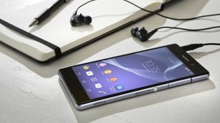
We've extolled the virtues of the 801 processor in our reviews, as it delivers impressive performance and battery life. Head over to the Ascend P7 and things are a little more unknown.
It's packing a 1.8GHz quad-core processor from HiSilicon - a firm which Huawei owns - as well as a Mali 450 GPU. It's lower powered and the overall operation isn't quite as slick as its rivals.
Operating system
The good news when it comes to operating system is all four phones are running the latest version of Google's platform - Android 4.4 KitKat.
None of the handsets are running the stock version you find on the Nexus 5 however, with each manufacturer putting its own stamp on the software.
The Galaxy S5 comes equipped with Samsung's now familiar TouchWiz UI, which is heavy on pre-installed apps (and bloatware) while also providing a whole host of additional features.
HTC's new Sense 6 overlay graces the One M8, and like TouchWiz it's a heavy skin with plenty of additional features - including BlinkFeed - and applications. It's a more attractive offering which we find easier to use.
Sony's UI doesn't come with a fancy name and it isn't as detailed as Samsung's and HTC's offerings. The lighter skin allows more of the natural Android interface to shine through and things are a lot less cluttered.
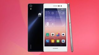
The interface which has seen the most tinkering by a manufacturer though is probably Huawei's Emotion UI 2.3 on the Ascend P7. The Chinese firm has completely removed the app draw in favour of having all your applications on the homescreens.
For those who are new to Android it is a simpler implementation which may be easier to learn, but Android stalwarts may find in frustrating. The other issue with Emotion UI is its design - everything looks a bit childish and that detracts from the overall experience.
If we were to rank the overlays it would go Sense 6, Sony UI, TouchWiz, Emotion UI 2.3 - although the top three are easily interchangeable depending on preference.

TechRadar's former Global Managing Editor, John has been a technology journalist for more than a decade, and over the years has built up a vast knowledge of the tech industry. He’s interviewed CEOs from some of the world’s biggest tech firms, visited their HQs, and appeared on live TV and radio, including Sky News, BBC News, BBC World News, Al Jazeera, LBC, and BBC Radio 4.
