In pictures: Every Palm Pre screen reviewed
The ultimate Palm Pre screenshot gallery
Updated: read our full UK Palm Pre review
The Palm Pre is a stunning new touchscreen smartphone – the interface uses a card concept where you can reorganise the cards by flicking them to and fro, and up to remove them.
Apps for media playback, browsing the web, finding contacts – they are all designed around the card interface and flicking with your fingers.
You can interact with the screen and swipe with your finger in the gesture area below the main screen.
Overall, the Pre is a powerful, multi-tasking, touchscreen phone that will challenge the iPhone and may outshine the T-Mobile G1, Samsung Instinct, and Blackberry Storm.
Here's a rundown of the screens you can expect to see when using the Palm Pre.
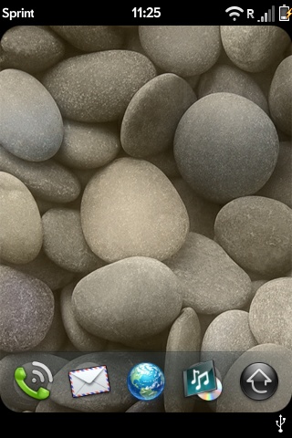
WELCOME: The main screen – the first thing you see when you turn on the phone – with five icons below
Get daily insight, inspiration and deals in your inbox
Sign up for breaking news, reviews, opinion, top tech deals, and more.
Phone calls

CALLING: Dialing a phone number is extremely accurate – we never hit the wrong digit or letter

VOICEMAIL: The Palm Pre does not support visual voicemail in the sense that you can't see a list of voice mail messages – you have to dial to get your messages

HISTORY: You can view a quick call history, though – choosing between all calls and just missed calls

SHOW NAMES: Sparse options for dialling, sure – but one option is to be able to type on the keypad and see contact names instead of actually dialling
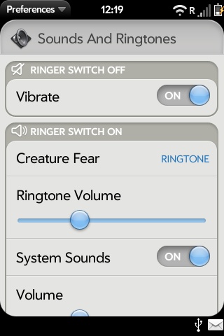
RINGTONES: The Palm Pre includes only a handful of ringtones, but you can turn an into MP3 into a ringtone easily
John Brandon has covered gadgets and cars for the past 12 years having published over 12,000 articles and tested nearly 8,000 products. He's nothing if not prolific. Before starting his writing career, he led an Information Design practice at a large consumer electronics retailer in the US. His hobbies include deep sea exploration, complaining about the weather, and engineering a vast multiverse conspiracy.
