iOS 10: we rank the 10 best features from Apple WWDC
Apple's latest operating system is full of new tricks

There's a lot going into the iOS 10 update that is going to shake up your daily iPhone and iPad routine and make the operating system a bit easier to use.
Siri is smarter, several key apps have been redesigned and the entire interface is full of more shortcuts. It doesn't have everything we wanted, but very close to the ideal phone and tablet update.
In fact, there's so much to iOS 10 that it's hard to piece everything together and determine which feature updates are significant and which are afterthoughts.
That's why we put together a list of what we think are the best iOS 10 updates, according to what we see at WWDC 2016.
QuickType suggestions current location
Apple loves to kill things off, including USB ports, CD drives and Floppy disks in hardware - to a lot of controversy. But the archaic thing iOS 10 may do away with should have everyone's full support.
"Where are you" is the most annoying question when you're on your way and don't have time to answer in full. The Siri-influenced QuickType keyboard is ready to solve that.
It immediately adds a "Current Location" button to the suggestions bar above where you're typing, when that bar is usually reserved for predicting your next word.
Get daily insight, inspiration and deals in your inbox
Sign up for breaking news, reviews, opinion, top tech deals, and more.
Your current location pops up with a GPS-linked map, and that's so much easier than explaining in detail your exact coordinates in a much longer and more time-consuming text.
Apple Maps is less terrible
It doesn't take a lot of work to make Apple Maps a whole lot better, and that's what iOS 10 does with a bunch of design tweaks that address is biggest flaws.
The ability to pan and zoom along the route is one of those essential changes that just needed to happen. Before the iOS 10 update, moving about the map would spring you back to your dot. Why couldn't I see ahead? Who designed that?
Traffic has also been added and new nearby points of interest make it ready to compete with Google Maps - or at least start to make a dent into Google's best app.
We also really liked the fact that apps like Uber are integrated into Google Maps, allowing users to request, follow and pay for their ride without ever leaving Apple Maps. It's getting there.
Decluttered Control Center
Right now the swipe-up-from-the-bottom Control Center is a menu overlay that's overloaded with shortcut buttons. It's good, but has gotten a bit too crowded.

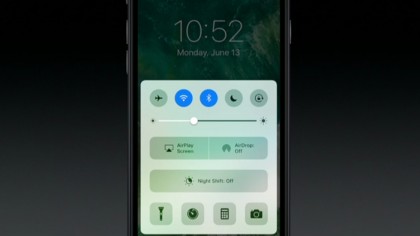
Apple addresses the issue in iOS 10 with fewer and bigger buttons, while shifting the music and volume playback controls to a new right pane within Control Center.
Once again, the bottom row of shortcuts is made up of four normal-sized icons (flashlight, stopwatch, calculator and camera) giving the iOS 9.3 Night Shift toggle its own space above.
It may be more controversial among people who have to make one extra gesture to slide to the music playback controls, but there's definitely more room to breathe in the menu.
'Widgets' in the lockscreen
Sliding to the right of the lockscreen menu reveals a new place for Apple's 'Today widgets.' Before iOS 10, it was coupled with notifications in the top pulldown menu overlay.
This makes it easier (and hopefully more useful) to access the widgets and get to your boarding pass or check your appointments, for instance, right from the lockscreen.
And hopefully with more use from iOS 10 users, more app developers will invest time and energy into making new widgets. It will hopefully snowball when the update launches to the masses.
It's still not as customisable as Android lockscreen widgets because they're relegated to an Apple-controlled sandbox, but it's a new start for Today.
Messages is full of emojis and special effects
Messages, whether they're standard texts or iMessages, was already a pretty great combination or SMS and data-sent conversations. However, Apple is sending the app over the top with iOS 10.
