3 simple iOS 9 features Apple still needs to steal from Android
I am desperate for these ideas to come to the iPhone 6S
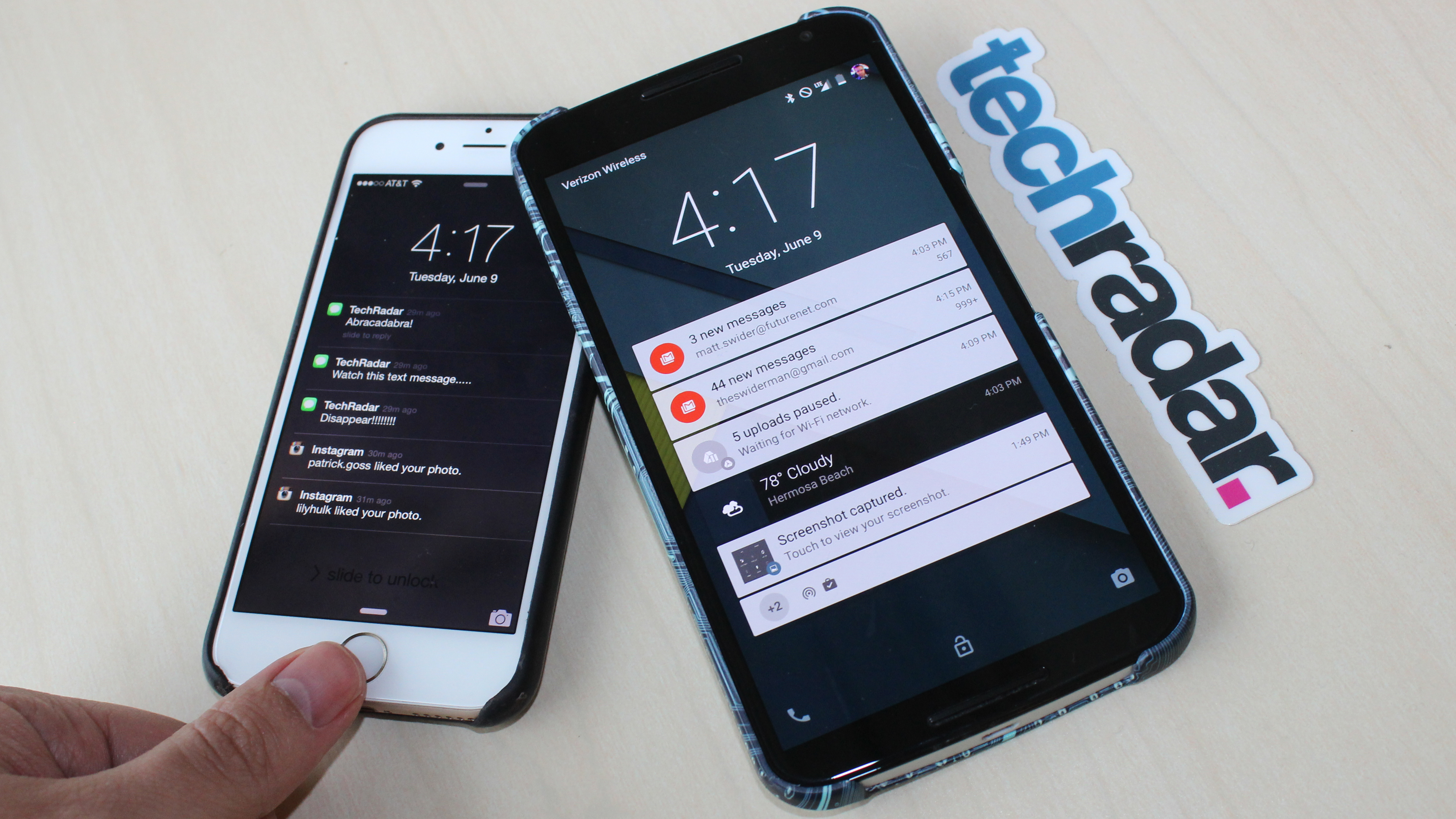
Without hesitation or lag, Google fans accused iOS 9 of copying Android features wholesale. The reverse happened when Android M was announced two weeks ago.
But, in my mind, Apple hasn't gone far enough to advance the user experience in its phone and tablet updates. It misses out on simple but efficient Android features.
To be fair, there are brilliant ideas on Android that I wish were on my iPhone, and just as many fundamental mechanics Apple leads the way with that Google refuses to adopt.
Listen up, Apple, here are the iOS 9 features that you forgot to poach from Google. Put that new copy and paste keyboard shortcut to use.
1. Make Control Center shortcuts actual shortcuts
Apple did us a huge favor by introducing the Control Center menu overlay in iOS 7, which slides up from the bottom of interface no matter the app you're in. Great.
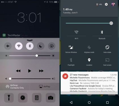
Shortcuts to toggle airplane mode, Wi-Fi, Bluetooth, Do Not Disturb and orientation lock are extremely helpful, as are the brightness slider, flashlight switch and camera button.
But these one-trick-ponies don't go far enough. Android's comparable quick settings buttons turn functions on and off when tapped and lead to their settings menu when pressed down.
Get daily insight, inspiration and deals in your inbox
Sign up for breaking news, reviews, opinion, top tech deals, and more.
Bluetooth should lead to the Bluetooth menu when pressed so that when I want to disconnect my wireless headphones, I can do so without nerfing my Apple Watch's required connection.
Wi-Fi, when held down, should lead to the Wi-Fi menu so I can connect to the right router, not be automatically linked to that shady "Free Wi-Fi If You Dare" at my hotel.
Why the iOS 9 update doesn't include toggle switches AND shortcuts to each individual settings menu is beyond me. It's something I readily appreciate from my Android phones.
Maybe this mechanic will come with the iPhone 6S, which is rumored to include Force Touch. It could easily tell between tapping and pressing down on the display.
2. Touch ID shouldn't erase notifications
iPhone led the way with notifications, at least until Android 5.0 Lollipop introduced lockscreen notifications and solved one of Google's biggest problems.
Now that things are a little more even, I'm favoring the Android approach simply because when I press my iPhone 6 Touch ID button, all of the notifications vanish forever.
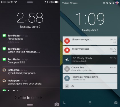
Sometimes I don't even mean to hit the fingerprint sensor, but poof! All of the app alerts I was about to read are now sorted in the awful "grouped notifications" view.
Android doesn't get rid of notifications on the lock screen until you swipe them away one by one or clear them in one fell swoop. There's no unexpected disappearing act here.
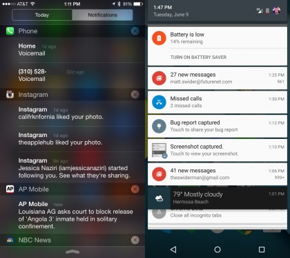
Google also lists notifications chronologically in its pull down menu, whereas Apple breaks them down into groups. Notifications are all about timeliness, so why aren't they sorted by time, Apple?
Miss a breaking news notification you only got a chance to glance at? Which app was it? You'll be hunting for it among your oddly sorted groups to catch up.
3. Keep active content in pull down bar
Now Playing and Passbook (renamed Wallet in iOS 9) need to live in the iPhone's pull down menu. That's what Google does with active content, and that's what Apple needs to do, too.
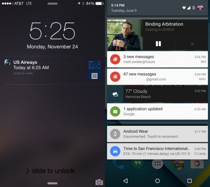
Here's what currently happens. If I happen to be on my phone in line at airport security (read: always), I need to go through a number of steps to retrieve my flight's QR code.
I have to press the lock screen button to put the phone to sleep, press it again to wake it to see the lockscreen menu, then slide the always-present Passbook flight lockscreen notification to the right to bring up the QR code.
Why am I locking my phone only to turn it on? Because Apple doesn't make this lockscreen-only Passbook shortcut available in the pull down menu while you're using your phone. Apple Watch keeps the Passbook shortcut in its dropdown menu at all times right before a flight, so why not the iPhone.
Yes, I can close the app I'm using and head into the Passbook app, but I've hidden it along with Stocks and Newsstand. It's only useful when I need it. The same applies to apps like Netflix and HBO Go.
Android keeps such relevant content in its pull down menu. If I'm watching Game of Thrones on HBO Go through an Android device streaming to Chromecast, I don't have to close my phone in order to see the lockscreen play/pause buttons.
Please, copy and paste
Apple has strived to make its iPhone and iPad software extremely user-friendly, and the iOS 9 update only improves upon this goal.
The thing is, Google has caught up with Android 5.0 Lollipop, bringing a more cohesive mobile operating system to the masses - over one billion active users.
Sometimes on Android, "It just works" - and that's a problem for Apple.
