Sailfish: the OS that wants to dethrone Android

There's revolution in the air. People and companies are tired of essentially being limited to a choice of just three smartphone operating systems.
They're tired of the walled gardens of iOS and Windows Phone and they're wondering about the open-source-but-secretive development of Android.
This atmosphere has led to four new operating systems being built to challenge the status quo. There's Firefox OS, Ubuntu, Tizen and Sailfish OS, an operating system developed by a small team with big ambitions.
Sailfish OS might be reasonably new, but many of the ideas driving it aren't. It's an open source Linux based operating system but more specifically it was born from the ashes of Nokia's failed MeeGo OS, which was used on precisely one phone: the Nokia N9, before the Finnish phone-smiths pulled the plug.
- Hands on: Jolla Phone review
Some of the people behind MeeGo weren't ready to abandon it though, so they jumped ship, formed a new company called Jolla, raised an impressive £160 million and got to work on Sailfish OS, taking many of the ideas from MeeGo with them.
Not a button in sight
So why should you care about Sailfish OS? Well, it's largely open source for one thing, and not open source in the way Android is where most of the development is done behind closed doors, but truly open, allowing the public to see much of what Jolla is doing and use the code for their own purposes.
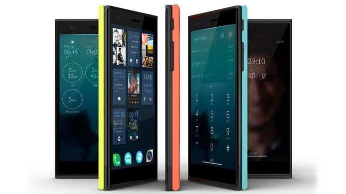
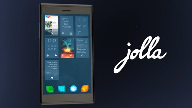
It also has a user interface that's quite different from any of the competition. It starts with the homescreen, which rather than showing static app icons instead gives you a window to all your open apps, and lets you switch between them or interact with them with a swipe, taking multitasking to a level not really seen on other phone OS's.
Sign up for breaking news, reviews, opinion, top tech deals, and more.

For example, if you have the phone app open on the homescreen a swipe one way will reveal the dialer and the opposite way will show you your contacts.
But each app icon also shows live information, so for example the music player might show what track is playing. In many ways it's a mix of BlackBerry 10's homescreen layout, Windows Phone 8's live tiles and Android's widgets all in one.
As you might have guessed from all that, it's also a very gesture based OS. You can access the app drawer with a swipe up from the homescreen, get back by swiping from one side to the other when in an app or close it down by sliding your digit from top to bottom.
You can also check your social network updates and other notifications without interrupting what you're doing by swiping up from the bottom of the screen, quickly access options that are relevant to the screen you're on by accessing the 'Pulley Menu' with a downwards swipe from the centre of the screen and wake the phone up from sleep by double tapping anywhere on the screen.
It's a system which cuts down on buttons and menus and gives you access to just about everything from any app or screen.
In fact there are no physical or virtual home, back, menu or search buttons. Being able to carry out different actions with just a swipe also makes it much easier to use one-handed than other mobile operating systems and could potentially help it stand out on larger handsets and tablets where two-handed use has been all but essential up to now.
James is a freelance phones, tablets and wearables writer and sub-editor at TechRadar. He has a love for everything ‘smart’, from watches to lights, and can often be found arguing with AI assistants or drowning in the latest apps. James also contributes to 3G.co.uk, 4G.co.uk and 5G.co.uk and has written for T3, Digital Camera World, Clarity Media and others, with work on the web, in print and on TV.