Samsung's newfound design-led approach has been widely attributed to the ongoing success of the iPhone range, and there are fundamental similarities between these two phones that can't be denied.
From the rounded metallic edges to the drilled speakers and general button and port placement, there's definitely a shared approach to basic smartphone design here.
But anything more than a cursory glance will reveal notable differences. The Galaxy S6 has a metal edge, but the predominant material is glass. There's tough Gorilla Glass 4 covering both front and back.
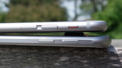
The iPhone 6's body, by contrast, is a single piece of metal. Only the front section is coated in glass. That, too, feels different to the Galaxy S6, with a pronounced tapered curve at the edges.
Rather surprisingly, the Samsung feels like the more delicate, jewel-like device here - and who would have predicted that just a year ago?
That's because Samsung's much-documented shift to a more design-focused philosophy has coincided with Apple producing its most functional (I hesitate to use the word utilitarian) phone for years. It's no ugly workhorse, but the well-used iPhone 6 handset before me wears its scuffs and scrapes better than the flashier Samsung.
The bevelled edges of the Galaxy S6 show up nicks far more readily than the simple, matte-finished metal of the iPhone.
Get daily insight, inspiration and deals in your inbox
Sign up for breaking news, reviews, opinion, top tech deals, and more.
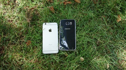
Another reason I got this impression was that aforementioned heavy use of glass in the S6. It just feels like it's a moderate drop away from a wince-inducing shattering incident, front and back.
In actual fact the glass is relatively tough, but it serves to make the whole handset more vulnerable thanks to its unique properties. Quite simply, the Galaxy S6 is extremely slippery.
I've had the Samsung Galaxy S6 for the best part of a month, during which time I've written a couple of these comparison pieces. In those pieces I noted that I'd experienced a few near misses where the Galaxy S6 had taken bizarre plunges off my flat sofa arm, it's super-slick back acting like a ski does when put down on a seemingly flat stretch of compacted snow.
My luck ran out on the final day of shooting with the Galaxy S6 and the iPhone 6. Placed down for a second on what seemed to be a flat, grippy wooden bench, the next thing I heard was the sickening sound of metal on stone as the S6 plopped around two feet onto the ground.
This left a small but ragged ding in the rim of the phone, its beautifully sculpted metal proving incapable of absorbing the impact of even a relatively a short drop.
I had previously experienced the same issue with the glass-backed Sony Xperia Z3 Compact, but that phone also has the benefit of a sturdy plastic rim that successfully absorbs such minor mishaps (at least in my experience).
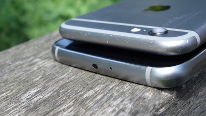
Compare that with the iPhone 6, and Apple's handset feels more capable of bearing similar wear and tear. The iPhone 6 I tested is something of an office run-around, and it's evidently had to share a few pockets with keys and change in its time. However, the handset's matte metal has worn these everyday scuffs and scrapes surprisingly well. It suits the 'distressed' look quite in a way that the Galaxy S6 won't.
Apple has also dropped the bevelled edge of recent handsets. This fits in with iPhone 6's flowing design, its subtly rounded display melting into the body seamlessly. However, it also removes an infamously nick-happy element of previous iPhone designs. The S6, by contrast, has retained that polished bevelled edge, and while it looks great… well, let's just say you'll probably want to invest in a case as a matter of priority.
Perhaps surprisingly, there's not a great deal of difference in size with these two phones - and that's to Samsung's credit. Despite the Galaxy S6 having a much larger display, it occupies a similar footprint to the iPhone 6.
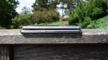
At 138.1 x 67mm, the iPhone 6 is slightly smaller than the 143.4 x 70.5mm Galaxy S6, but at 6.9mm it's a hair thicker too (only by 0.1mm mind).
This is because Samsung seems to have been far more aggressive with its screen bezels, particularly when it comes to the top and bottom examples. Apple's big round recessed home button may be more reassuring to press than Samsung's squished lozenge, but it seems to take up a lot more space as a result.
Display
The iPhone 6 is the top choice on the market for those who remain convinced that a smartphone should be completely operable with a single hand.
Even more than its slim design, that can largely be attributed to its 4.7-inch display. In keeping the iPhone 6's screen well below 5-inches, Apple has ensured that those with medium to large hands will be able to reach all corners of the screen with the thumb of their holding hand - though Apple's insistence on placing the virtual 'back' button at the top left of the screen makes it a bit of a stretch at times.
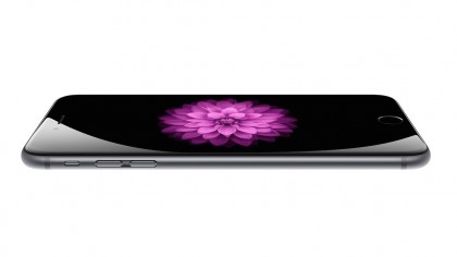
If you're one of those busy sorts who often finds themselves furiously tapping out a message whilst walking along the street with a hot beverage in the other hand the iPhone 6 is for you. Commuters who find themselves catching up on their Pocket reading list whilst holding onto a Tube train handle will also appreciate the iPhone screen's compact dimensions.
For those that can't quite reach, there's a slightly clunky reachability function that drops the display down with a light double tap of the home button, but I never used it.
The Galaxy S6 isn't quite so easy to wield in this way, what with its 5.1-inch display. But one-handed usage isn't completely out of the question for certain tasks, particularly if you have large and limber hands.
Where the Galaxy S6 display really shines, though, is in its sheer fidelity. Its QHD resolution makes it the sharpest smartphone screen out there, for one thing.
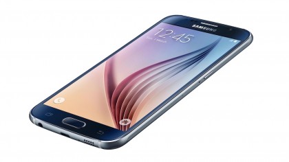
As I've mentioned, the Galaxy S6's 577ppi pixel density is almost twice that of the iPhone 6's, and it's undoubtedly noticeable when you're looking at high resolution media content on both phones side by side.
In general usage, particularly when used in isolation, it's difficult to say that the 2K resolution is justified here, however. You simply won't see a marked benefit over the 1334 x 750 iPhone 6 screen.
Besides its smaller dimensions, the main reason for this is that the iPhone 6 display is so very bright and clear. The picture almost looks painted on. Add in its greater brightness and Apple's piercingly cool colour temperature, and it manages to hold its own against the Galaxy S6's bigger, sharper, more colour-accurate Super AMOLED screen.
It also helps that so many media, website, and app assets are optimised for this popular screen, whereas it still feels like content creators are rather slowly latching on to the QHD standard - at least when it comes to mobile optimisation.
Still, there's no doubting that by most meaningful metrics, the Galaxy S6 screen is better. In fact, we'd say it's the best smartphone screen on the market. If you fancy showing off to your friends even more, splash some extra cash on the futuristic Galaxy S6 Edge. It has a screen which curves round either side of the handset.
Current page: Design and display
Prev Page Introduction and key features Next Page Interface and Performance