Design
It's fascinating to compare the designs of the Samsung Galaxy S6 and the Samsung Galaxy Note 4.
The Galaxy S6 feels like the start of something special from Samsung. I've been willing the Korean company to match its evident manufacturing nous with some design smarts for years now, and the Galaxy S6 finally achieves that mix.
You might not think that when you first open the box, though. Samsung isn't ripping up its old design playbook here, and the S6 is a very familiar looking device from the front.
At the top of the phone there's a familiar Samsung symbol below a metallic earphone grill, both of which look very much like previous Samsung phones – including the Note 4. At the opposite end of the phone you get that lozenge-shaped home button, which is flanked by capacitive multitasking and back keys, just like every other Android-powered Samsung phone I've used over the past five or so years.
You might start wondering what all that initial review buzz was about, but fish that bad boy out of the box and the differences will become apparent before you've even flipped it over.
That surrounding material you're feeling against the creases of your fingers? That's aluminium alloy rather than shiny plastic. This premium material has a lovely matte finish to it, and a curious shape that renders it at once round and angular. I like.

The pleasing tactile sensations continue on the back, where the textured removable plastic covers of old have been replaced with a fixed, smooth expanse of Gorilla Glass 4. And check out that glimmery finish, which reveals its true colour when held at an angle under light. You'll notice this is present on the front, too, once you've stopped gawping at the display.
Get daily insight, inspiration and deals in your inbox
Sign up for breaking news, reviews, opinion, top tech deals, and more.
It's quirky little touches like this, as well as that front-on look that you probably didn't even realise was distinctively Samsung until now, that ensure the Galaxy S6 can withstand allegations of plagiarism (it looks a bit like an iPhone 6 from the bottom, y'see).
Which is good, because I get the impression that the Galaxy S6 won't withstand much else – not without a case, at least. It's very well built, but the shiny glass back is positively asking to be scuffed and scratched through normal daily use.
The Galaxy S6 I've been using has evidently been carefully wielded by a couple of people now, and it clearly hasn't been dropped at any point – the metal surround has no notable dings to it. Yet, held against the light, I can already see lots of little micro-scratches congregating around the bottom edges of the back, seemingly from where it's been laid down repeatedly on a variety of mildly abrasive surfaces.
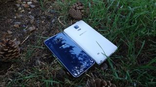
It's also lost the IP67 rating of its predecessor, the Galaxy S5, which means that the S6 is neither dust nor water resistant. That's a shame.
Of course, the Galaxy Note 4 doesn't have that IP67 rating either, but it does feel like it's far more resistant to cosmetic scuffs and scrapes. Say what you like about that faux-plastic back cover, but it's not going to mark up when you lay it down on a wooden bench.
If the Galaxy S5 marked the death knell of the old Samsung design approach, and the Galaxy S6 was the start of something new, then the Galaxy Note 4 will go down in history as the half way point.
It mixes elements of both to create a device that's tough and functional, but relatively easy on the eye and pleasant to hold. It's achieved this through an aluminium rim that makes it feel distinctly more upmarket than previous Note phones. The rim on the white model I've been using has been given a curious white finish, which I'm not wholly sold on, but it's still a marked improvement.
It's altogether a much squarer phone than the Galaxy S6, from its more severely angled corners to its dead-straight, flat edges. This has the unfortunate side effect of making it feel bigger and chunkier than it is – and make no mistake, it is both big and chunky.
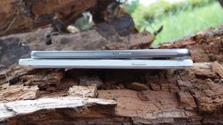
At 8.5mm it's hardly chubby, but that's enough to make it 1.7mm thicker than the S6. It's also 8mm wider and 10mm longer, as well as almost 40g heavier. Practically speaking, I was always acutely aware of the Note 4 whenever I had it on my person, whether in the inside pocket of a light jacket or quickly stuffed into a trouser pocket. The term "lug around" has rarely seemed so appropriate.
Otherwise, button and port placement is very similar between the two phones. Samsung continues its policy of putting the volume keys on the opposite edge to the power key (left and right respectively), which seems to make its slightly more awkward to operate one-handed on the Note 4 – but then that's the case in general.
One key difference is the 3.5mm headphone port. It's on the bottom of the Galaxy S6, while on the Note 4 it's on the top. Personally, I prefer the Galaxy S6's approach, because it keeps the headphone cable out of the way when you're actually using the phone, but I'm aware that opinion varies on this.
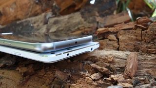
It's possible that Samsung simply didn't want people attempting to dock the S Pen, which is housed on the bottom edge, in the wrong opening. That's perfectly understandable.
Display
The Samsung Galaxy S6 and Galaxy Note 4 are the titans of AMOLED screens – no one else in this particular league really gets a look-in.
Just like the design of the two phones, there are sufficient differences between the two screens to make a straight-up judgement tough to make.
Both are superficially similar – Super AMOLED displays with QHD (2,560 x 1,440) resolutions. However, the Galaxy Note 4's is much bigger at 5.7 inches versus the Galaxy S6's 5.1 inches.
Technically, this means that the Galaxy S6 display is the sharper of the two, with the same pixels packed into a significantly smaller space – 577ppi against 515ppi, to be precise.
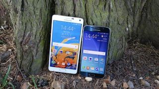
But I would actually suggest that this is practically unnoticeable in real world usage. Indeed, I reckon that the Galaxy Note 4 is a better showcase for the QHD resolution than the Galaxy S6, making better use of those extra pixels across a wider canvass.
That's not to say that the Galaxy Note 4's is the better screen, though. The Galaxy S6 arguably has the best smartphone display on the market – it's just that its QHD resolution has less to do with that fact than you might think.
The Galaxy S6 display is around 100 nits brighter than the Galaxy Note 4's – and I wouldn't call that dim in any sense. Similarly, the Galaxy S6 produces even more accurate colours, with a colour temperature that gets admirably close to the 6,500K ideal.
Both are great displays, but the S6 is better at displaying general smartphone tasks, while the Note 4 really makes high resolution media sing.
Current page: Design and display
Prev Page Introduction and key features Next Page Interface and performance