Interface
Samsung has updated the Galaxy Note 4 to Android 5.0 Lollipop, which means that it's running on the same basic OS as the Galaxy S6. While the bigger phone is running on Android 5.0.1, the newer phone is running Android 5.0.2.
The two phones are also running slightly different versions of Samsung's TouchWiz UI. All of which means that while their software handles very similarly, the experience isn't identical.
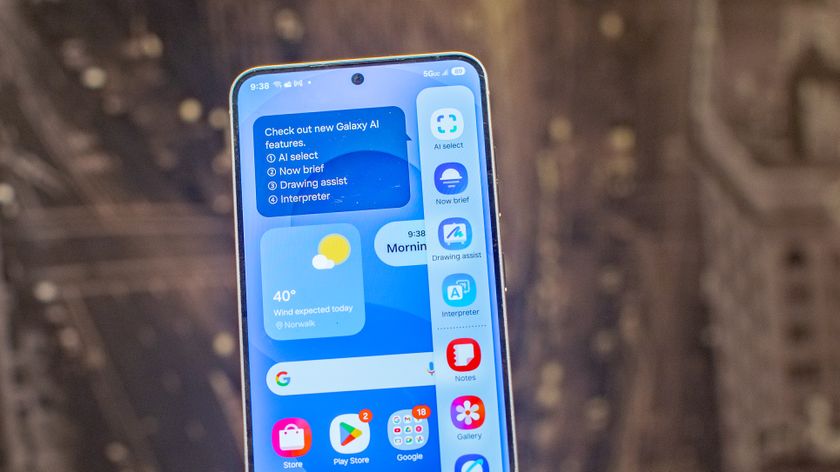
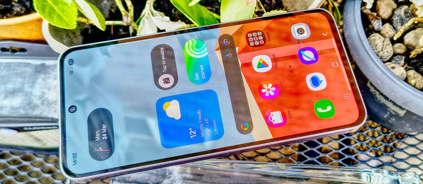
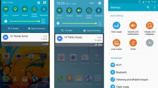
The Galaxy Note 4's interface has more of the S6's classier, more subtle interface touches than the Galaxy S5. It's got an equally restrained clock widget, as well as a similar notification menu and a settings menu that presents the main options in a grid and the rest in an easy-to-scan list.
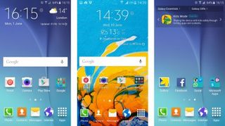
However, the lock screen has the same childish bloopy effects as last year's flagship, whereas the Galaxy S6 has a pleasant ripple effect. The S6 also uses squarer, flatter app icons more in keeping with Google's own Lollipop efforts.
I'm talking about fairly minor, nit-picky differences here. When it comes down to it, both run modern TouchWiz, which means that both are pleasant and easy to use and far from the bloated mess that the custom UI used to be.
However, neither is as slick or attractive as stock Android 5.0. Samsung may have stripped things back, but this is still an obfuscation of the Android experience rather than an enhancement.
Take the shonky incorporation of Flipboard, for example. It's accessible via a swipe left from the first homescreen, right where you'd want Google Now to be, and it isn't as quick or useful as simply booting up the Flipboard app itself. I quickly opted to steer clear of it on both phones, I'm glad it can be deactivated altogether.
Get daily insight, inspiration and deals in your inbox
Sign up for breaking news, reviews, opinion, top tech deals, and more.
Of course, it's not just the older version of TouchWiz that makes the Galaxy Note 4 the busier of the two. Samsung has also equipped the bigger phone with tools for using that S Pen stylus.
You get an additional S Note widget on the second screen, enabling you to quickly enter various types of notes, including basic scribbles and image annotation.

Whip out the S Pen itself and you get the Air command menu, which provides shortcuts to core functions like Action memos (scribble a number and it'll convert it digitally) and Screen write (take a screenshot and scrawl on it).
This is the most accurate implementation of the S Pen stylus yet - it really is easy to write naturally with it. However, it won't prove useful to everyone.
I had to force myself to use it as part of the critical evaluation process. Not once did I reach for it automatically to take a quick note or navigate more precisely, indicating that it still isn't the quickest or easiest way to carry out essential tasks on a smartphone.
Still, I'm well aware that there are productivity hounds out there who swear by the Galaxy Note series and its S Pen implementation. If you're looking for that extra layer of control over your phone, it's got a clear advantage over the Galaxy S6.
Performance
The different-but-similar vibe continues with performance. The Samsung Galaxy S6 runs on a custom 64-bit Exynos 7420 CPU, while the Samsung Galaxy Note 4 runs on a Snapdragon 805 processor.
Neither chip is what you'd call common. The Exynos made its debut in the S6, while the 2.7GHz Snapdragon 805 was a kind of curious in-betweener chip that bridged the gap between last year's main chip the Snapdragon 801 (which powers the Galaxy S5) and this year's flawed upgrade the Snapdragon 810 (which powers the HTC One M9).
Besides the Galaxy Note 4, the Nexus 6 is perhaps the most notable device to run on the Snapdragon 805.
Both chips are very fast, but the Galaxy S6's Exynos chip is capable of much more. In my GeekBench 3 tests, the Note 4 scored 1,099 on single core and 3,355 on multicore – an impressive set of scores that's well ahead of last year's flagship Android phones. The Galaxy S6, though, blasts ahead with 1,495 and 5,155 respectively.
In real world terms, however, the difference doesn't feel so pronounced. Both phones run their operating systems and general tasks extremely silkily, with nary a stutter. It really is difficult to detect a difference in practical terms, and the fact that both run on 3GB of RAM likely has something to do with this smoothness – though even here the Galaxy S6 has the edge by using faster DDR4 RAM.
Both run advanced games impeccably, too. Playing Dead Trigger 2 with the settings bumped right up (a good way to put any phone through its paces) didn't pose a problem for either.
There are signs that the Galaxy S6 is operating on another level of performance, however. Hit the camera app and, while neither hangs about, the newer phone snaps to it a couple of beats quicker.
The gap is even smaller when it comes to the speed of apps booting up, but there does tend to be the slightest of advantages to the Galaxy S6. But I'm really talking slight.
Current page: Interface and performance
Prev Page Design and display Next Page Battery life and media