The 10 ugliest phones of all time
Leather on a phone? That's nothing compared to these monsters...
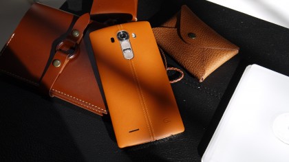
The phones that make you go: MWauuauuuughghAARGH!
- It's Star Wars week on techradar and we're bringing you everything from the dark side of tech. Here's a selection of the most dystopian phones we've ever seen – these are some of the worst design choices phone makers have made throughout the years. Any Sith would be proud of inflicting one of these phones on the world.
How do you make a phone that stands out? LG's strategy was to plaster the back of its brand new LG G4 with animal hide. That's right, real bonafide leather made of the skin of dead animals.
Don't think about it too much or it might make you a bit queasy. However, some of you might think it's classy, a phone with a real alternative touch.
Either way, it's far from the worst mistake we've seen in our time looking over the world of phones. Here are 10 of the top double-take phone fashion disasters we've had the misfortune to come across.

Explore all of our Star Wars Week content. Come over to the Dark Side...
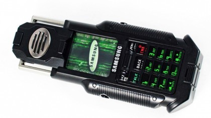
Samsung NPH-N270 Matrix
Release date: 2003
The first Matrix film inspired a whole sub-genre of rubbish pretenders to its sci-fi throne. And just as the original The Matrix thrust the all-time classic Nokia 8100 into the spotlight, The Matrix Reloaded saw Samsung have a stab at another 'movie' phone: the $500 Samsung NPH-N270 Matrix.
It was meant to be the futuristic phone of our daydreams. It was, well, horrible. Looking like something that belongs on the building site of a Mad Max-style apocalypse rather than a catwalk.
The over-designed speaker flips up and out of the tiny screen while the phone's body is needlessly bulked out. It looks less like a prop from the classy Matrix movies, more like a reject from Batman & Robin. Ouch.
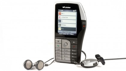
Virgin Mobile Lobster 700TV
Release date: 2006
Dude, there's something on your shoulder. No, seriously, there's a great big lump coming out of your neck. Never has a phone looked so much as it has inadvertently grown an unfortunate puss-filled cyst on its side than the Virgin Mobile Lobster 700TV.
So… why? Well, the 700TV was among a mercifully small group of phones that tried to offer more than just phone features years before app stores as we now know them exploded, and the lump was needed to fit in the extra hardware and controls for a DAB radio and TV tuner.
That's right, the Virgin Mobile Lobster 700TV could receive digital radio and Freeview TV. Sounds pretty neat now, doesn't it? While we'd kinda like these features back now, please, they didn't change the world back in 2007 with this £199 lumpy monstrosity.
Wasn't that expensive, though.
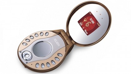
Siemens Xelibri 6
Release date: 2003
Have you ever wanted a phone that doubles as a make-up compact? Of course you haven't. Well that's what Siemens had a crack at with the Xelibri 6.
This was just one phone from a range obnoxiously and reductively aimed at a female audience. You can probably imagine the focus group that came up with it now.
People that use phones every day are busy and don't have the time to pamper themselves before the work commute. So why can't they do it on the way to work?
Fair enough, we've all seen someone sort out their mascara on the train. But do you want your phone to look like a mirror-clad oyster shell that won't even fit in your pocket? Thought not.
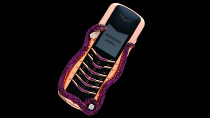
Vertu Signature Cobra
Release date: 2006
Luxury phones are a bit of a tough sell for the normal person when standard top-end ones cost the same as many of us spent on our first cars. That's Vertu's game, though.
It makes phones for people who pop Cristal just for the sound of the cork flying out. And sometimes it produces amazing-looking devices. But other times it goes...the wrong way.
The Vertu Signature Cobra was its nadir. It's like Vertu took a good-looking phone, clad it with gold and then filled a piping bag full of dog mess and made a snake-snaped frame for the thing, finishing it off with glitter and sequins.
Maybe some people are so rich that normal rules of taste and decency don't apply. But there's a limit. To top it off, the thing cost $310,000/£213,000 and that was back in 2006.
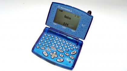
Motorola V100
Release date: 2000
Haven't you always wanted a phone that looks like a toy picked up at the airport to silence a 5-year-old on a flight to Magaluf? No? Well that's what the Motorola V100 seemed to be about.
Translucent blue plastic and more cheap rubbery buttons make us wonder: who is this for exactly?
Well, back in 2000 when the phone was released it was designed to appeal to SMS addicts who found T9 typing just not, well, enough.
For those not born in the '80s, SMS'ing is texting and T9 was how we used to type out messages before everything from gaming to tax returns was done on touchscreens. Kids today don't even know they're born.
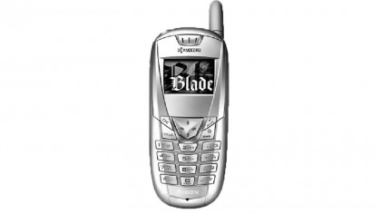
Kyocera Blade
Release date: 2003
Sometimes trying hard backfires. Back in 2003 Sony Ericsson was the king of style phones. That's right: Sony didn't make phones on its own back in those days.
However, in trying to nick some of the style cues Sony Ericsson established, Kyocera went way overboard, making a phone that'd make you cringe rather than go 'ooh', in the Blade.
It's no wonder Kyocera phones never really took off. At 23mm thick it was also chunky enough to fill a pocket alone. That's even thicker than some of the construction site-ready phones Kyocera makes these days.
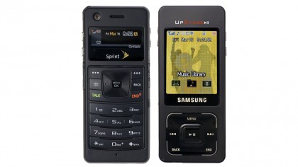
Samsung Upstage
Release date: 2007
Until Android kicked off and the Galaxy series took hold, Samsung was left clutching at straws in the mobile world. Even Motorola had bags more success. But it wasn't for lack of trying on Samsung's part.
Take the Samsung Upstage from 2007. Even the name suggests it thought it was going to wipe the floor with everything else and start a phone revolution.
What was it? A naff candy bar phone with an extra screen and bonus buttons on the back that made it a Jekyll & Hyde monster, a phone and MP3 player hybrid. No surprise: it was a total flop.
Let's not forget, this was the same year the iPhone launched. Samsung comes up with a lot of ideas. Not all of them are golden. Not nearly all of them. It launched for $150 with a contract in the US.
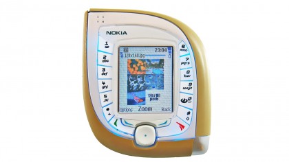
Nokia 7600
Release date: 2003
Back in the 2000s, Nokia was the king of phones. But it had a few real misses: meet the Nokia 7600.
It had a bizarre teardrop-shaped body that looks nice on paper. But in real life? It's madness. The Nokia 7600 was chunky as anything, and almost impossible to use. This was back in the days before touchscreen and the buttons were plastered on each side of the screen in two totally non-ergonomic straight columns.
Not only did it look weird enough to earn you nothing but ridicule from friends, it was just about impossible to use for the first three weeks too. A stone cold classic. Not.
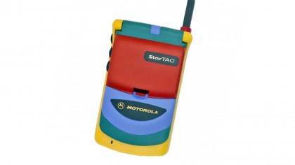
Motorola StarTAC Rainbow
Release date: 1996
StarTAC? Star of tacky, more like. Making phones anything but black has been a hard road for phone-makers over the years. There were the years of cringey pink mobiles, before companies like Nokia showed how it's done with their Lumia phones. And then there was the StarTAC Rainbow.
The Motorola StarTAC Rainbow was…. well. It was a bold effort. As if a rainbow vomited onto a boring old clamshell phone, its colours just don't fit with the rest of the design. And back in 1997 this wasn't all that cheap either. The original StarTAC cost $1000.
In fairness, the Motorola StarTAC Rainbow is remembered by some as a bit of a minor classic. But you don't half need some cojones to pull one off.
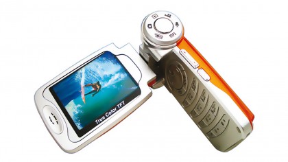
Xcute DV1
Release date: 2005
We may have forgotten this, but in the 2000s we saw some incredibly innovative phone cameras. The Nokia N93 had an optical zoom. The Nokia N86 has variable aperture. Yep, Nokia was the king of phone cameras back then, and Samsung also made the first 8-megapixel phone.
These high-end cameras were packed into serious phones. But Xcute got the wrong end of the stick and crammed one into a clamshell phone called the Xcute DV1 back in 2006.
It looks like the sort of phone you'd pick up at Carphone Warehouse to send SMSs and play Snake on, but then there's that giant growth in its hinge. It looks like someone has sellotaped a bazooka onto the thing. Boy, this is a bad-looking phone.
But at least it's interesting. It had two screens and the design was mean to make it feel a bit more like the handycams that were popular back in those days.

Andrew is a freelance journalist and has been writing and editing for some of the UK's top tech and lifestyle publications including TrustedReviews, Stuff, T3, TechRadar, Lifehacker and others.
 Become a TechRadar Insider


