Apple Watch vs Moto 360
The fabled iWatch compared the first circular Android watch
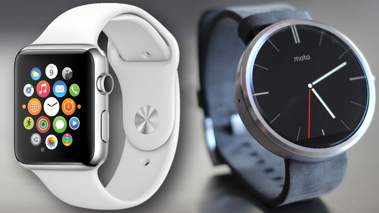
It's circle vs square in the Moto 360 vs Apple Watch comparison, and we're two weeks away from being able to wear both, given the newly announced Apple Watch release rate.
Of course, wearing both would be ridiculous, so now that we know more about what's been hiding up Apple CEO Tim Cook's sleeve, we can see if it's really better than Motorola's fashionable Moto 360?
The dueling smartwatches feature premium stainless steel designs among the options and only work with their respective operating systems. Apple Watch needs an iPhone and Moto 360 an Android.
Sitting on the Android 5.0 Lollipop or iOS 8 fence? You can pick one or the other in this Apple Watch vs Moto 360 comparison. It may come down to which has the best features, or whether or not you can afford that high Apple Watch price.
Display
Circle beats square, even though both smartwatches boast impressive displays. It's just that we're tired of boxy computerized watches before.
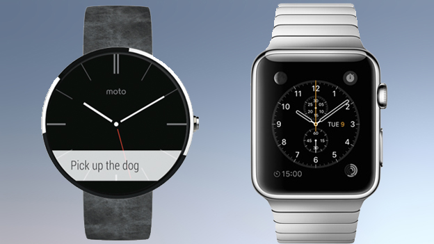
Moto 360 offers something ambitious with its round 1.56-inch LCD screen, while Apple Watch sticks with a tried-and-true rectangular shape in two heights: 38mm (1.5 in) and 42mm (1.65in).
Apple's iPhone-compatible watch has the advantage of an "flexible Retina OLED display" laminated with a single crystal layer of scratch-resistant sapphire glass, at least among its higher-priced editions.
Get daily insight, inspiration and deals in your inbox
Sign up for breaking news, reviews, opinion, top tech deals, and more.
All Apple Watch models include an innovative Force Touch display, but none feature an always-on screen due to battery life concerns.
Winner: Moto 360. Yes, Apple Watch comes in two sizes and features a nice Retina display that beats Motorola's good-but-not-good enough LCD. But the round look and always-on display win out.
Build quality
Neither watch falls into the trap of looking plastic. The tiny smartwatch components are housed in premium metal cases.
The Moto 360 is encircled with a stylish stainless steel frame. It contrasts with the plastic found in earlier Android Wear watches like the Samsung Gear Live and LG G Watch.
Better yet, Motorola updated its website to give it the same Moto Maker treatment as its Moto X phone, allowing users at least a little bit of customization over their new smartwatch.
The best example of this is the new all-metal Monolink band. It's sophisticated looking without adding much to the Moto 360's bottom line.
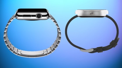
Apple Watch takes things a step further with three editions. The Apple Watch Sport features either an aluminum space gray or silver anodized aluminum case, and the "Watch" has a shinier steel or space black stainless steel case.
Apple Watch Edition really steps things up with an 18-karat rose or yellow gold case. There's also two sizes of Apple Watch - perfect for those with smaller wrists.
Winner: Apple Watch. For once, the Cupertino company is offering customers more choice than its Android-based competitor.
Straps
Whether you call them straps or bands, Apple Watch brings more variety to the wristwatch in this category too. There are six watch straps materials, each available in a range of colors.
Leather options with various closure styles include Classic Buckle, Modern Buckle, Leather Loop, while the Sport Band is ideal for gym-wear thanks to its rubber-like elastomer makeup.
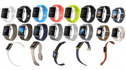
The two metal bands are both stainless steel. There's the Link Bracelet with butterfly clasps (we demoed a similar one for Moto 360 in Chicago last year) and flexible magnetic mesh Milanese Loop.
Best of all, it's easier to swap out the default straps depending on your mood or the occasion.
Winner: Apple Watch. Sure, Moto 360 has metal bands now too, but there aren't as many choices and they're not as easy to change out despite being 22mm. You have to take them to a jeweler. Not so with the Apple Watch.
Watch faces
One of the biggest beefs I've had with Android Wear smartwatches is the lack of watch face options, though the Moto 360 does boast some customizations to default watch faces.
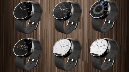
Its Motorola Connect app lets circular smartwatch owners tweak the six pre-loaded watch faces with new color options. That's in addition to the Google Play Store's multitude of third-party watch faces.
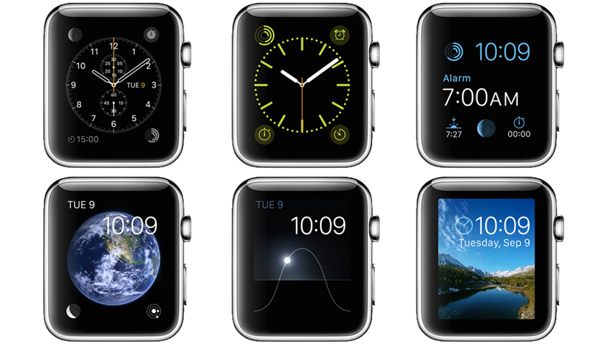
Apple Watch on the other hand has nine watch face, after originally previewing 11, and all of them can be customized even further with what it calls "Complications."
Don't like the color, design element or functionality? Tweak it. Want to even include stock quotes, weather reports, your next calendar event, and a daily activity tracker? Add that too. Apple claims that there are "millions" of different watch face available this way.
Winner: Tie. Motorola does a decent job of letting you alter existing faces, but you have to rely on third-party watch faces for truly custom designs. Apple smartwatch is the opposite, with plenty of tweaks to just nine Apple Watch faces.
- 1
- 2
Current page: Display, design, straps and watch faces
Next Page Specs, interface, apps and fitness