Speaking plainly, Prime Video is ugly as hell. Its menus are cluttered, its library is a muddled mix of free, paid and add-on content and its general user interface (UI) is about as friendly as those Velociraptors in Jurassic Park.
Thankfully, though, executives at the Amazon-owned platform have long been aware of its shortcomings on the design front, and Prime Video is finally getting a makeover worthy of its standing among the very best streaming services in 2022.
Beginning this week, Prime Video is rolling out a new, redesigned experience for subscribers using the Prime Video app on living room devices (such as Fire TV sticks) and Android phones. The overhaul is heading to the streamer’s app on desktop and iOS devices, too, but not until all of those aforementioned devices have received the update first.
So, what’s the big idea? Well, the most significant design change is coming in the form of an upgraded menu navigation system intended to help Prime Video subscribers more easily browse the platform’s roster of movies, TV shows, sports and premium channels.
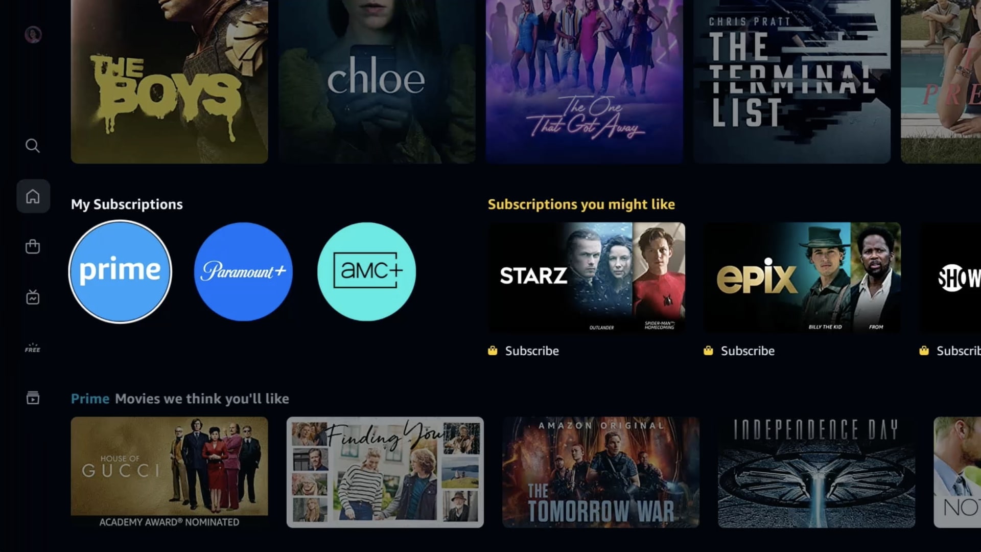
As you can see in the screenshots below, the Prime Video app will soon feature a series of side menu options – Home, Store, Find, Live TV, Free with Ads and My Stuff – whose pages will offer sub-navigation panels to better differentiate between available content.
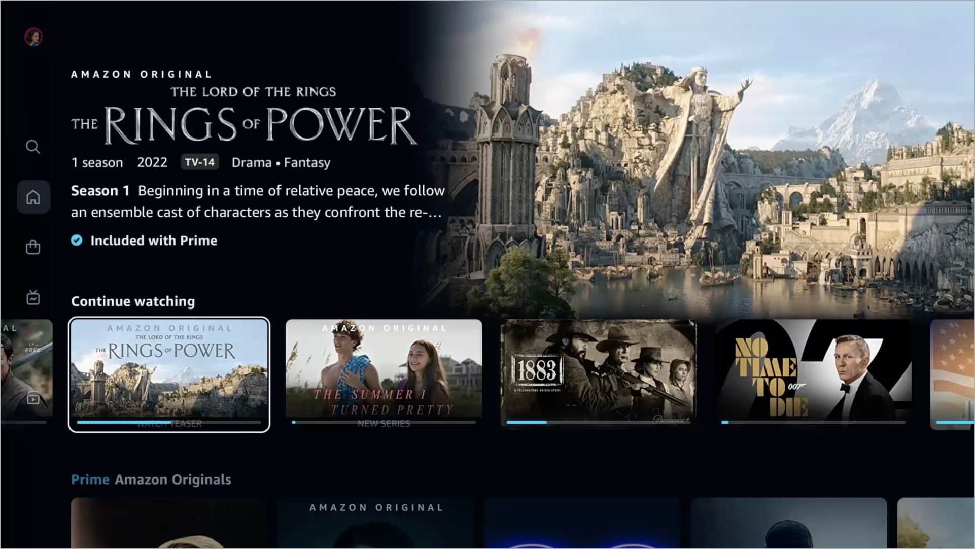
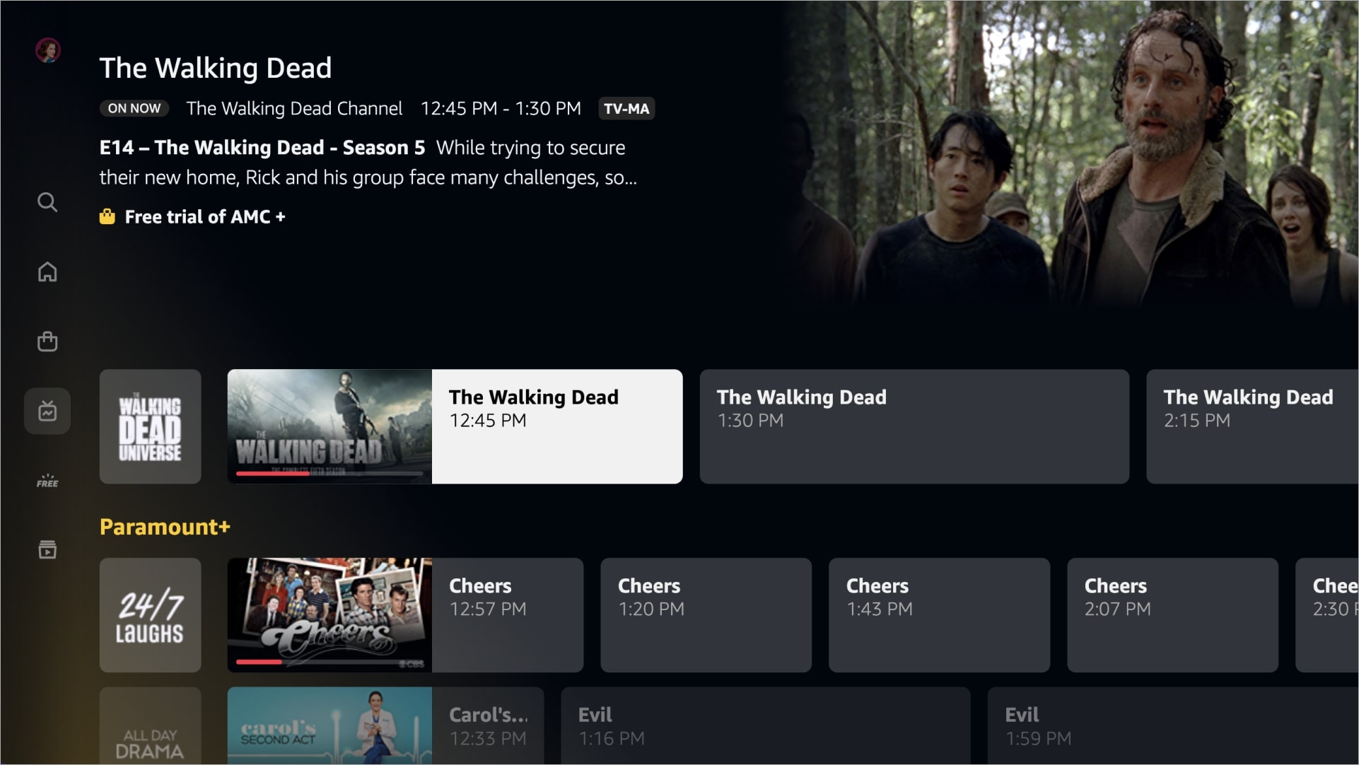
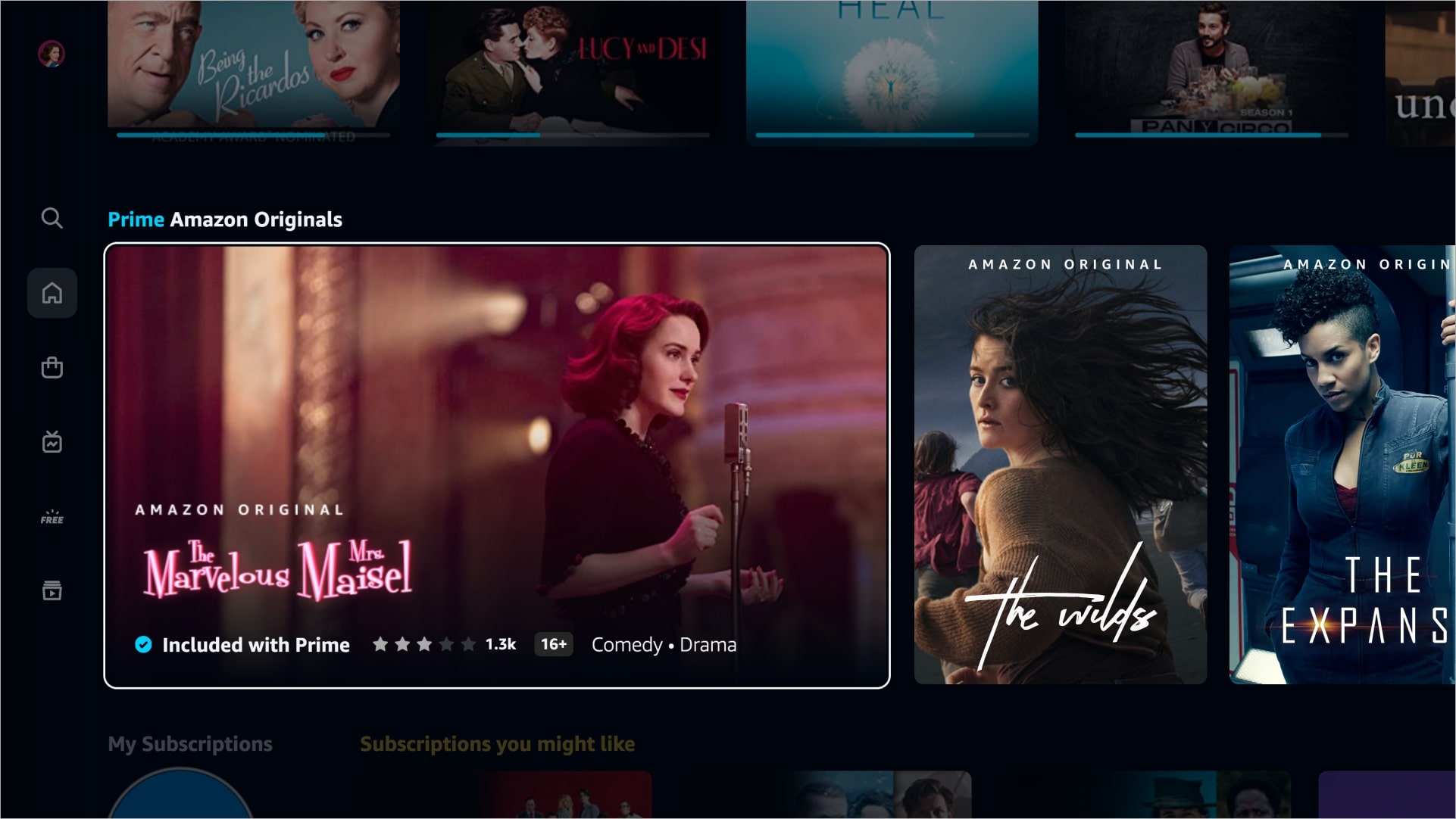
Sports programming, for instance, will fall under a dedicated Sports sub-menu in the Home section, while Prime Video's growing library of original content – which is soon set to include the highly-anticipated Rings of Power series – will appear in a dedicated carousel separate to the platform’s licensed movies and TV shows (similar to Netflix’s originals tab).
Prime Video’s redesign borrows from Netflix in other ways, too. The app will soon feature its own Top 10 Chart, ranking titles based on popularity (presumably over a week-long period) and displaying them in an easy-to-navigate list. Check it out in action below.
Get daily insight, inspiration and deals in your inbox
Sign up for breaking news, reviews, opinion, top tech deals, and more.
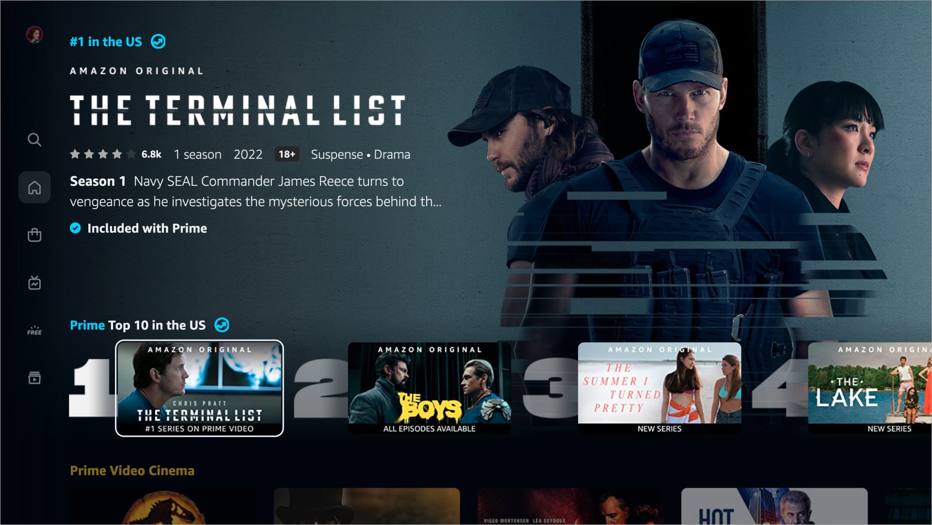
The Prime Video team also appears to have recognized user frustrations surrounding what content is and isn’t available to watch as part of a standard Prime Video subscription.
New visual cues will be added to titles to differentiate between those available for free (marked with a blue checkmark icon) and those available to rent, buy or subscribe to (marked with a shopping bag icon). A handy My Subscriptions tab will appear at the top of the homepage, too, granting easy access to everything included in a user’s membership.
And finally, the Find page will give subscribers the option of searching for specific titles, genres or collections while filtering results by standard or 4K UHD video quality.
As mentioned, the Prime Video redesign will begin rolling out to living room and Android devices this week, with iOS and desktop versions of the app set to receive the update later in the year. We’ll share our thoughts on the overhaul once we’ve tried it for ourselves.
Analysis: a game changer for Prime Video?
In a fiercely competitive industry, an update like this is big news for Prime Video subscribers who may have felt tempted to ditch the service for greener pastures (the likes of Apple TV Plus and Paramount Plus, for instance, have improved immeasurably in 2022).
We recently reported on research that suggests Prime Video currently offers customers the best cost-per-title value of any streaming service in most regions – but we also explained that this purely mathematical value doesn’t make Prime Video the best-value platform, period, citing its poor UI and smaller triple-A content offering versus Netflix and Disney Plus.
Now, though, the streamer looks to have rectified one of those major shortcomings, and with new movies and series on the way soon – coupled with the internet-breaking success of The Boys season 3 – Prime Video is, ahem, primed to mount a more substantial challenge against its biggest streaming rivals in the years to come.
For more of the latest streaming service news, check out our thoughts on Netflix's spatial audio upgrade and our assessment of HBO Max's surprisingly well-received ad-supported plan.

Axel is TechRadar's UK-based Phones Editor, reporting on everything from the latest Apple developments to newest AI breakthroughs as part of the site's Mobile Computing vertical. Having previously written for publications including Esquire and FourFourTwo, Axel is well-versed in the applications of technology beyond the desktop, and his coverage extends from general reporting and analysis to in-depth interviews and opinion. Axel studied for a degree in English Literature at the University of Warwick before joining TechRadar in 2020, where he then earned an NCTJ qualification as part of the company’s inaugural digital training scheme.