Prime Video redesign comes to India - At last, finding content on it may get easy
Much awaited design change

Amazon Prime Video, as long as it was just purveying films and series, could make do with its pain-vanilla screen design. Movies and series were just stacked up in columns based on language and genre, and you just worked your way through them to pick on the content you wanted. Sometimes, content got hidden - algorithms were blamed for this - but gritted you teeth and took in your stride.
But Prime Video also started offering subscriptions to other platforms through Prime Video Channels and also streamed popular movies through early access rentals. But finding your Prime Video Channels and the movies on early access rentals could not be attempted without prayer or two (or worse, a few expletives) on your lips.
Your cries of exasperation were, mercifully, heard by the design folks at Prime Video who announced a redesign in other places. And today, the platform announced that starting this week, Prime Video India is rolling out a redesign on Prime Video app on smart TVs and the Android app. Those using the app on iOS and web will have to wait for some more time to get the redesign.
What are the new updates?

Prime Video has gone about the redesign work with the implicit idea of letting the users find the content easily. Don't ask why it wasn't the case hitherto. Here are the changes in the design that Prime Video has come up with:
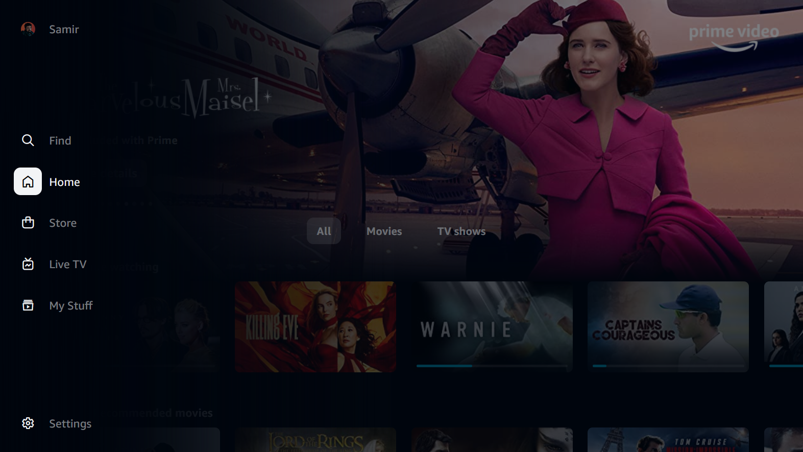
The navigation menu has been tweaked to make broad selection — including movies, TV shows, and premium channels — easy. On the TV app, the new navigation menu has been relocated to the side of the screen. "The app will launch with five primary pages: Home, Store, Find, Live TV, and My Stuff. Customers will also have sub-navigation options to more easily browse by content or offer type, such as 'Movies' or 'TV shows' on Home, and 'Channels' or 'Rent' on Store."
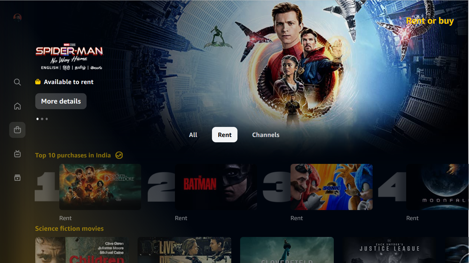
Talking of 'Store', it is single destination for accessing movies to rent, along with a wide selection of Channels available as add-on subscriptions. That's, your Prime Video Channels subscription and the list of movies available on early access rental would not be hidden anywhere, but would be available in 'Store'. This, it has to be said, is indeed convenient and easy for users.

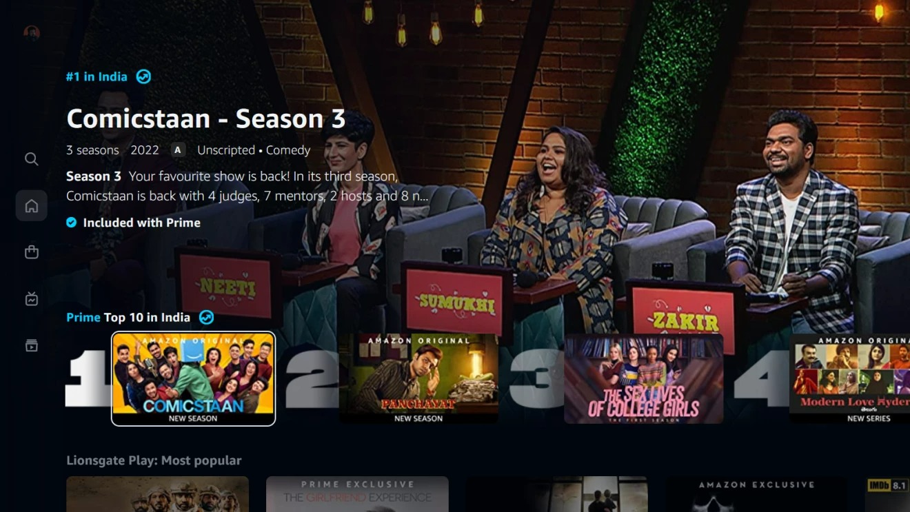
The new Prime Video app has new carousels that present videos with more appealing cinematic imagery. There are also some elements that Prime Video seems to have borrowed from, says Netflix. It too now has a 'Top 10 chart'which showcases popular and trending content on the platform.
Get daily insight, inspiration and deals in your inbox
Sign up for breaking news, reviews, opinion, top tech deals, and more.
The platform said that its "new design features make it easier for customers to tell what content is included with their Prime membership vs. what is available for purchase, either to rent or via an add-on subscription."
It has come up with visual cues to clearly indicate this. Those that are included with the subscription get a blue checkmark icon, and those that are available to rent or subscribe are marked with a gold shopping bag icon. In 'Search' too, the new visual cues would be shown to clearly indicate which videos are included for customers (marked with a blue checkmark icon) and which are available to rent or subscribe to (marked with a gold shopping bag icon).
Prime Video's competitors have a task on their hands

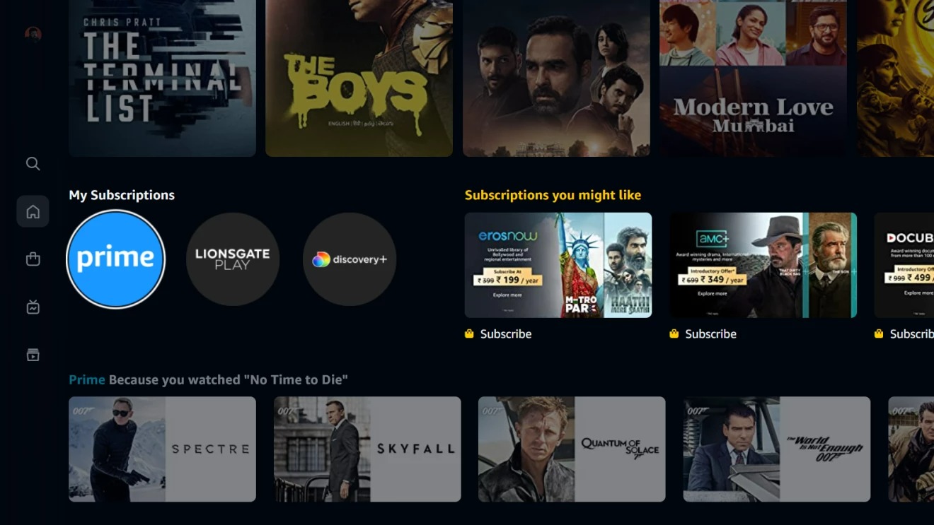
Near the top of 'Home' within the “My Subscriptions” row, users can access all videos included with their Prime membership, as well as any Channels they may have subscribed to, with only a single click.
On the new “Live TV” page, users also get a program guide which will show what is currently on-air from add-on Channels, as well as find out when future programming will begin. Customers can immediately view any live station to which they are subscribed, or simply click-thru to start a subscription for a new Channel.
‘My Stuff’ will allow customers to keep an easy tab on their downloaded videos, watchlists and also manage their Channel subscriptions, along with rented movies.
Prime Video has done what was expected of it, but the new design has come not a day too soon as the clutter so far was kind of spoiling the viewing experience. Now it can take on its competitors with more confidence. Others like Disney Plus Hostar, Zee and SonyLIV in India need to match this. Their apps, as they exist now, are not all that user-friendly. The ball is now in their court.

Over three decades as a journalist covering current affairs, politics, sports and now technology. Former Editor of News Today, writer of humour columns across publications and a hardcore cricket and cinema enthusiast. He writes about technology trends and suggest movies and shows to watch on OTT platforms.