TechRadar Verdict
The 'e' in Samsung Galaxy S10e stands for 'essential', which means it packs almost everything the S10 and S10 Plus have, at a lower price. You get a 5.8-inch screen, the same two primary cameras, and all-day battery life, but you’ll miss out on a third lens, the curved display edges, and the in-screen fingerprint sensor. That's the tempting compromise offered by Samsung's 'budget flagship' and answer to Apple's iPhone XR.
Pros
- +
Fast phone you can use one-handed
- +
Superb camera for the size and price
- +
Wireless PowerShare is useful
Cons
- -
Dual-camera compromise
- -
No in-screen fingerprint scanner
- -
Noticeably thicker than the S10
Why you can trust TechRadar
The Samsung Galaxy S10e was the company's flagship phone with 2019 specs and features at 2016 prices, giving consumers the opportunity to nab top features form the Galaxy S10 at a solid discount.
The handset is no longer one of Samsung's newest smartphones, as it has been succeeded by two generations of flagship phones. While the newest Galaxy S21 lineup doesn't include an affordable 'Lite' phone equivalent, the Galaxy S20 Fan Edition released later in 2020 fills that role for an update on the S10e. We'll leave our reviews for the main S21 phones here to compare specs.
The Samsung Galaxy Note 20 has also been released, but if you want the absolute top-tier stylus handset, you'll want to go with the Samsung Galaxy Note 20 Ultra. We didn't receive another budget flagship in the Note 20 line, so the S10e's biggest competition is the aforementioned S20 Fan Edition – though its larger sizes mean the S10e remains the affordable pick in a smaller form factor.
In such a way, the S10e (‘e’ for ‘essential’) has plenty in common with the Apple iPhone 12 mini, and it’s easy to see it as the Samsung budget flagship for its line: both pack the standout perks of their generation while shaving off a few extras present in their costlier siblings. While Apple's new compact flagship has better specs and 5G connectivity, the S10e is still a cheaper option.
But you probably won't be picking between either less-expensive device - you'll be eyeballing those handsets compared to their costlier siblings. We found the S10e to a robust phone that's worth forgoing the extra perks in the S10 (which is $150/£113/AU$210 more) or the S10 Plus ($250/£189/AU$350 more). As a bonus, the S10e’s smaller dimensions will certainly appeal to folks who don't appreciate the increasing size of flagship phones.
The Samsung Galaxy S10e may pale in comparison to the company's later flagships, but if you're looking for a useful 2019 smartphone that's still better than its contemporary Galaxy A phones, you're in luck.
- Read our Samsung Galaxy S10 review
- Read our Samsung Galaxy S10 Plus review
- Read our hands-on Samsung Galaxy S10 5G review
- And here's all you need to know about the Samsung Galaxy Fold
Naturally, there are compromises for that lower cost. The S10e doesn’t get some of some of the neat features packed in its pricier siblings, like an in-screen fingerprint sensor, curved screen sides or a telephoto lens. These perks have indeed appeared in more handsets in 2019, like the Huawei P30 and OnePlus 7 Pro, so it’ll be curious to see if their exclusion gives you flagship phone envy.
But we doubt you’ll be too jealous. The Galaxy S10e is a one-hand-friendly phone with outstanding specs to match - a combo that will endear the handset to you. Its 5.8-inch all-screen display is easy to hold and its chipset is fast enough that it’ll compete with other flagships for years to come, even if its compromises in display resolution and camera fall short of the Samsung Galaxy S10 and Galaxy S10 Plus.
Samsung Galaxy S10e price and release date
The Samsung Galaxy S10e came out on March 8, 2019 in the US, Canada, Europe, India, China, and other select countries. It’ll roll out to a total of 130 markets by the end of March, though the company hasn’t specified exactly which countries it’ll be available in by then.
Now that the S20 line has launched, the Galaxy S10e has a discounted pricetag of $599 / £499 / AU$1,199 / AED 2,699 for the 6GB of RAM and 128GB of storage version, and that price goes even lower during deals seasons.
If you want the slightly more powerful 8GB of RAM and 256GB of storage, at this point, it seems like it’s only available on the US Samsung online store, and you’ll pay $699 (prices aren’t available outside the US) for it. It’s unclear if this means the higher-priced model isn’t available in other regions.
Design
Weight: 150g
Dimensions: 142.2 x 69.9 x 7.9mm
OS: Android 9
Screen size: 5.8-inch
Resolution: 1080 x 2280
CPU: Octa-core chipset
RAM: 6/8GB
Storage: 128/256GB
Battery: 3,100mAh
Rear camera: 16MP + 12MP
Front camera: 10MP
As previously stated, one of the Galaxy S10e’s more attractive features might, ironically, be its smaller size. As main flagships get ever-larger, a contingent of consumers have steadily gone for smaller phones – just look at the popularity of the iPhone SE (RIP) - and the S10e is as manageable as top-tier phones get with a width of 2.75 inches. (Curiously, the iPhone XS is the smallest of its generation, and the S10e is smaller than that phone by a hair.)
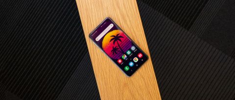
The S10e otherwise looks like a shrunken version of its pricier siblings, with a few exceptions. Samsung didn’t include the Galaxy line’s Infinity Edge tapered display in this less expensive model, so you’ll have to accept a flat front screen with more noticeable bezels. As it’s the smallest of the S10 line, the S10e is also the lightest, coming in at 150g - which is another feather in its cap when compared to the 208g iPhone XR.

While the S10e doesn’t have its pricier siblings’ fancy in-screen fingerprint scanner, Samsung didn’t leave a biometric fingerprint pad on the back, opting instead to put a small capacitive sensor within an enlarged power button on the top-right side. It’s surprisingly responsive, though it works far better with thumbs. Why? Because you have to cover the whole sensor with your digit, and mashing your fingertip flat enough to envelop the button is tough from any angle. Just use a thumb.
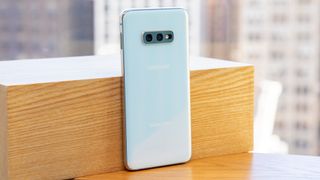
Otherwise, the phone looks flagship, with a chromed aluminum case sandwiched by attractive glass and the elegant rounded corners we’ve come to love in the Galaxy S line. The rear has a narrower camera bump than its pricier siblings due to the lack of a third camera and the absence of a heartbeat sensor (which might be an admission that folks weren’t using it much anyway).

The phone officially comes in six colors, though only four are available in the US: Prism Black, The pearlescent Prism White, shimmering Prism Blue, and the new punchy pastel Flamingo Pink. Sadly, Prism Green and Canary Yellow are restricted to other regions.
The S10e’s left edge has the volume rocker, which is responsive and functional. Below it sits the much-disliked Bixby button, but fear not: Samsung has gamely allowed you to finally use it to activate other apps. There is a caveat: the button functionality has been split into single and double presses, and one of those must activate Bixby.

Luckily, it’s easy to cordons Bixby to double-press and set single-press to whatever your heart desires. Considering how much Samsung has fought to keep third-party apps from remapping Bixby out of the picture, we’ll take this compromise.
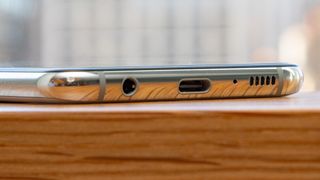
On the bottom edge, you’ll find a center-mounted USB-C port, microphone port, speaker grille and...a 3.5mm headphone jack. Samsung has kept its trash-talking high ground.
Display
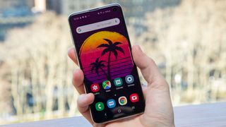
The 5.8-inch AMOLED display lives up to the Galaxy S name, with bright colors and crisp detail. If you don’t quite like the color balance, you can tinker with an easy fix called Vivid Mode, which does what it says on the box and lets you further tweak it to be a warmer (more red) or cooler (more blue) picture. If even that isn’t enough, you can tinker with the RGB levels individually.
Side-by-side with an iPhone XS Max, the S10e’s screen kept up gamely, losing out only on the darkest scenes in a media comparison (the ‘Blackwater’ episode of Game of Thrones is good fodder for this. Just saying), where backgrounds of varying blacks average out into dark gray smudges.

This is somewhat expected, as the S10e has a single 2280 x 1080 (438 ppi) resolution setting. Samsung sets this as the default for its flagship phones, but both the S10 and S10 Plus max out at 3040 x 1440 for a higher ~550 ppi. One other minor difference between the models: the S10e has Corning Gorilla Glass 5 on front and back, while its bigger siblings have had their front display’s glass upgraded to Gorilla 6.
What the whole S10 line has in common, however, is the punch-hole in the top-right corner of the screen, the source of the Samsung-termed ‘Infinity-O’ display. It’s noticeable, like the notches before it, though far less an eyesore than the wider camera tabs found in the likes of the iPhone XS and XS Max.
In some ways, dropping the hole within the display looks more attractive than tucking it into a corner, as the eye naturally gravitates toward the uninterrupted borders of the lit screen rather than the circular cutout. But it also feels like Samsung’s flexing its design and manufacturing chops here rather than offering a dynamic solution to the front-facing camera issue. Whether you like it or not will probably come down to personal taste – we like it, but wouldn’t hold it against you to dismiss the punch-hole as a stopgap stunt.
In any case, most media apps will automatically black-bar the top and bottom of the display to fit their aspect ratio, which envelops the punch-hole. Don’t worry about it getting in the way of your binge sessions.
- Take a look at our Samsung discount codes for the best Samsung offers and savings.
David is now a mobile reporter at Cnet. Formerly Mobile Editor, US for TechRadar, he covered phones, tablets, and wearables. He still thinks the iPhone 4 is the best-looking smartphone ever made. He's most interested in technology, gaming and culture – and where they overlap and change our lives. His current beat explores how our on-the-go existence is affected by new gadgets, carrier coverage expansions, and corporate strategy shifts.
Most Popular


