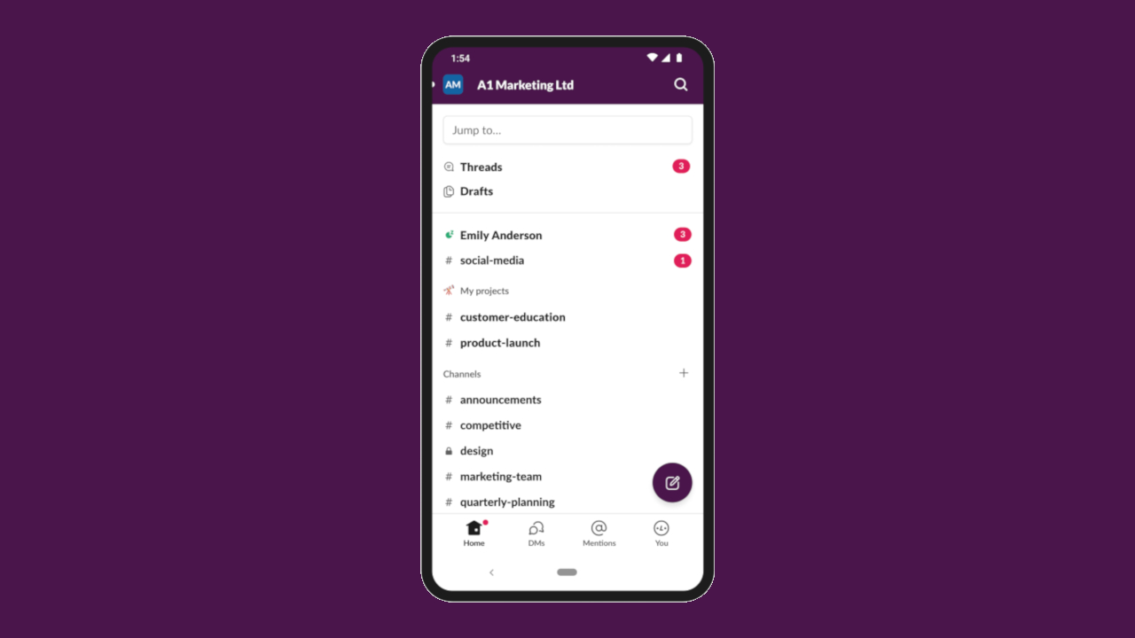
Slack update makes it easier to collaborate on mobile
New navigation features and a tab bar have been added to Slack's mobile apps

After updating its desktop app with a major design overhaul earlier this year, Slack has now released updated versions of its iOS and Android apps that aim to provide users with a simpler and more organized mobile experience.
One of the biggest changes in the company's new redesign for mobile is the addition of tabs to provide quick access to all of the things users need at the bottom of the app. Slack's previous navigation system was confusing and unconventional which is why it decided to go back to basics to provide a navigation experience that most mobile users will expect in the form of a tab bar.
The new apps now include swipe gestures that allow users to easily navigate between screens. From any tab in Slack, users can swipe right to open a list of their workspaces or swipe left to go back to their last conversation. From within a conversation, users can also swipe right to get back to their last tab.
- Slack now lets you choose where your data is stored
- You can now join Microsoft Teams calls from Slack
- The future of workplace communication
Slack has also made it easier to work with other apps by using shortcuts. Some apps include shortcuts that allow users to take actions in another service without leaving the workplace chat app. This makes it easier to take actions in Slack such as initiating a call, setting a reminder or creating a poll. To get started using app shortcuts, users now just need to tap on the lightning bolt icon below the input bar.
Direct messages, mentions and availability
In previous versions of Slack for mobile, it was difficult for users to reach their list of direct messages (DMs). In the redesign though, recent conversations now appear as a tab in the tab bar and can be accessed by tapping on the DMs icon.
While testing its redesigned mobile apps, Slack moved the “Activity” screen to a more prominent location in the app and renamed it “Mentions and reactions”. After making this change, the company received strong feedback from its testers that Mentions and reactions had quickly become a core part of their daily usage patterns and had significantly improved how they work on mobile.
Slack has also made it easier for users to set their availability as in the previous design, these controls were in a menu that was difficult to find. Now users can update their status, set their availability, snooze notifications and access their preferences from the “You” section in the tab bar.
Are you a pro? Subscribe to our newsletter
Sign up to the TechRadar Pro newsletter to get all the top news, opinion, features and guidance your business needs to succeed!
At a time when everyone is now working from home, Slack's redesigned mobile and desktop apps will make it easier for workers to stay connected with their teams while also being more productive.
- We've also highlighted the best online collaboration tools
Via ZDNet
After working with the TechRadar Pro team for the last several years, Anthony is now the security and networking editor at Tom’s Guide where he covers everything from data breaches and ransomware gangs to the best way to cover your whole home or business with Wi-Fi. When not writing, you can find him tinkering with PCs and game consoles, managing cables and upgrading his smart home.
