7 cool creations from Adobe's secret labs
An end to blurry photos, better image searching and more
Sign up for breaking news, reviews, opinion, top tech deals, and more.
You are now subscribed
Your newsletter sign-up was successful
Join the club
Get full access to premium articles, exclusive features and a growing list of member rewards.
Every year, Adobe shows off some cool prototypes and features that different teams are working on, that might or might not show up in a product sometime in the future.
This is how we first saw content-aware fill: a tool in Photoshop CS5 that can fill in the background when you erase the stray tourist in the corner of your otherwise-perfect landscape shot.
We've also seen great ideas - like being able to apply a filter that would give your image the look of a particular photographer (instant Ansel Adams black and white photos, for example) - that haven't turned into a real feature yet.
Article continues belowSome of these are features the product teams are working on. Others are ideas put together in a developer's spare time; in one case, the developer is an intern who's only been with Adobe for six weeks. They're all really cool and cutting-edge features for getting more from your media. Here are seven Adobe labs projects to be excited about.
1. No more blurry photos
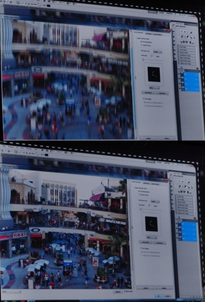
When you take a picture, if it comes out blurry then either you had the focus wrong - or the camera moved while the shutter was open. If you can work out exactly how the camera moved, you could 'subtract' that motion and calculate what the picture would look like without it.
Start with a blurry photo from a smartphone you were shaking around, end up with a crystal-clear snap where you can read the text on a poster. If Adobe can make this work well enough to ship, everyone is going to want it.
2. Layers that can overlap
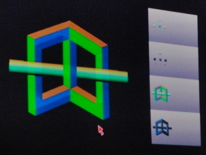
If you want to combine sections of two different photos - like the CAD rendering of next year's motorbike and a photo of a fun road to ride it on - to make an image, you can do that with layers, one on top of each other.
Sign up for breaking news, reviews, opinion, top tech deals, and more.
But suppose you want the motorbike to go behind the rider and in front of the tree in the original photo? Today you have to copy different bits and pieces out of the photo into different layers you stack up. With more powerful layers you could slide parts of one layer under or over another, like weaving a basket. This impossible Escher-style object is a great example.
3. No more badly dubbed films
Rubadub is an idea for dealing with the lip sync problem that makes some foreign films so hard to watch; it analyses the original soundtrack and automatically stretches and compresses the new audio to make it fit - so the voice matches the lip movements. Even more impressive; this is the project done by a summer intern; we think he's getting a full-time job at Adobe!
4. Combine different videos of the same event
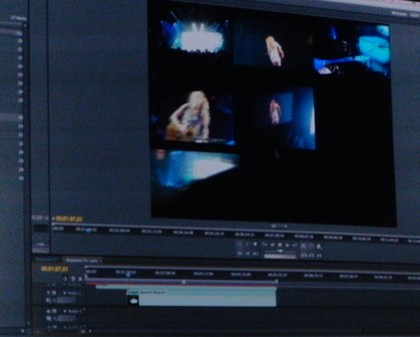
Search for a concert on YouTube and you find lots of videos from different angles, starting at different times, some with great audio, some drowned out by audience noise.
Imagine being able to play them all back at once to get a multi-camera video and have them sync up automatically, and have the best sound track playing. Figuring out the points that are the same across all the videos and using those to sync the clips turns shaky fan videos into something special.
5. Searching photos - using a photo
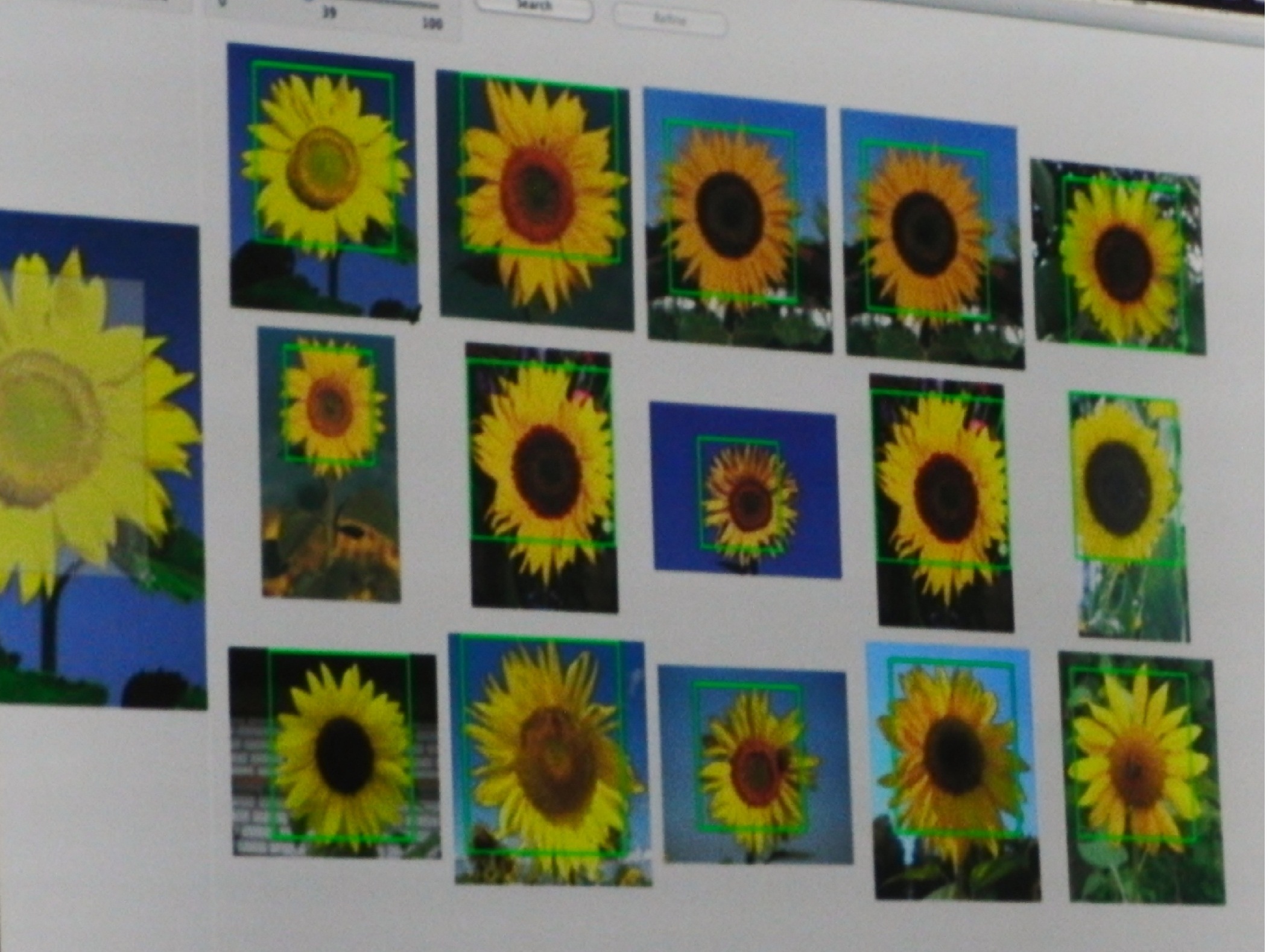
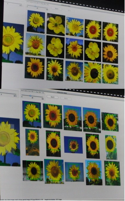
You can search for 'similar images' on Google and Bing already but the results can be odd enough to qualify as quirky artwork in their own right. Adobe showed us a 'related photos' search that can tell the difference between buttercups and sunflowers, or between the Coca Cola can in the foreground and the building behind it. Turns out the secret is letting you choose which part of the image you care about.
6. Use 3D inside a video
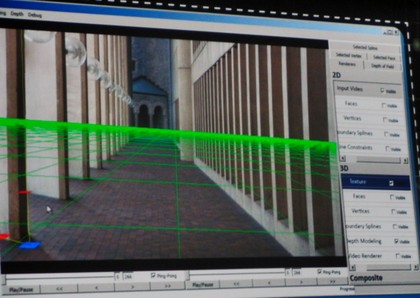
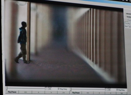
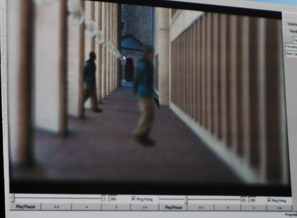
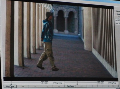
Detecting the dancer and the background enables your TV to show ballroom dancing in fake 3D that looks rather odd. A similar technique used for editing is much more useful; select a figure walking across a row of columns and if the video editor can detect where the columns are you can move the figure so they walk behind a column and disappear (or copy them to have two actors on screen at once).
You could also move the camera around the scene - like Blade Runner - or change the focus to the actor rather than the background. And with a fast graphics card, you could do it all in real time; we can see some amazing gameplay based on this kind of real-time video editing.
7. Tap that works on phones and PCs
NFC is coming; the same technology that makes Oyster cards work will be in phones and Windows 8 tablets. Adobe wants to put support into Air so the same application on Android and on Windows can play a trailer when you tap a DVD case - or get your blood glucose level from a future sensor you could wear on your wrist. The easier it is to use NFC in an app on lots of platforms, the more apps will do clever things with it.
Plus: Page layouts that work on any screen size
Adobe has more than seven interesting ideas: we also really like 'liquid layout'. The digital magazine page that looks so good on your iPad might end up with black bars down the side on a 7" PlayBook or Xoom or stretched way out on a big notebook screen. Letting a page designed for paper stretch the way a web page does with columns getting narrower and wider is harder than you expect, but it's on the way.
Mary (Twitter, Google+, website) started her career at Future Publishing, saw the AOL meltdown first hand the first time around when she ran the AOL UK computing channel, and she's been a freelance tech writer for over a decade. She's used every version of Windows and Office released, and every smartphone too, but she's still looking for the perfect tablet. Yes, she really does have USB earrings.
 Become a TechRadar Insider


