5 smart Mac OS X Finder alternatives
Apple's file browser getting you down? Then try one of these
Finder is a love-it-or-hate-it app. Although it's efficient, Finder's restrictions irk some users.
If you're feeling frustrated, check out one of these five potential replacements.
1. Path Finder ($39.95)
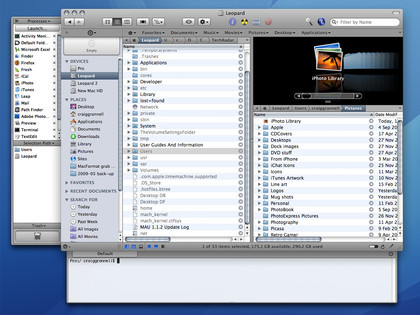
The hugely configurable Path Finder feels like a 'pro' version of Finder, and includes tabs, cut and paste, independent Cover Flow, built-in editors, a drop stack, and a dual-pane view. While its stability is sometimes questionable, it can function as a straight Finder replacement.
2. Leap ($59)
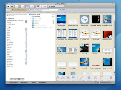
Ironic Software's Leap file browser is a peek into the future, where flat hierarchies rule and tags have conquered folder models. Initially disconcerting, Leap's tag-infused type/location model for finding items while refining a selection by drilling down into folder structures soon feels natural. Although pricey, Leap is great for making sense of chaotic drives.
3. ForkLift ($44.95)
Get daily insight, inspiration and deals in your inbox
Sign up for breaking news, reviews, opinion, top tech deals, and more.
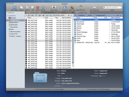
Although primarily an (S)FTP client, ForkLift is also an excellent dual-pane file manager. Quick Look, Spotlight and Smart Folder support means important Finder bases are covered. Tabs, any-to-any copying and access to archives without unpacking them ensures ForkLift has key unique features for anyone regularly working with multiple devices and archives.
4. FileBrowse ($25)
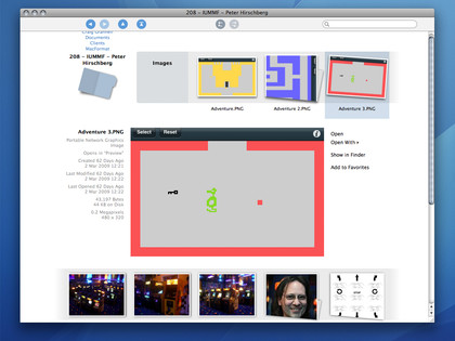
More a companion to Finder than an outright replacement, FileBrowse excels at media browsing. Folder icons are generated on-the-fly for a content overview, and in-context previews enable rapid navigation of images. (Deep is another browser for photographers and designers, filtering search results by palette.)
5. Liquifile ($19.90)
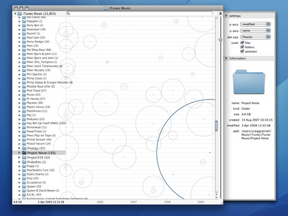
Liquifile is an oddball app which uses a concept called liquid browsing, representing the size and modification dates of files and folders by circles - for example, larger circles to the right of the timeline-labelled grid are newer and larger. You can also optionally flatten folder hierarchies within the view. Compared to Leap's filtering, Liquifile feels somewhat quaint, but it's worth a look for the visually inclined.
