Creative much? How Surface Pro 3, not iPad, is Adobe's best canvas
Latest Creative Cloud updates get touchy-feely

The right tools
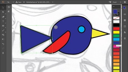
Among the new drawing tools Adobe introduced for Illustrator CC 2014 is Curvature, which allows artists to create smooth curves by tapping once, or corner points and straight lines with two taps instead. (The same trick can also be used on Windows or Mac desktop systems.)
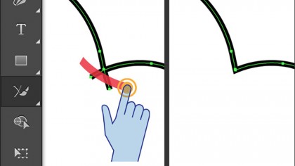
Likewise, the new Join tool makes it insanely easy to connect paths that failed to intersect or overlap while drawing. In addition to adding the necessary connections, Join is also capable of removing overlapping segments as well – tasks that previously required more advanced skills on the desktop.

Adobe also incorporated a couple of new features that first debuted on the company's iPad apps, and they're quite cool. Using the Shapes Ruler and Stencil tool, artists can make short work of straight and parallel lines, angles or even complex French curves by controlling a virtual ruler on-screen with two fingers.
Going one step further, the Shape Builder tool allows artists to combine or remove shapes from an object with ease, turning a cluster of seemingly random lines into a much cooler lightning bolt, for example.

Baby steps
By comparison to Adobe Illustrator CC 2014, legendary image editor Photoshop CC 2014 takes a somewhat smaller step into the future. Rather than introducing a dedicated Touch Workspace for the legacy application, Adobe has instead introduced little enhancements all over the existing UI, making it easier to use on touch or pen-equipped devices like Surface Pro 3.
One of the bigger improvements involved increasing the size of icons and touch targets by 200 percent over the previous version, which makes tools and buttons far easier to tap on. Drawing lines or strokes with a pen is also more accurate and natural, thanks to a combination of higher frequency sampling on hardware and software alike.
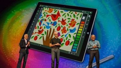
Of course, the biggest advantage of the Touch Workspace and Surface Pro 3 combo is the ability to place a crisp, colorful 12-inch display right into your hands or lap. Designers are no longer chained to the desktop or encumbered by a notebook keyboard and trackpad separating them from the work.
Get daily insight, inspiration and deals in your inbox
Sign up for breaking news, reviews, opinion, top tech deals, and more.

A few caveats
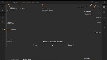
Unfortunately, the Touch Workspace experience hasn't been totally streamlined with this initial release. For starters, opening an existing Illustrator document throws the user straight back into the Desktop's trusty old open and save dialog box, rather than the more Modern (formerly "Metro") environment found on Windows 8.
Other niceties like Save As are also missing from Illustrator CC's Touch Workspace mode, so artists will need to temporarily switch back to the classic user interface whenever they want to save alternate versions of the currently open document.
Despite these few UI nitpicks, Touch Workspace makes for a compelling addition to Adobe Creative Cloud, and makes Surface Pro 3 a must-have for anyone who spends time drawing or painting with Illustrator CC. (For the moment, Photoshop CC users have less reason to cheer, but the additional features do make the application easier to use while disengaged from a keyboard and mouse.)
- 1
- 2
Current page: Surface Pro 3 with Adobe: tools and retooling
Prev Page Microsoft Surface Pro 3's Adobe Touch Workspace