Instagram for Android app gets first major makeover in nearly 2 years
So fresh and so clean

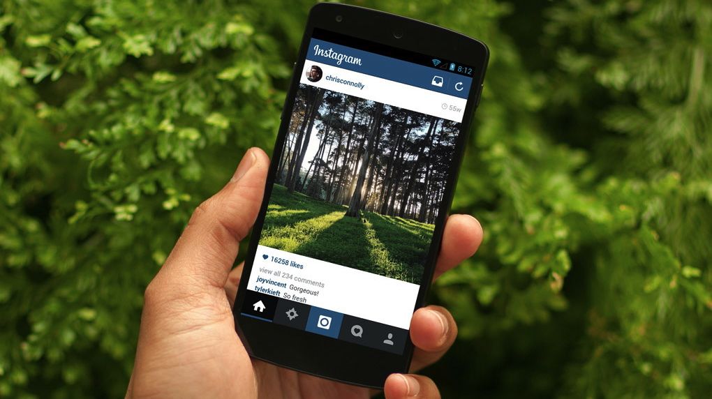
In its first major visual overhaul since it launched in April 2012, the Instagram app for Android is sporting a cleaner look and faster feel, one that elevates the 'gram's game on Google's mobile OS.
"We wanted to focus in on our Android users," Phillip McAllister, engineering manager at Instagram, told TechRadar. "Android is a first-class citizen for us and we wanted to provide a better design."
This means a faster, richer Instagram Android app, one designed for the Google-powered operating system that stays true to the photo sharing service.
"This new design is both uniquely Android and uniquely Instagram," McAllister said. "It's more in harmony with the Instagram platform and will have the familiarity Android users enjoy."
It's also about giving a nod to the blossoming global market; according to Instagram, more than 60% of its users are located outside the US. Almost half of its overall users come by way of Android.
By paring the app down, including chopping its size by half, Instagram aims to make it chummy with the wide array of Android devices used in regions around the world.
What's new with Android's Instagram
Users will notice a crisper, more streamlined look to the Android app. The redesign has extended down to the fonts and icons, giving the overall app an up-to-date appearance. Don't look for a host of new features here - this overhaul is all about capturing greater visual appeal and keeping most of the app's functionality intact.
Get daily insight, inspiration and deals in your inbox
Sign up for breaking news, reviews, opinion, top tech deals, and more.

Though McAllister said the company strives to keep its Android offering on par with its iOS counterpart, there's undoubtedly some design carry-over from the Apple version, which saw its own overhaul late last year.
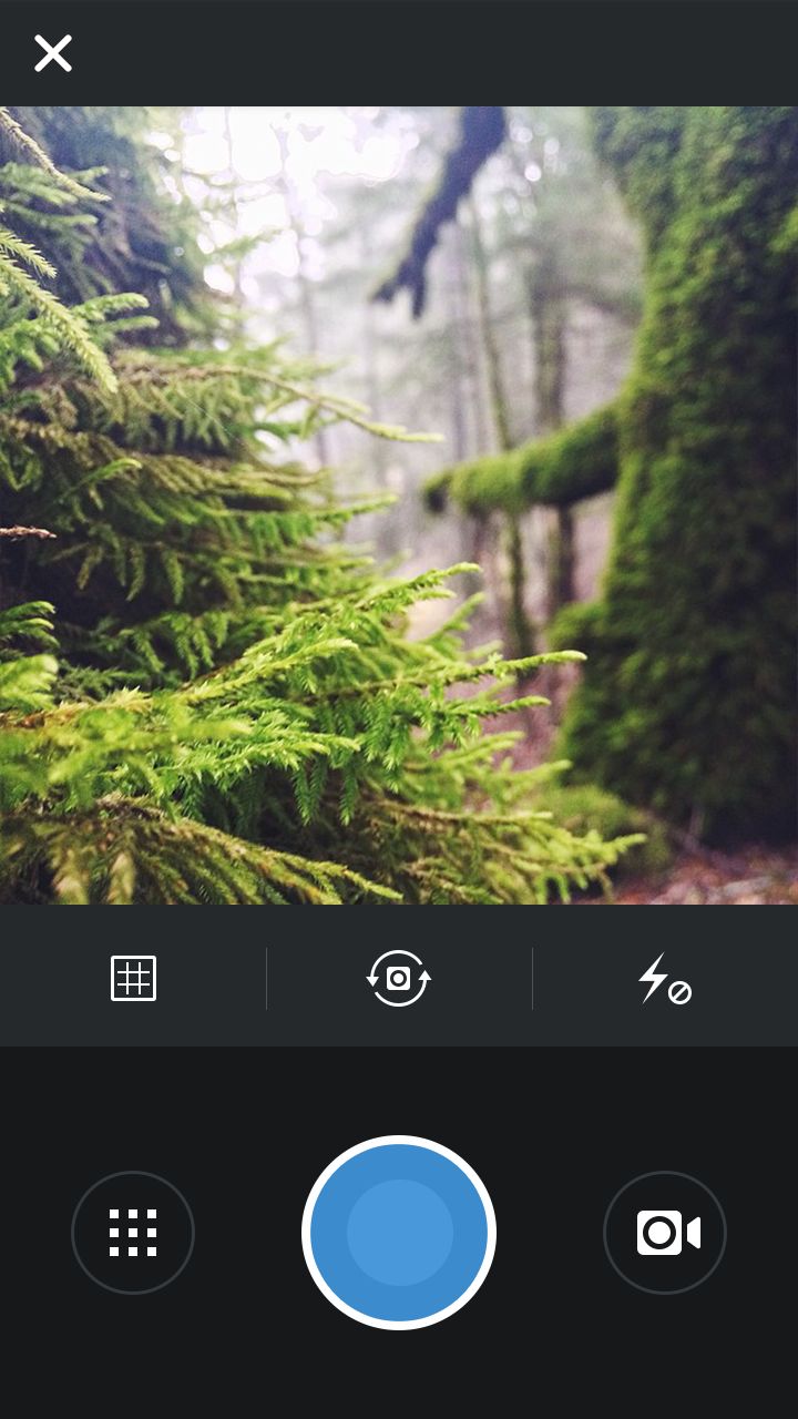
For one, the blue orb that lets users take a picture in Camera in the iOS app is now beaming for all droids to see. It has a bit of a twist on the original monotone blue circle, as do some of the other rejiggered icons, but the overall look of the Camera UX is in line with iOS.
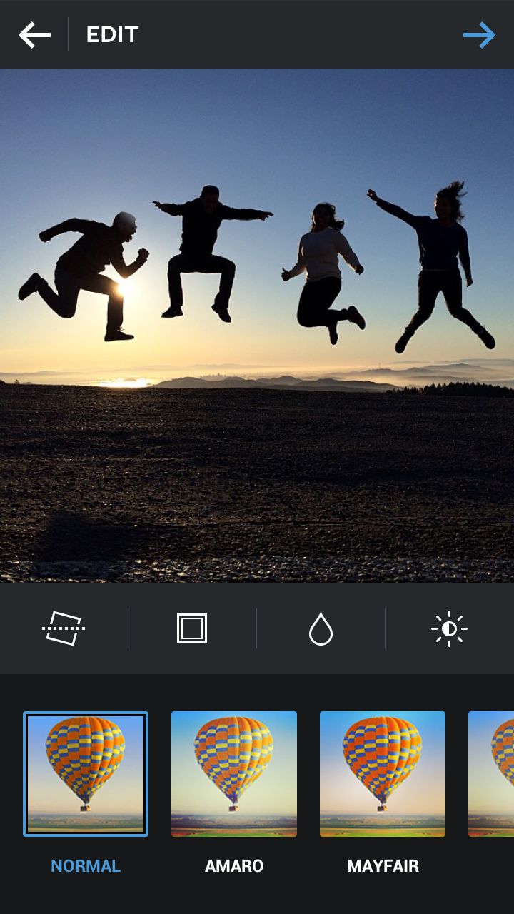
For McAllister, the most noticeable changes are to be found in the Camera and Sharing screens. The makeovers allow for more room for the Camera's tools, and make "better use of the screen space for richer and fuller photos."
The changes aren't limited to the Camera layout, though these are generally more subtle.
Profile pages are largely the same except for a few design tweaks, namely the disappearance of dividing lines, and the Explore tab touts the app's new iconography.
The Edit tab has undergone a tweak that sees all commands pushed to the bottom, leaving the photo to take up most of the screen space. Some fresh air was breathed into the Feed, though again the changes aren't radical (take a peek at the time-posted clock and colored hearts to see what we mean).

Get up and gram
Despite focusing on the app's aesthetics, there are some functional improvements as well.
In addition to cutting its size down (amounting to faster download times and less space on storage-starved devices), the app will also now better fit varying screen sizes, whether large phablet or petite Mini, by self-identifying the display's dimensions and adjusting accordingly.
Finally, the Android app is noticeably faster than previous iterations; McAllister said there's a 20% speed difference on some devices and the profile tab is capable of loading almost two times faster.
"The feeling of the app is a lot faster," he said.
The new look will be available in Instagram for Android version 5.1, and ready for downloading today in the Google Play Store. All you need is Android 2.2 and up to give it a whirl.
Michelle was previously a news editor at TechRadar, leading consumer tech news and reviews. Michelle is now a Content Strategist at Facebook. A versatile, highly effective content writer and skilled editor with a keen eye for detail, Michelle is a collaborative problem solver and covered everything from smartwatches and microprocessors to VR and self-driving cars.
