


Microsoft has released its first visualisation app for Office 2013 and Office 365 in the form of a histogram function that can be used with Excel.
The app has become available on the Microsoft Research website, and is the first in a series as the company experiments with visualisation types.
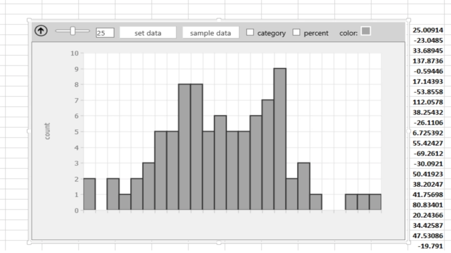
The Microsoft Research Histogram shows the distribution of data, counting and categorising data points and creating a bar graph of their frequency. It's possible to view data by categories or continuous values.
A web version of the app working on Excel is available on the site.
TOPICS