Oh my Word: even when they're free, Microsoft's Office apps look depressing
There's nothing excel-lent here, says Phin

Microsoft made Office free for iOS and Android this week (previously it was free to download but you needed an Office 365 subscription to do more than read documents). Microsoft tried to spin this as something it had basically intended to do all along – instead of, as it likely actually is, a last-ditch attempt to cling to the vestiges of relevancy.
In a move that sounded like nothing so much as a teenager telling you he 'meant to do that' when he screws up a skateboard trick and breaks an ankle, Microsoft's head of Office marketing, Michael Atalla, told The Verge, "It's an extension of the strategy that we've got. It's not a total strategic shift, as much of an extension of the existing strategy."
I idly thought about checking out some of the Office apps on iOS again. Turns out I'd deleted them from my iPad after pawing at them a bit on their initial release because, as someone who only uses Office apps under very noisy protest, I most decidedly do not have an Office 365 subscription.
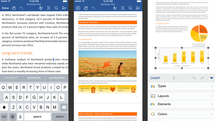
So I went to download them again out of professional curiosity, and as Word was downloading, I noticed that it had one of the new video previews on the App Store as well as still screenshots, so I watched that. This drew me to looking more closely at the other screenshots; screenshots, remember, designed to make you so excited about Word that you install it.
Go on; take a look at the screenshots for Word on iOS. Or, if you'd rather not sully your browser, here's my executive summary: they're all about executive summaries. And pie charts. And long-term trends. And customer research. And, God help us, a child playing with a kite in a wheat field presumably to break up the unrelenting grimness of the screenshots.
Yuck yuck yuck
If you use Word, Microsoft is saying, 'We know it's because you have to use it for this kind of soulless, turgid and utterly dispiriting tripe. It's fine. If you're doing anything even vaguely creative, you'll probably already be using Pages and we can't tempt you back from that.'
Pages screenshots show an exciting, beautiful poster for people heading off on a fun adventure, for Pete's sake. (Mind you, on closer inspection, the adventure in question appears to be flying a damned kite; have I just stumbled onto some massive global desk top publishing conspiracy, or is kite-flying just much more widespread than I had hitherto been led to believe?)
Get daily insight, inspiration and deals in your inbox
Sign up for breaking news, reviews, opinion, top tech deals, and more.
Even the screenshots for Numbers, Apple's spreadsheet app, look mildly interesting, with some lovely typography and design; Apple's saying "yeah you might have to make a pie chart for some reason, but you don't have to hate your life as you do so".
To be sure, Microsoft clearly and sensibly wants to show that its office apps are capable of heavyweight work, but surely we can take that as read? You're allowed five grabs on iTunes, Microsoft; use four of them to show people doing inspiring things with your software, and you can use one to reassure people that it can still do all the dull stuff too. Even if that one page is just a blank Word document with 'Oh, yeah, and it can do, I dunno, like, PivotTables and all that other crap you actually need for your job' set in 36-point Calibri.
As it is, every single one of Word's screenshot just seems like a window into a tortured corporate hell. In one, showing off Track Changes, Michael Atalla asks if the original author can "reference the research in a footnote", to which 'David Alexander' replies "Yes, I will add the research information".
It's all just too depressing for words. Neatly, however, it appears to be exactly as depressing as Word.