Microsoft gives Outlook on the web a new look
Focus on productivity and efficiency

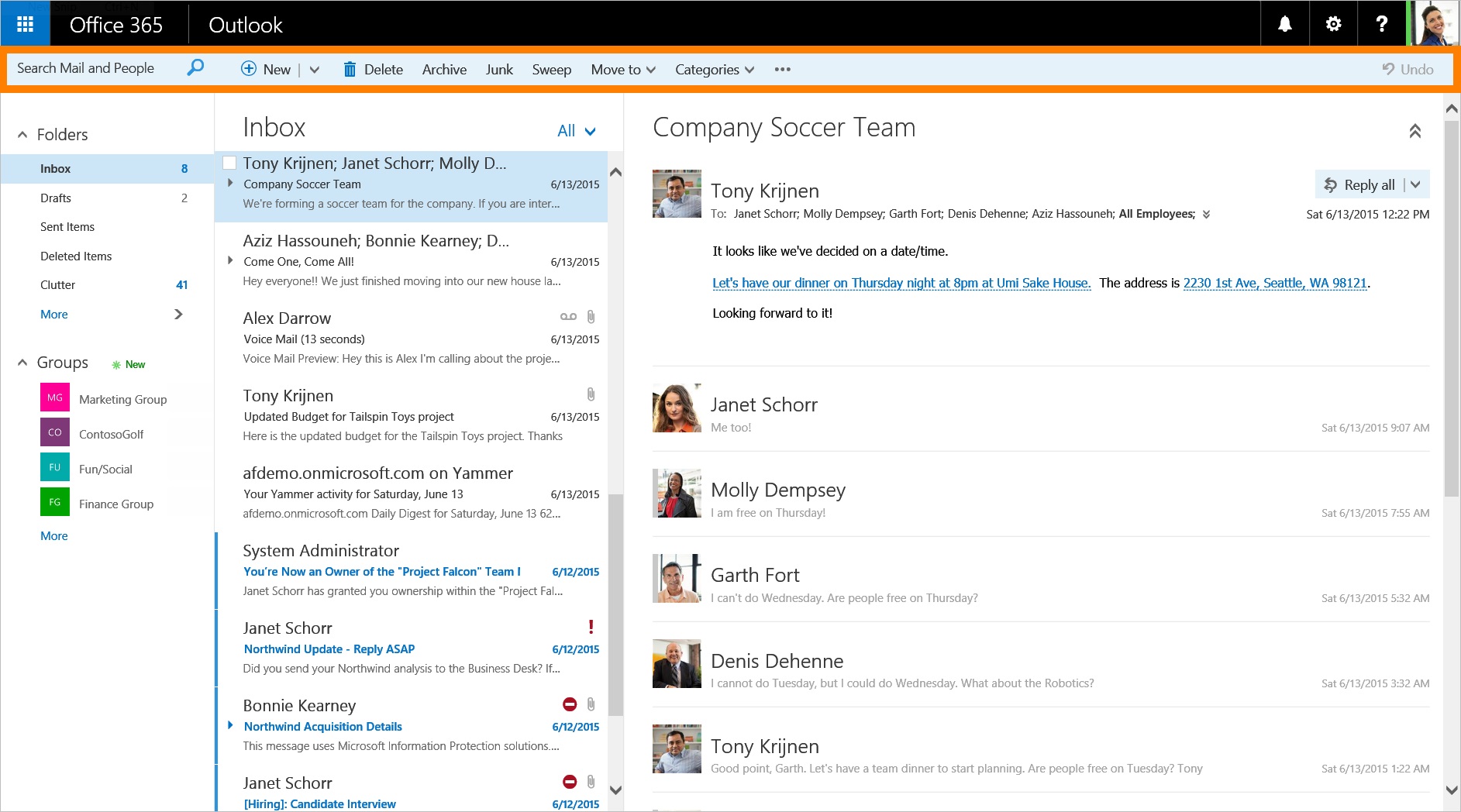
The familiar Outlook Web App, or OWA, is getting a makeover. In addition to rebranding OWA to "Outlook on the web," Microsoft is updating the user interface for Office 365 users.
The main visual improvement is a new taskbar at the top, which will appear in Mail, Calendar, People and Task experiences in Outlook. The taskbar is called the Action toolbar, and gives you "quick access to the most common commands, whether you are clearing out your inbox, replying to an email, or adding an event to your calendar," Microsoft said in a statement.
For users with touchscreen devices, there are a few subtle UI tweaks on Outlook on the web that make it more finger-friendly, including larger subject lines in emails and prominent buttons in Calendar to make it easier to create new meeting requests.
Pinning and sweeping
Similar to how Windows 10 allows you to pin frequently used apps to the new Start menu as a tile, you can also pin important email messages to the top of your inbox. Pinned messages appear highlighted in yellow.
A feature called Sweep creates an automatic filter. You can manage recurring messages, like promotional emails and newsletters, by setting specific rules.
"With Sweep, you can choose to keep messages from a specific sender for a specified number of days, only keep the latest message or delete all messages from the sender," Microsoft said.
Email with style
There is more control over images and visuals when composing emails. Outlook on the web allows users to resize images, add borders, apply shadow effects and more. Additionally Outlook on the web also comes with emojis.
Are you a pro? Subscribe to our newsletter
Sign up to the TechRadar Pro newsletter to get all the top news, opinion, features and guidance your business needs to succeed!
Microsoft is rolling out algorithms to help you stay in contact with important people. When you place your cursor over the recipient line, you'll be presented with a list of people with whom you frequently correspond.
"The list of common recipients is intelligent and adapts as the people you email changes over time," Microsoft said.
Stay on schedule
The Calendar experience got some visual changes to make it easier for you to stay on top of your schedule. When you have a big event, you can add a charm to the date. For example, if you have a flight, you can add an airplane charm. In the future, when you're glancing at your calendar, you get a quick visual cue of when you should be ready for travel.
Charms appear on the lower right hand corner of calendar events.
Business users can also quickly schedule email follow-ups for important items from the calendar.
" You can specify the recipient list, include a quick message, and set the day and time you want the email reminder to be sent," Microsoft said. "This is a great feature to keep everyone updated on important items and deliverables."
These changes are available now to First Release Office 365 customers. If you're not a First Release customer, you'll have to wait until the first week of September.
- Read our review of Windows 10